
Songster Font Free Download
Is Songster free to download?
Songster is a commercial font sold on Creative Market, so the full version needs a paid license. Get it from the official listing: Songster font download.
Need something free? These serif fonts from Google Fonts are free for personal and commercial use:
Design style
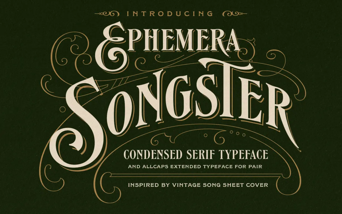
Songster pulls its reference from nineteenth-century song sheet covers, and that lineage shows in the contrast: strong verticals, thinned-out transitions, and terminals that flare slightly rather than end abruptly. It sits in that familiar territory of woodtype-adjacent revivalists, but the drawing is tighter and more controlled than most of the genre’s rougher entries. The caps carry a bit of swagger without tipping into novelty — this is a display face built for a title line, not a stunt.
The Regular style is the workhorse: solid, high-contrast, legible at a glance. The Line Shade companion adds an inline shadow effect that reads as a printer’s second colour pass, the kind of thing that used to happen when letterpress plates were slightly offset. Layer the two and you get a passable one-color-to-two-color trick without needing actual overprinting.
Character set and features
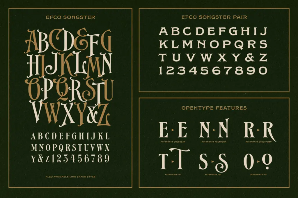
Songster is caps-only across its core styles, which is worth noting upfront — there’s no lowercase to fall back on for body copy or even long headline sentences that want mixed case. The Pair font extends the family with a complementary style meant to sit alongside the main caps, and the Extras file brings in ornamental marks: flourishes, dividers, the kind of filler glyphs that vintage labels and covers relied on to balance a composition.
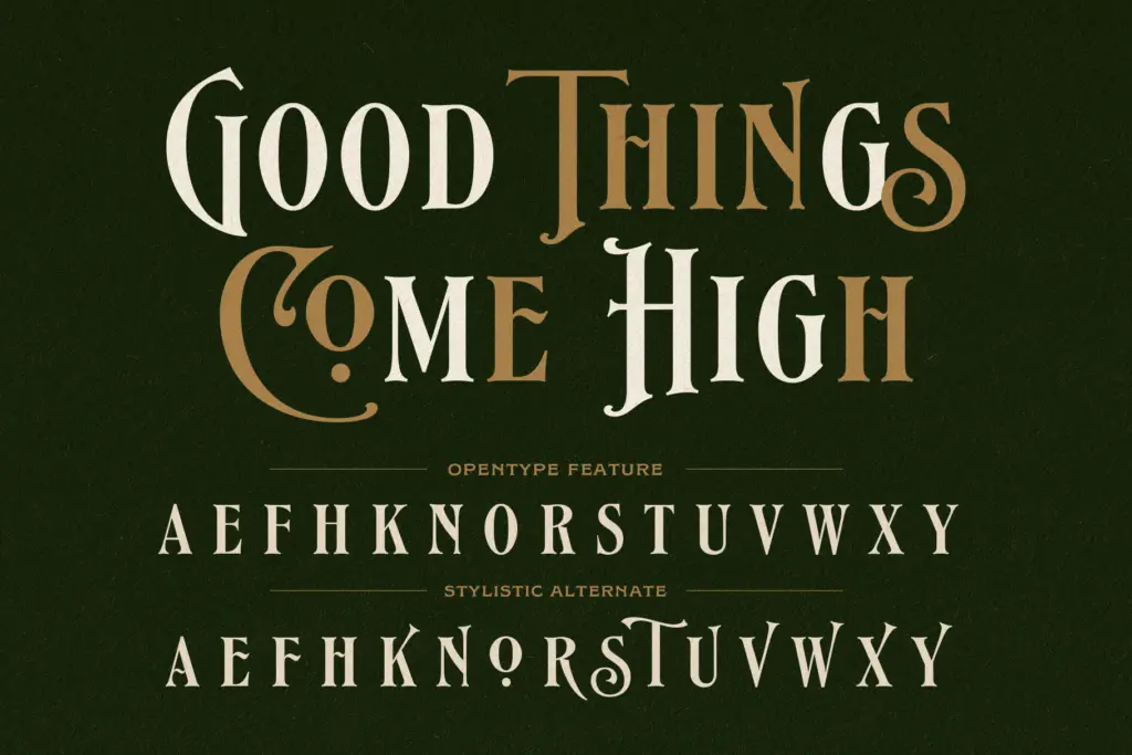
OpenType stylistic alternates are included, letting individual letters swap for variant forms within the same word — a useful trick for breaking up repetition in short-word settings like logotypes or single-line headlines, where a repeated letter shape can otherwise look mechanical. The alternates don’t reinvent the letters so much as offer a second flavour of the same idea, which is exactly what’s needed for this kind of face: subtle variation, not distraction.
Because there’s no lowercase, the practical character set is smaller than the four-file count suggests. Designers used to full families with weight ranges and italics should recalibrate expectations — this is a focused, single-purpose toolkit rather than a flexible system font.
Use cases
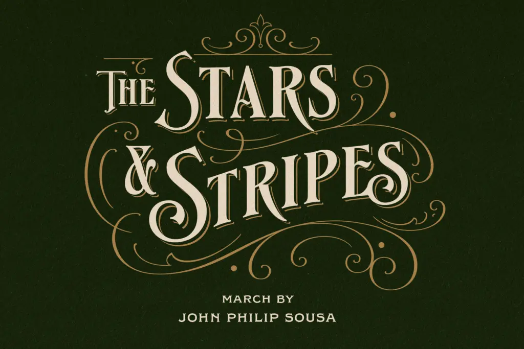
Songster is built for short, loud lines: logotypes, signage, packaging labels, poster mastheads, book and record covers. Anywhere a vintage American songbook or apothecary label aesthetic is wanted, this delivers convincingly without requiring the designer to trace old ephemera by hand. The Line Shade layer is particularly good for cover work where a stamped, two-pass print look is the goal — it does that job with far less setup than faking it in an image editor.
It’s less useful anywhere text needs to run more than a few words, since the all-caps limitation forces every composition into short bursts. Pairing with a plain sans or a humanist serif for supporting text and body copy is the practical route, since Songster itself won’t cover that ground. For its intended lane — punchy, retro-flavoured display type — it’s a capable, well-drawn option rather than a jack-of-all-trades family.
What we liked, and what we didn’t
Strengths
- The Line Shade companion style convincingly mimics a two-pass letterpress effect without extra production work
- Stylistic alternates break up repeated letters nicely in short logotype-style settings
- The ornament extras are genuinely useful for balancing vintage label and cover compositions
Trade-offs
- No lowercase means it can't handle anything beyond short all-caps lines
- Limited to display use — it needs a separate text face for body copy or long headlines
Songster is a well-executed vintage display serif that does one job — short, loud, retro-flavoured headlines and labels — very well. The all-caps-only limitation and lack of a true weight range keep it out of general-purpose territory, but for logotypes, packaging and cover work it earns its keep.

Tmfonts writes independent reviews of typefaces: what each font does well, where it falls short, what it suits, and where it is sold.