
Noir et Blanc Font Free Download
Is Noir et Blanc free to download?
Noir et Blanc is a commercial font sold on Creative Market, so the full version needs a paid license. Get it from the official listing: Noir et Blanc font download.
Need something free? These serif fonts from Google Fonts are free for personal and commercial use:
Design style
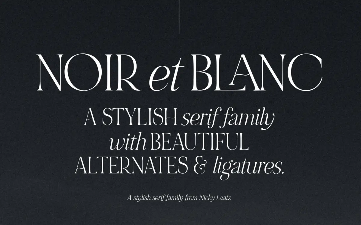
NOIR et BLANC is built as a contrast pair rather than a single alphabet. The upright serif carries thick, rounded uppercase forms that lean heavy and a little theatrical, while the italic supplies the lowercase partner: narrower, sloped, and noticeably more sensuous in its curves. The idea is that you mix the two together rather than use either alone, which is a slightly unusual way to construct a typeface but a fair reflection of how a lot of branding lockups actually get built by hand — a swash cap next to a script-like lowercase.
The bold uppercase has real weight to it, with bracketed serifs and a rounded, almost bulbous quality on bowls and terminals. It reads more decorative than a workhorse serif — closer to a display letter that happens to have serifs than to a text face. The italic lowercase is drawn with more restraint, sloped enough to feel like a companion rather than a rival, and its curves have a calligraphic softness that keeps the pairing from feeling mismatched.
Character set and features
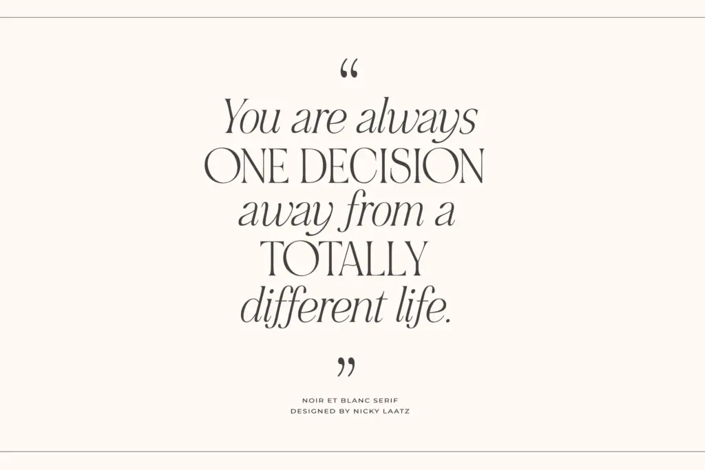
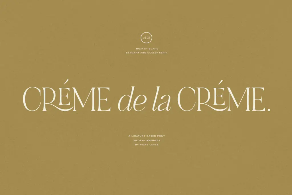
The set includes ligatures and stylistic alternates, which is where most of the personality lives. Swapped letterforms let you break up repetition in a wordmark or a headline — useful for the kind of one-off lettering treatments this typeface is clearly aimed at. These features need OpenType-aware software to access; typed straight out of the box in something that doesn’t support the feature set, you’ll only get the standard character set, so it’s worth checking your software before committing to a layout that depends on the alternates.
The brief notes three lightly varying weights meant to hold up across sizes and against both light and dark backgrounds, which suggests some thought was given to the face working beyond a single hero headline. A Canva-ready version is included, lowering the barrier for anyone not working in design software with full OpenType support. Language coverage extends across several European languages including French, German, Nordic languages, and Portuguese, so accented setting is accounted for.
Use cases
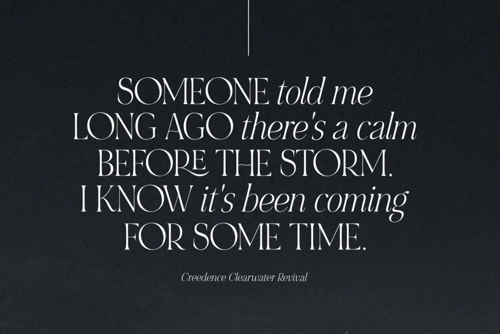
This is a branding and packaging typeface first — the kind of face you reach for on a logotype, a perfume label, a wedding suite, or a quote graphic where a handful of words need presence. The bold caps work well as a monogram or a short lockup; the italic lowercase suits taglines and short editorial pull-quotes set alongside it. It is not built for body copy or long-form reading — the drama in the caps and the slope in the lowercase both work against sustained legibility at small sizes.
Where it earns its keep is in short, high-impact type: a single word on packaging, a title card, a social quote graphic, an invitation. Pair the two styles as intended and you get a look with more personality than a plain serif pairing; try to stretch it into paragraphs or long-form use and the decorative choices that make it interesting will start to work against you.
What we liked, and what we didn’t
Strengths
- The bold uppercase and sleek italic lowercase genuinely complement each other when mixed as intended
- Ligatures and alternates give short headline-style setting real variation
- Canva-ready files and multi-language support lower the barrier for quick branding jobs
Trade-offs
- Not legible enough for body text or dense paragraphs
- OpenType alternates require compatible software, so the standard set alone is less distinctive
NOIR et BLANC is a decorative branding face that leans on the tension between a heavy upright uppercase and a softer italic lowercase. It does short, high-impact type well but isn't built for reading at length. Best suited to logos, labels, and invitation-style work rather than editorial layouts.

Tmfonts writes independent reviews of typefaces: what each font does well, where it falls short, what it suits, and where it is sold.