
California Palms Fonts & Graphics Free Download
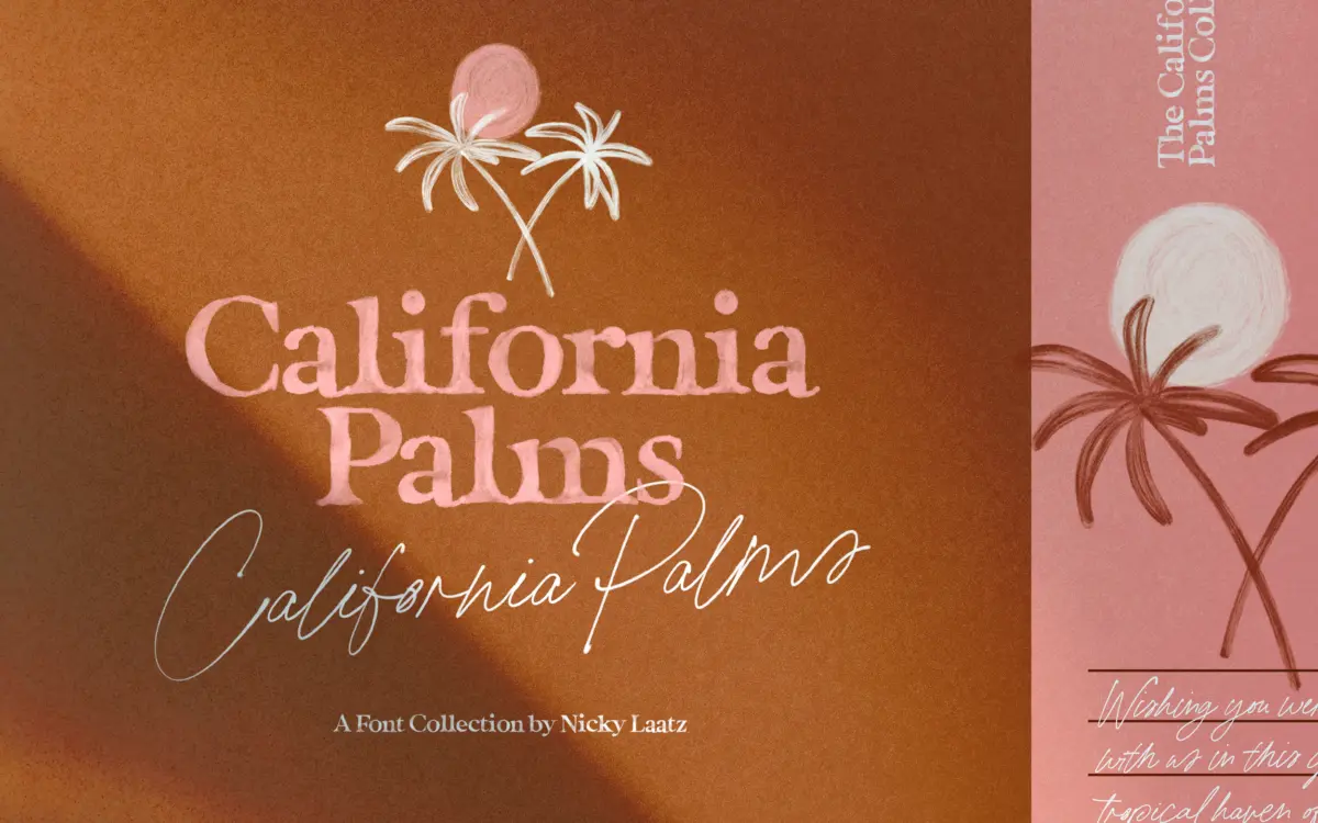
If you searched for a California Palms Fonts & Graphics free download, the honest answer is that Nicky Laatz sells this bundle and does not publish a free or demo edition of it. The money buys a kit of textured serifs, a signature-style script and a folder of summer doodles, licensed through Creative Market or the designer’s own shop.
California Palms Fonts & Graphics free download: the short answer on demos and price
Neither the Creative Market listing nor the product page on nickylaatz.com offers a downloadable demo. Both pages have a live text box for typing a few words in the script, and that is the only free preview. We also found no California Palms page on Fontspring or MyFonts. Copies of the full pack on “free font” sites are not authorised and come with no licence, not even for personal use.
Prices when we checked in October 2026:
- Creative Market: Desktop $30 per seat. Webfont, E-pub and App licences are sold separately, listed at $30, $50 and $240 before the page’s discounts.
- nickylaatz.com: Standard Desktop EULA $32, shown on sale at $27.20, with web font, digital ad and e-pub licences on the same page.
The designer’s page notes that the script is not sold on its own, so one licence covers the whole kit.
Get California Palms Fonts & Graphics — official listing
California Palms Fonts & Graphics specimen and verified specs
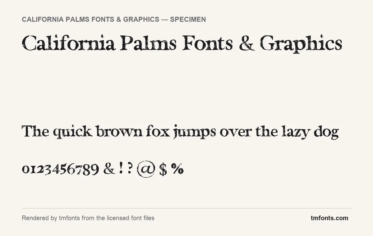
- Styles: 6 (Marker Serif, Script, Script SVG, Script Thicker, Serif, Watercolour)
- File formats: OTF
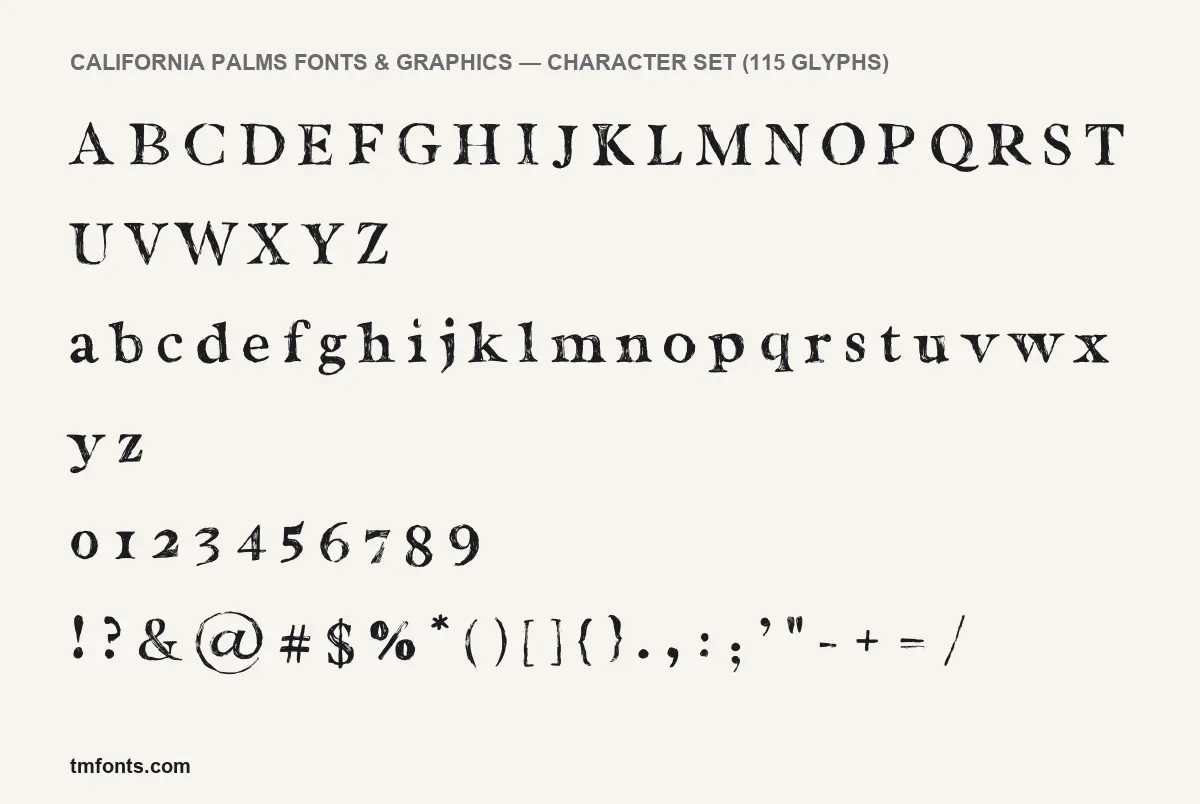
- Glyphs: 115
- Language support: Basic Latin (English), Western European
- OpenType features: kerning
- Designer: Nicky Laatz
Checked by tmfonts from the licensed font files.
The Marker Serif up close
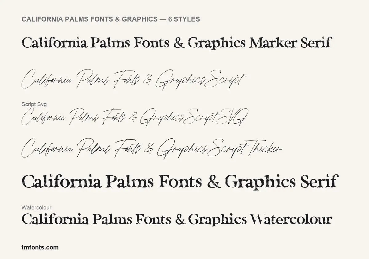
The licensed files treat Marker Serif as the family’s main style, and it is the face in the specimen above. It is an old-style serif with wedge-shaped, bracketed serifs, and every stroke is filled with scratchy, hatched lines, as if inked with a dry marker over a printed outline. The capitals follow classical proportions: a wide M, a round O, and a Q whose tail sweeps under the baseline.
The figures are old-style. The 0, 1 and 2 sit at lowercase height while 3, 4, 5, 7 and 9 drop below the line, so dates and prices blend into a sentence. The @ is drawn noticeably larger than the letters around it.
Serif looks like a heavier cut of the same rough letters. The scripts go the other way: a quick, wiry signature with oversized capitals, plus a Thicker version with more weight. The listings describe the watercolour serif as painted; in our styles sheet it renders as dark letters only, because its colour sits in an SVG layer our renderer does not draw.
Inside the California Palms bundle
- Six font styles in the licensed files: Marker Serif, Serif, Watercolour, Script, Script SVG and Script Thicker.
- Format: OTF for every style. The SVG styles are OpenType-SVG colour fonts.
- Glyphs: 115 in Marker Serif, covering A to Z, a to z, figures, punctuation and common symbols.
- Version: 1.004, built with Fontself Maker. Creative Market dates the product to 1 July 2019.
- Graphics: the Creative Market listing counts 65 summer doodles, supplied as a layered PSD, individual PNGs, individual PDF vectors and an Illustrator file, plus a help PDF.
SVG colour fonts, OpenType and language coverage
According to both listings, the SVG styles are bitmap-based colour fonts. They need Photoshop CC 2017 or Illustrator CC 2018 or later (Creative Market’s FAQ also names InDesign CC 13.0.1 and newer), they stay sharp up to capitals about two inches tall, and they cannot be used as webfonts. Elsewhere, use the regular OTF styles.
Marker Serif has one OpenType feature, kerning, which fixes the spacing of awkward letter pairs automatically. The designer says the script has 74 automatic ligatures that make typed words look handwritten; they switch on by default in Adobe apps and Affinity, but Creative Market’s FAQ warns that Canva can’t read them.
The nickylaatz.com page says the fonts are PUA encoded, which normally means the extra glyphs have Private Use Area codes you can copy from Character Map (Windows) or Character Viewer (Mac) and paste into Canva or Cricut Design Space. The Marker Serif file we examined has no PUA glyphs, so that applies to the script only.
On languages, the listing says English only, with a handful of accent marks. Our file check found Basic Latin plus some Western European characters, so test any accented name before you send it to print.
Where California Palms works, and what to set beside it
The kit is made for seasonal graphics: a summer menu, a pool-party invitation, a rosé label, Instagram story templates. Use Marker Serif for large headlines, where the hatching reads as texture rather than noise, add the script for a name or short note, and scatter a few doodles. None of the styles suits paragraphs.
Keep supporting text clean:
- Karla or Nunito Sans for body copy and small print.
- Crimson Pro for longer reading text if you want to stay with a serif.
- Josefin Sans in spaced capitals for dates, times and addresses.
Licence terms in plain English
Every use needs a paid licence, personal projects included. Under Creative Market’s font licence, Desktop covers unlimited personal and commercial projects, from packaging and products for sale to social posts and paid ads, with one seat per person using the fonts. On the web it allows the fonts only as images; embedding them in a site needs a Webfont licence, and e-books and apps each need their own. The terms also set conditions on logo use. Nicky Laatz’s page adds that the standard desktop licence is the one to buy for T-shirts and other merchandise that use the doodles. A California Palms Fonts & Graphics free download from an unofficial site carries none of these rights. This is a summary, not legal advice.
Installing the fonts on Windows and Mac
Download California Palms from your purchase page and unzip it. On Windows, right-click the OTF files and choose Install. On a Mac, double-click each OTF and click Install Font. Restart your design app afterwards.
Free Google serifs that come close
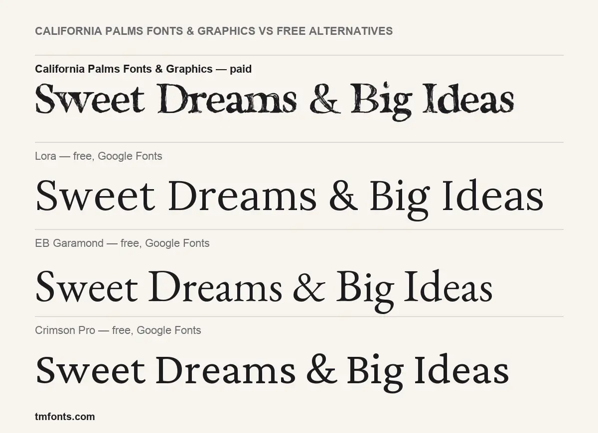
No free font reproduces the hatched texture. Still, if a California Palms Fonts & Graphics free download was meant to fill a gap in a zero-budget job, these three Google Fonts share the classical serif skeleton and are free for commercial use. Our comparison image sets the same phrase in each.
- Lora has similar bracketed serifs and calligraphic curves, drawn in clean, solid strokes. It is the sturdiest of the three.
- EB Garamond is closest to Marker Serif’s old-style bones, with small serifs and a lighter, bookish colour. It looks like the textured letters with the ink cleaned off.
- Crimson Pro sits between the two: a little darker than Garamond, with sharper serifs and a steady rhythm that suits body text.
California Palms Fonts & Graphics FAQ
Can I get California Palms for free?
Not officially. There is no California Palms Fonts & Graphics free download, demo or personal-use version; the only free option is the text preview on the listings. Licences start at $30 per desktop seat on Creative Market, or $32 on nickylaatz.com ($27.20 on sale when we checked).
Why doesn’t the watercolour style show any colour?
Its colour lives in an SVG layer. According to the listing, you need Photoshop CC 2017, Illustrator CC 2018 or a newer version to see it.
Does California Palms work in Canva or Cricut?
The regular OTF styles install and type normally. Ligatures won’t switch on automatically in Canva, per the listing, but the designer says the fonts are PUA encoded, so extra glyphs can be pasted in from a character map. Treat the SVG colour styles as Adobe-only.
Who made California Palms?
Nicky Laatz, who is named as designer in the font files and sells the kit through her own shop and Creative Market.

Tmfonts writes independent reviews of typefaces: what each font does well, where it falls short, what it suits, and where it is sold.