
The Erupha Serif Font Free Download
Is The Erupha Serif free to download?
The Erupha Serif is a commercial font sold on Creative Market, so the full version needs a paid license. Get it from the official listing: The Erupha Serif font download.
Need something free? These serif fonts from Google Fonts are free for personal and commercial use:
Design style
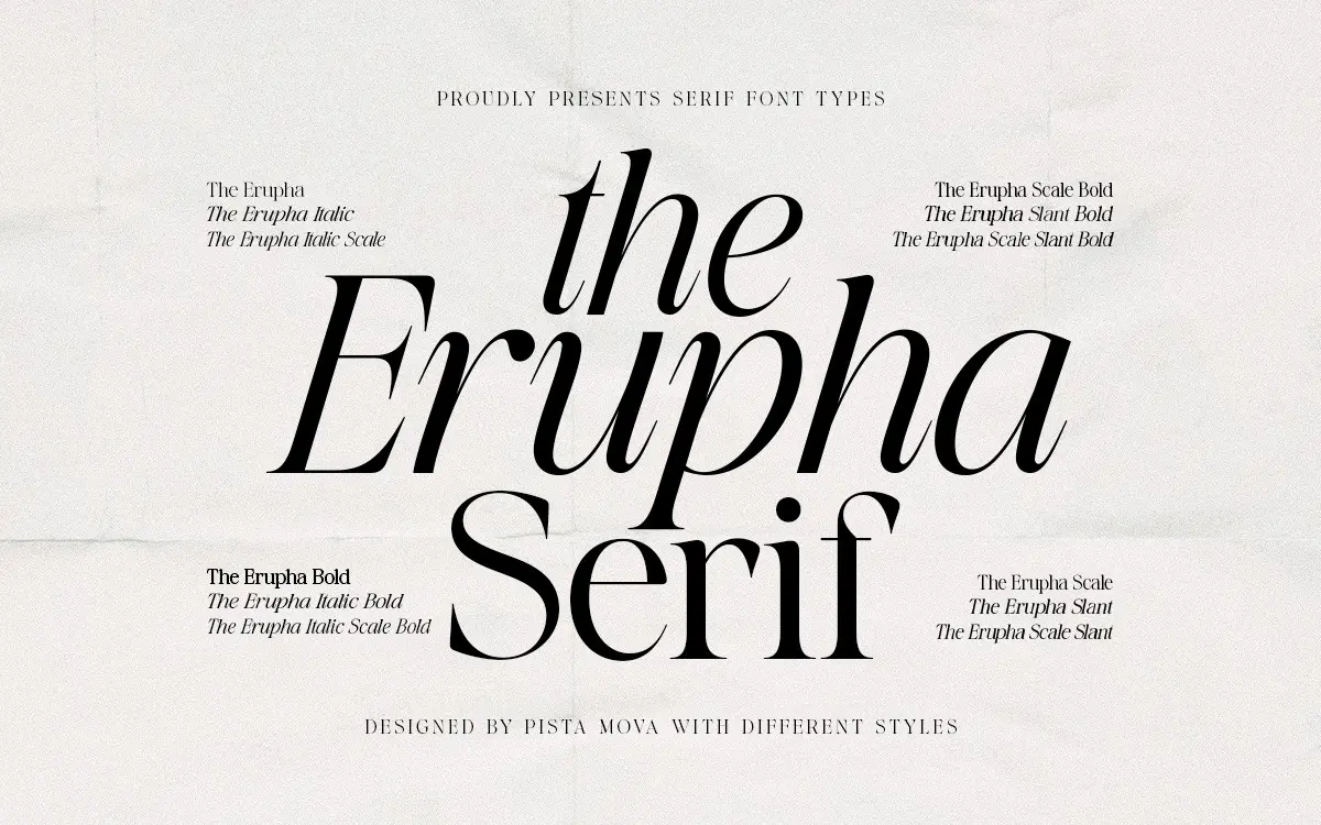
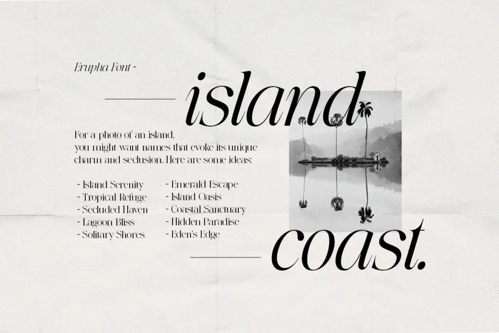
The Erupha sits in that familiar territory of high-contrast serifs built for fashion and editorial work — thin hairlines against thick stems, a vertical stress, and serifs that stay narrow and pointed rather than bracketed. The proportions are tall and narrow, which gives it a confident, upright posture on the page rather than a relaxed one. This is a display-leaning serif, not a text face, and it reads that way: the contrast is pronounced enough that it starts to flicker at small sizes, but at headline scale it has real presence.
The curves are where the character lives. Bowls on the rounded letters are drawn with a slight tension, pulled in at the widest point rather than left generous, which keeps the face feeling controlled rather than showy. It’s a look that owes an obvious debt to the high-fashion serifs that have circulated for the past decade, but the execution here is competent rather than derivative to the point of being interchangeable.
Character set and features
The package includes 12 font files, which suggests a family with distinct romans, italics, and likely some weight variation, though the brief doesn’t break out specific weight counts. The italics are described as true italics rather than a slanted roman, and that shows in the cursive-influenced joins and the more fluid entry and exit strokes — they carry a different personality from the upright, which is the right call for a face pitched at editorial pull-quotes and headline pairs.
Ligatures are a stated feature, and OpenType support extends to them specifically. That’s useful for the kind of tight letter combinations that high-contrast serifs are prone to colliding on, particularly around ascenders and descenders in italic. There’s no mention of small caps, alternates beyond the ligatures, or extended language support, so treat this as a face built primarily for Latin-alphabet, English-language use until proven otherwise. Buyers wanting old-style figures, a full stylistic alternate set, or multi-script coverage should look elsewhere or confirm before committing.
Use cases
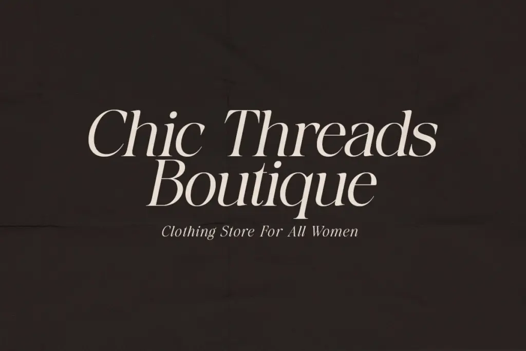
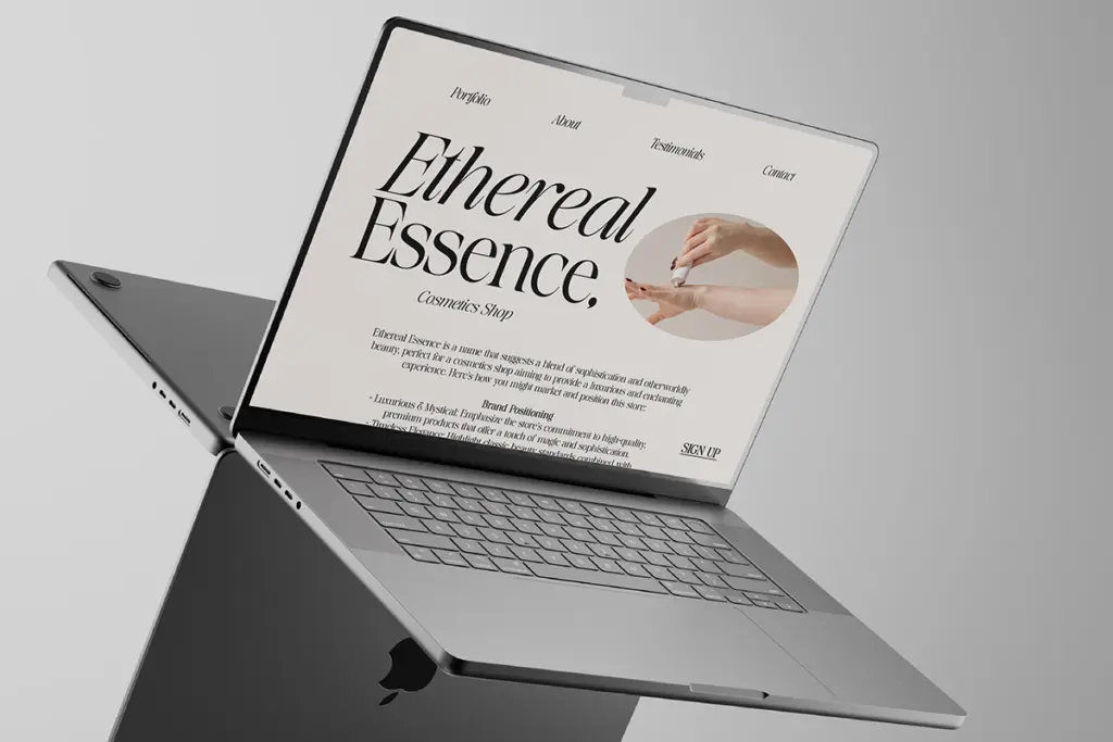
Erupha’s natural home is short-form, large-size text: magazine mastheads, cover lines, pull quotes, wordmark logotypes, invitation lettering. The high contrast and narrow proportions make it a strong candidate for anything that wants to read as fashion-adjacent or

Tmfonts writes independent reviews of typefaces: what each font does well, where it falls short, what it suits, and where it is sold.