
Birdie Font Free Download
Is Birdie free to download?
Birdie is a commercial font sold on Creative Market, so the full version needs a paid license. Get it from the official listing: Birdie font download.
Need something free? These handwritten fonts from Google Fonts are free for personal and commercial use:
Design style
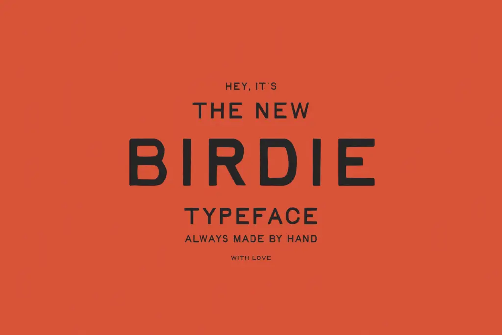
Birdie sits in that well-worn category of handwritten fonts built to look like they came off a distressed rubber stamp or a tired job-press plate. The strokes carry a soft, slightly uneven edge rather than the crisp vector cleanliness of most script fonts, and letters lean casually rather than following a strict slant angle. It reads as handmade in the sense that a real hand-lettered sign reads handmade: not polished, not uniform, and clearly not traced from a grid.
What separates it from the flood of similar rough-script fonts is restraint. The distressing is present but not overdone — there’s no exaggerated ink bleed or fake paper texture layered on top, just irregular stroke weight and terminals that don’t quite close the same way twice. That keeps it from tipping into gimmick territory, which is where a lot of vintage-print scripts go wrong.
Character set and features
Birdie includes contextual alternates for both the upper and lowercase alphabet as well as the digits, which is the feature that actually matters here. Handwritten fonts live or die on repetition: type the same letter twice in a word and if it looks identical both times, the
What we liked, and what we didn’t
Strengths
- a
- b
- c
Trade-offs
- a
- b
placeholder

Tmfonts writes independent reviews of typefaces: what each font does well, where it falls short, what it suits, and where it is sold.