
The Meadows Font Free Download
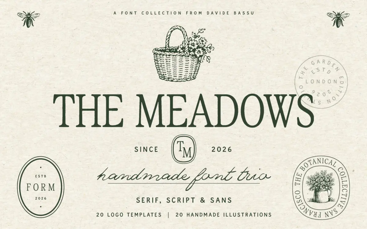
Is The Meadows free to download?
The Meadows is a commercial font sold on Creative Market, so the full version needs a paid license. Get it from the official listing: The Meadows font download.
Need something free? These handwritten fonts from Google Fonts are free for personal and commercial use:
Design style
The Meadows reads as a mood board turned into three coordinated typefaces rather than a single font with a strong single idea. The serif has a slightly worn, hand-cut quality, with irregular stroke weights and terminals that don’t quite match from letter to letter — the kind of imperfection that reads as handmade rather than digitally smoothed. The script sits alongside it with a loose, informal slant and connecting strokes that feel like a marker or brush pen rather than a pointed nib. The sans is the plainest of the three, functioning as a quiet, grounded companion rather than a design statement in its own right.
None of the three individually pushes hard on character. What they do well is agree with each other tonally: warm, unpolished, a bit domestic. That’s a deliberate choice for a countryside-market aesthetic, but it means the trio is more of a mood than a piece of typographic invention. Designers looking for a script or serif with a distinct, ownable silhouette may find each style a touch generic when isolated from its siblings.
Character set and features
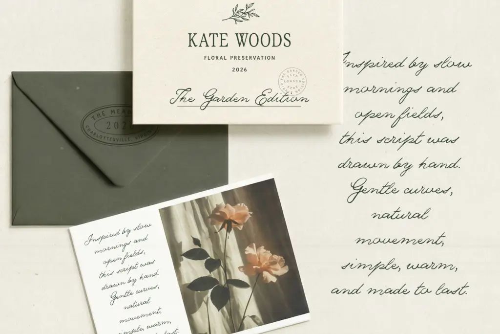
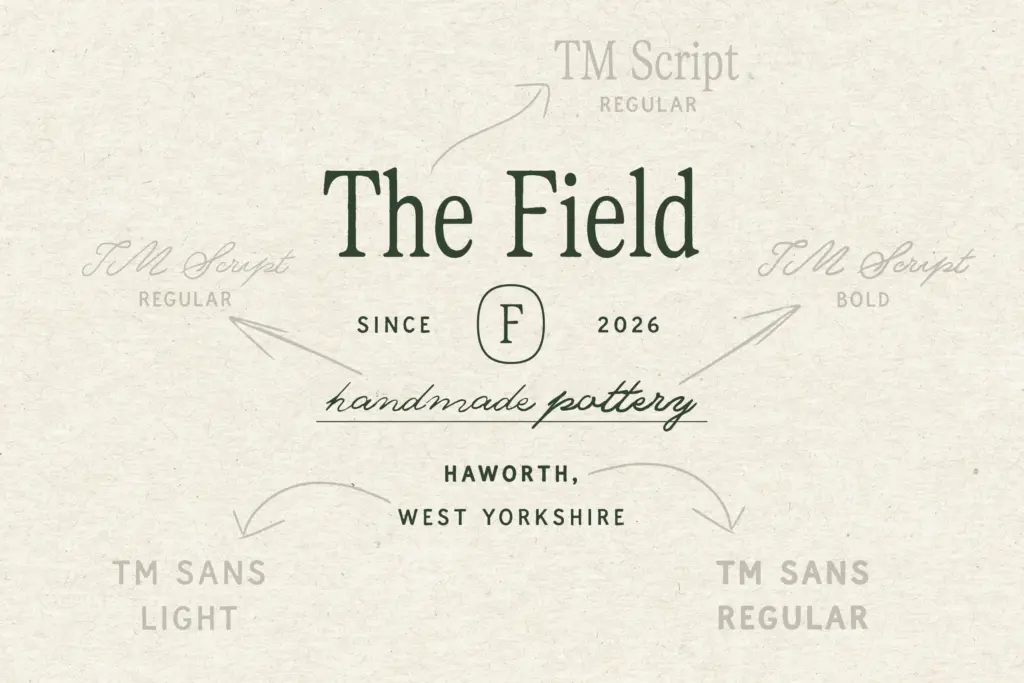
The package covers the basics you’d expect from a working font family: uppercase and lowercase, numerals, and punctuation across all styles, with multilingual support for Western European languages. The serif comes in Regular and Tall variants, the sans in Light and Regular, and the script is the most fleshed-out of the three with Regular, Slanted, Bold and Bold Slanted — giving the script real range for emphasis and hierarchy without switching families.
The bundled extras — 20 logo templates and 20 illustrations — are clearly aimed at buyers who want a ready-made brand kit rather than just a font file. That’s useful for solo founders and small studios building a look quickly, but it also means the type itself is doing less of the heavy lifting; the illustrations and templates are propping up the identity as much as the letterforms are. Worth noting: no OpenType ligature or alternate-glyph details are specified, so anyone expecting swash variation or contextual alternates in the script should confirm before relying on it for handwriting-style authenticity.
Use cases
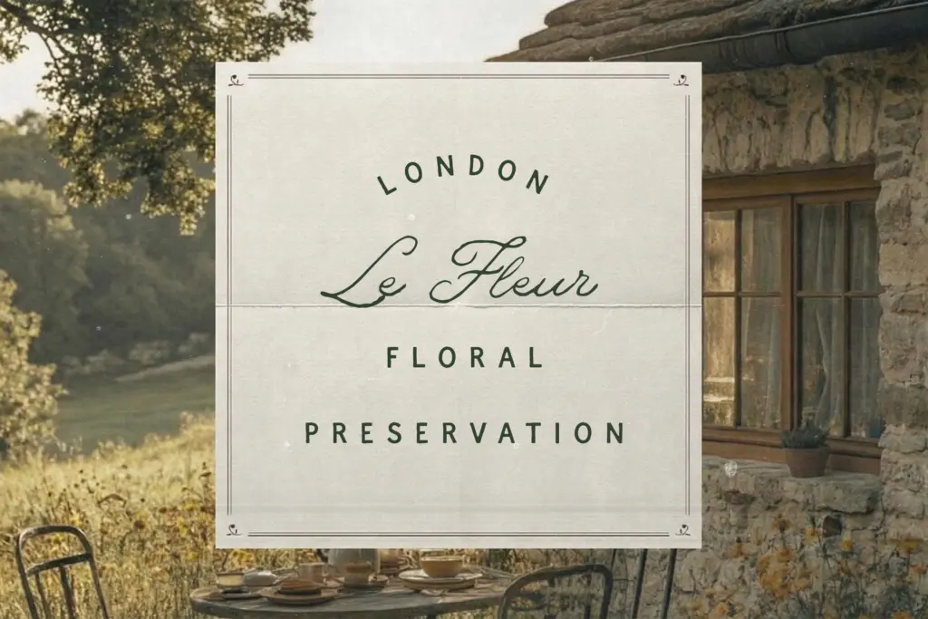
This trio is built for a specific kind of brand voice: farmers markets, small-batch food and drink packaging, wedding stationery with a rustic rather than formal tone, and editorial spreads that want warmth over polish. The serif works well for body copy and product names where a slightly imperfect, human texture suits the story. The script is best used sparingly — a signature line, a quote, a short heading — rather than set at length, as handwritten-style scripts tend to fatigue the eye in long passages.
The sans is the safest workhorse of the three, good for labels, addresses, and any place you need legibility without character competing with the serif or script. Used together, the trio can carry a full identity system from logo to packaging to social graphics, provided the client brief already wants
What we liked, and what we didn’t
Strengths
- The three styles are tonally consistent and clearly designed to work as a system.
- The script offers genuine range with four weight and slant variants.
- The bundled logo templates and illustrations shortcut full brand-identity work.
Trade-offs
- Each individual style feels somewhat generic when separated from the trio.
- No documented OpenType alternates or ligatures, which limits handwritten authenticity in the script.
The Meadows delivers a coherent, warm-toned trio built for a specific rustic-editorial mood rather than a technically ambitious typeface. It works well as a packaged brand-building tool but each individual style is more supportive than distinctive on its own.

Tmfonts writes independent reviews of typefaces: what each font does well, where it falls short, what it suits, and where it is sold.