
Promenade Font Free Download
Is Promenade free to download?
Promenade is a commercial font sold on Creative Market, so the full version needs a paid license. Get it from the official listing: Promenade font download.
Need something free? These serif fonts from Google Fonts are free for personal and commercial use:
Design style
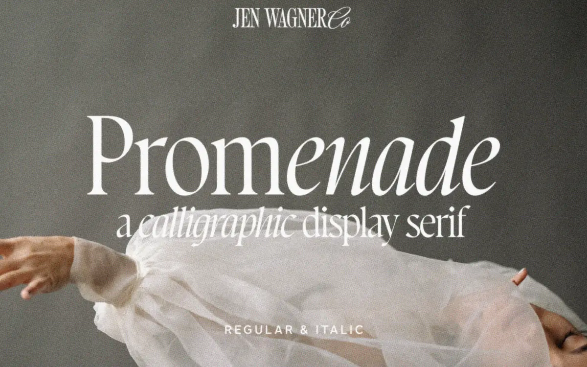
Promenade is a serif built from calligraphic roots, and it doesn’t hide that origin. You can see the flat-nib pen in the way strokes swell and thin, in the angled stress of the curves, and in terminals that taper rather than stop square. It sits somewhere between a formal serif and a handwritten letter, which gives it a warmth that most straight-drawn serifs don’t have.
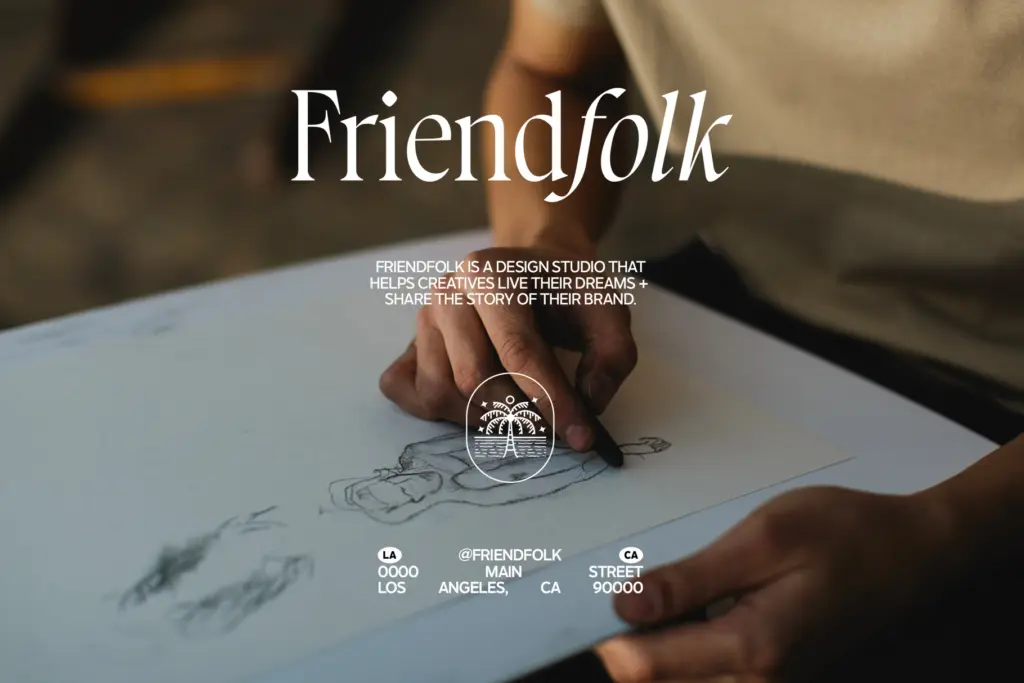
The italic is the stronger of the two styles. Letters lean and connect with a looseness that reads as genuine handwriting rather than a slanted version of the roman. Where the roman is composed and upright, the italic loosens the collar a bit — more movement in the joins, more variation stroke to stroke. Pairing the two within a single piece of type, roman for a word and italic for another, is clearly what the design was built to do, and it works better than most regular/italic combinations because the two styles feel like relatives rather than a face and its slanted clone.
Character set and features
As shipped, Promenade is spaced generously — the designer’s own note is that it’s set for reading, not for tight display work, and that’s accurate. Left at default spacing it reads calmly at body-copy sizes, letters given enough air that the calligraphic swells don’t crowd each other. For logotypes, headlines, or anything meant to look considered rather than casual, you’ll want to pull the tracking in; the font’s own guidance of roughly -20 to -40 units matches what the letterforms actually want once you start setting short lines at large sizes.
The calligraphic details — the ink traps implied by the terminals, the pen-angle stress in the bowls — hold up fine at headline sizes but start to blur at small text sizes, particularly on screen. This is a display-leaning serif more than a body-text one, even though its default spacing suggests otherwise.

Use cases
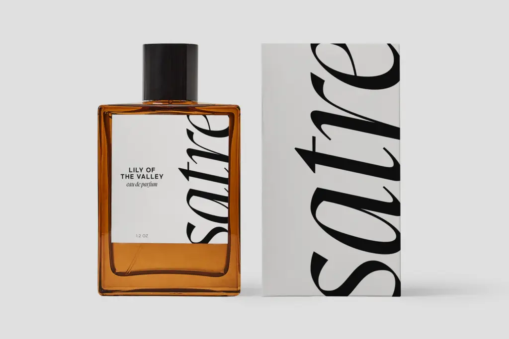
Promenade’s natural home is branding and short-form editorial work: logotypes, quote graphics, invitation headers, packaging, anywhere a few words need to carry some personality. The regular-and-italic combination is worth building into a logo lockup on its own — set a brand name in roman and a tagline or secondary word in italic and the pairing does a lot of the design work for you.
It’s less suited to long-form text. The pen-drawn detail that makes it interesting at large sizes becomes noise in a paragraph, and the default loose spacing that helps readability at body sizes works against the tighter, more considered look the font is capable of at display sizes. Treat it as a headline and identity typeface, not a workhorse text face, and it earns its keep.
What we liked, and what we didn’t
Strengths
- The roman and italic feel like genuine relatives, making regular/italic combinations in logos unusually cohesive.
- Pen-drawn terminals and stroke contrast give it a handmade warmth that straight-drawn serifs lack.
- Works well as a quick identity-building tool for short lines: names, taglines, quote graphics.
Trade-offs
- Default spacing is loose and needs manual tightening (roughly -20 to -40) to get the intended display look.
- Calligraphic detail blurs at small text sizes, so it's unsuitable for body copy.
Promenade is a calligraphic serif that earns its keep in short-form branding work, especially when the roman and italic are set together. It needs tighter spacing than its defaults to look its best, and it isn't built for long passages of text, but as a display and logo face it has real character.

Tmfonts writes independent reviews of typefaces: what each font does well, where it falls short, what it suits, and where it is sold.