
Golden Reverie Font Free Download
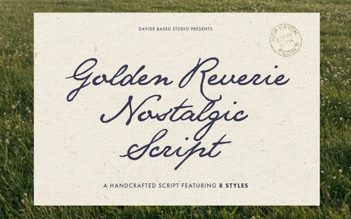
Is Golden Reverie free to download?
Golden Reverie is a commercial font sold on Creative Market, so the full version needs a paid license. Get it from the official listing: Golden Reverie font download.
Need something free? These handwritten fonts from Google Fonts are free for personal and commercial use:
Design style
Golden Reverie sits in the crowded field of handwritten scripts built for weddings and boutique branding, but its stroke handling has a gentler pace than most. The letters lean toward a low-contrast, flowing hand rather than the pointed-nib flourish common to this category. Curves are rounded rather than whipped, joins are soft, and the baseline drifts slightly rather than sitting rigid — the kind of movement that reads as handwritten rather than digitised calligraphy.
The eight styles give the family real range. At the lighter end the strokes thin out to something closer to a pencil sketch of a signature; at the heavier end the letters thicken into something bolder and more confident, closer to a marker script. That spread matters more than it sounds — a lot of single-weight scripts force you to fake emphasis with size alone, and Golden Reverie doesn’t need that trick.
Character set and features
The set covers full uppercase and lowercase, numerals and punctuation, with multilingual support across Western European languages including the Scandinavian set. That’s a practical detail for anyone doing stationery or packaging work that needs accented characters to look native rather than bolted on.
Where the font is less forthcoming is in the specifics of its OpenType feature set — no mention of contextual alternates, ligature counts, or swash variants beyond the general handcrafted description. Scripts in this space usually lean on ligatures to avoid awkward letter collisions, and without confirmation of that mechanism, buyers should test their actual word combinations before committing to a layout, particularly in the bolder weights where strokes run closer together.
The lowercase is the font’s strongest asset: the x-height is generous enough to keep short words legible at a glance, and the exit strokes are restrained rather than looping into neighbouring letters, which helps at smaller sizes. Uppercase letters carry more flourish, as expected in this genre, and work best used sparingly — as initials or monogram marks rather than run continuously.

Use cases
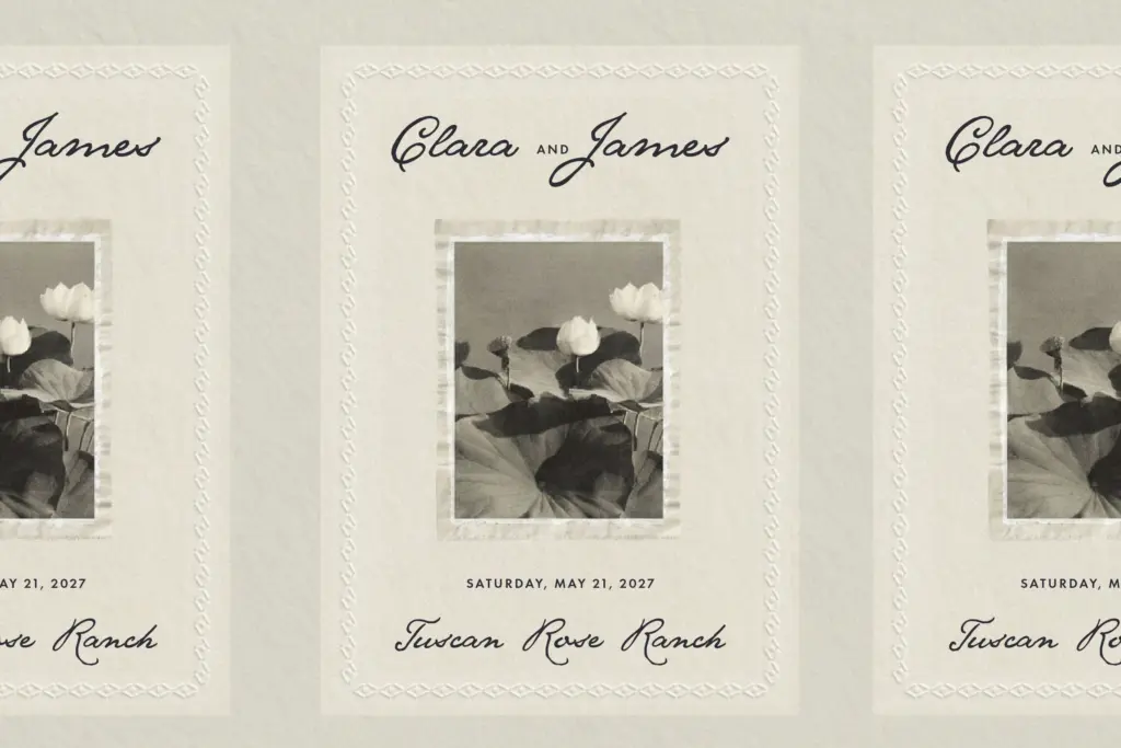
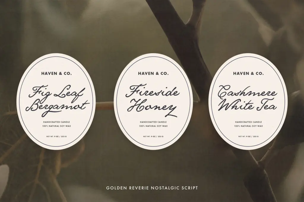
This is a font for the moment in a layout where warmth matters more than neutrality: a save-the-date, a perfume label, a magazine pull quote, a signature line on a certificate. The lighter weights suit longer phrases — a vow excerpt, a tagline — where a heavier script would tire the eye. The bolder weights are better reserved for short marks: a monogram, a logotype, a single word on packaging.
It’s not a font for body copy, dense listings, or anything that needs to be read quickly and repeatedly — that was never the brief, and it shows in the joined, variable rhythm of the letters. Pair it with a plain sans or a quiet serif for supporting text; asking it to carry a full page of information on its own will expose the same fatigue every script in this category runs into. Used for accents, headers, and signature moments, though, it does the nostalgic, handwritten job it sets out to do without overreaching.
What we liked, and what we didn’t
Strengths
- Eight weights give real range from delicate accents to bold marks without switching families
- Generous lowercase x-height keeps short phrases legible at small sizes
- Multilingual support covers Western European accents, useful for stationery and packaging work
Trade-offs
- No detail on ligatures or contextual alternates, so letter collisions in bolder weights need manual checking
- Not suited to continuous reading — the variable rhythm tires the eye past a line or two
Golden Reverie is a competent, warm-toned script with genuine range across its eight weights, best used for short accents rather than long passages. It won't surprise anyone familiar with the wedding-script genre, but it executes the brief cleanly. Worth testing your specific word combinations before committing, since ligature behaviour isn't detailed.

Tmfonts writes independent reviews of typefaces: what each font does well, where it falls short, what it suits, and where it is sold.