
Altone Font Free Download
Is Altone free to download?
Altone is a commercial font sold on Creative Market, so the full version needs a paid license. Get it from the official listing: Altone font download.
Need something free? These sans serif fonts from Google Fonts are free for personal and commercial use:
Design style
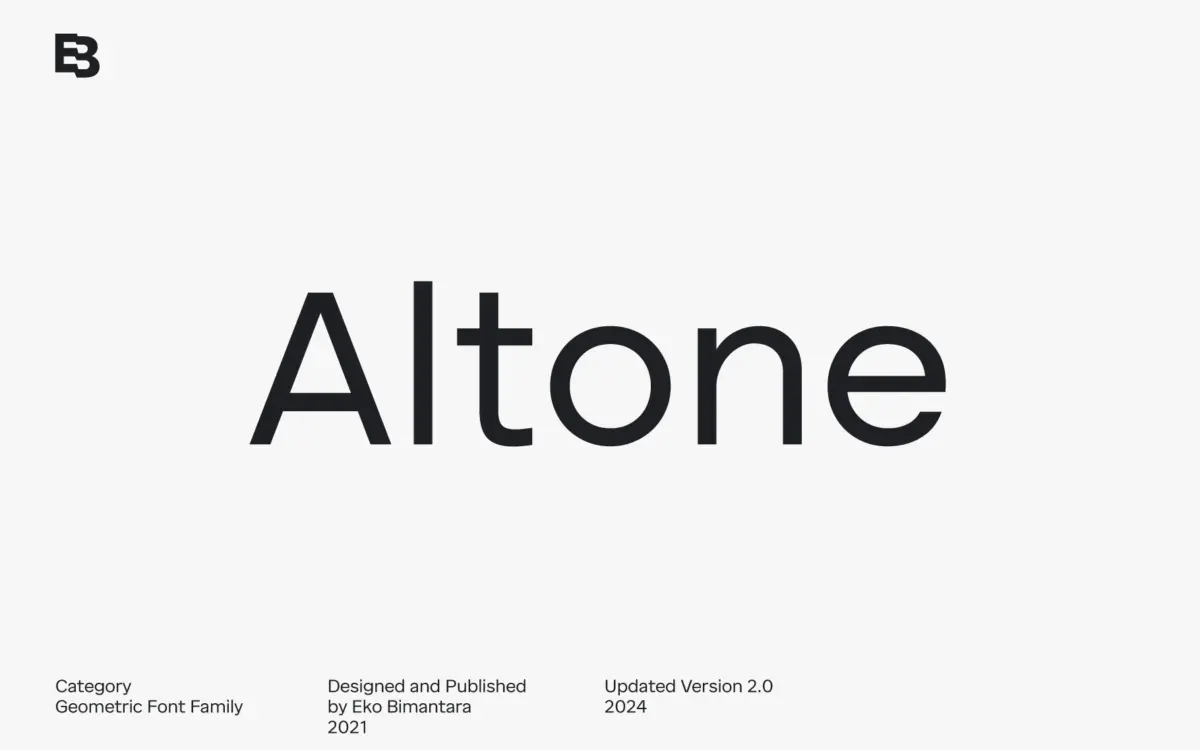
Altone sits closer to grotesk than to the classical Bauhaus geometric sans it’s often filed next to. The distinction matters: instead of pure circles and triangles forced into letters, Altone uses moderate, proportional widths with a flat apex and closed apertures. Stroke ends are cut straight across rather than angled, which gives the typeface a slightly more mechanical, assembled feel than a warmer geometric face would have. It reads as confident but not showy — the kind of restraint that comes from prioritising regularity over personality quirks.
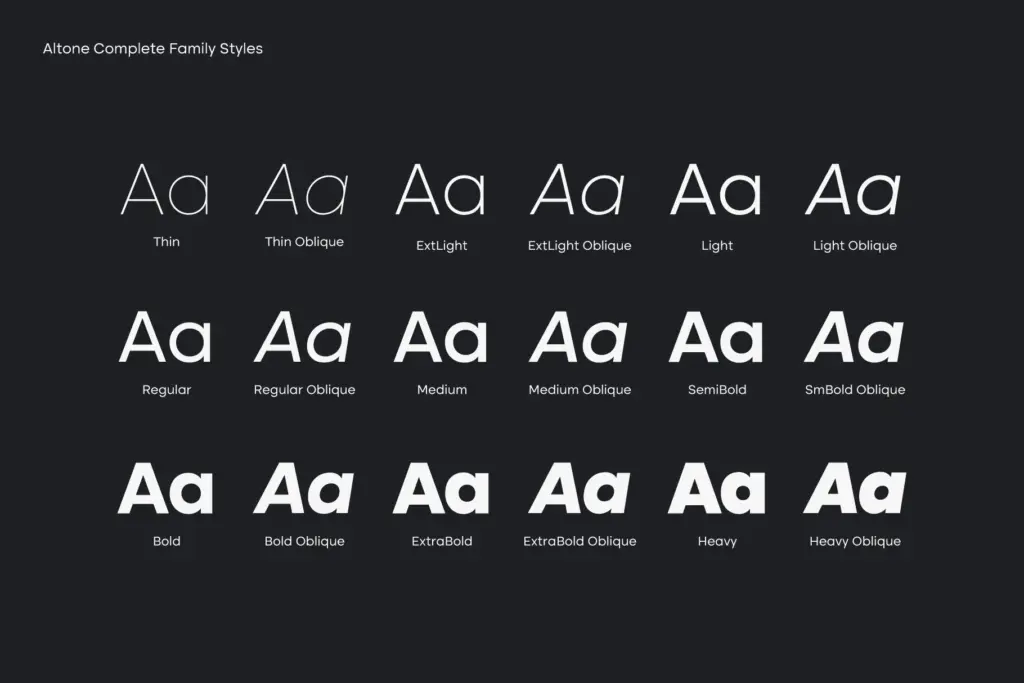
The nine weights, from Thin to Heavy, are evenly spaced enough that adjacent steps feel like genuine, useful increments rather than arbitrary interpolation stops. Each weight carries a matching oblique rather than a true italic, which is consistent with the grotesk lineage it’s drawing from — obliques here are slanted romans, not redrawn cursive forms, and they hold their structure well even at the heavier end where slanting a bold stroke can sometimes distort counters.
Character set and features
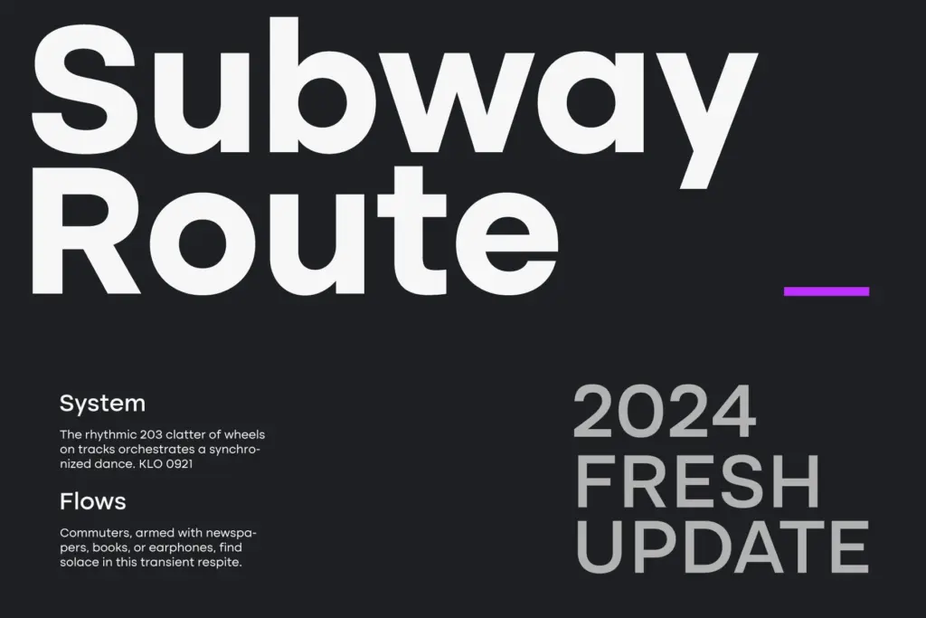
The OpenType feature set is aimed at practical, everyday typesetting rather than display flourish. Stylistic alternates give some flexibility on a handful of letters without changing the overall voice of the face. Figure handling is more thorough than most sans families bother with: tabular lining figures for anything that needs to align in columns, plus fraction, numerator and denominator forms for technical or financial layouts. That’s a feature set built by someone who’s actually had to typeset a rate card or a spec sheet, not just a specimen poster.
Broad Latin language coverage extends the family’s reach beyond English-only branding work, which is worth noting if a project needs diacritics across several European languages. The variable font versions — Upright and Oblique — mean the full weight range is accessible as a single file where that workflow is supported, useful for web projects that want fluid weight control without loading nine static instances.
Use cases
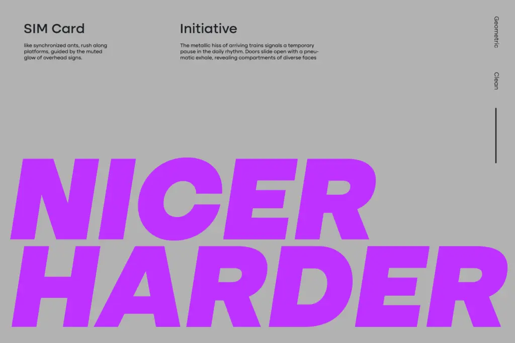
Altone’s natural home is corporate identity and brand systems: annual reports, wordmarks, interface type, anywhere a project needs a sans that won’t argue with the content. The closed apertures and straight terminals keep it legible at small sizes, and the tabular and fraction figures make it genuinely usable in data-heavy layouts — pricing tables, dashboards, financial documents — where many geometric sans families fall back on default figures and hope for the best.
At display sizes the heavier weights carry enough presence for headlines and signage, though designers looking for a geometric sans with more warmth or idiosyncrasy in the letterforms — a rounder bowl, a more distinctive ‘a’ or ‘g’ — will find Altone deliberately plain by comparison. That plainness is the point: it’s a workhorse family built to disappear into a brand rather than announce itself, and it does that job competently across a wide weight range.
What we liked, and what we didn’t
Strengths
- Tabular, fraction, numerator and denominator figures make it genuinely useful for data-heavy layouts.
- Nine evenly spaced weights with matching obliques give real flexibility across a brand system.
- Variable font versions in Upright and Oblique suit fluid web typography workflows.
Trade-offs
- The closed apertures and flat apex keep it restrained to the point of feeling generic next to more characterful geometric sans faces.
- Obliques rather than true italics limit expressive range for editorial or narrative settings.
Altone is a competent, disciplined geometric grotesk with a genuinely useful figure set and a wide, evenly stepped weight range. It won't turn heads on its own, but it's built to do quiet, reliable work across corporate and editorial systems.

Tmfonts writes independent reviews of typefaces: what each font does well, where it falls short, what it suits, and where it is sold.