
Bobby Jones Font Free Download
Is Bobby Jones free to download?
Bobby Jones is a commercial font sold on Creative Market, so the full version needs a paid license. Get it from the official listing: Bobby Jones font download.
Need something free? These sans serif fonts from Google Fonts are free for personal and commercial use:
Design style
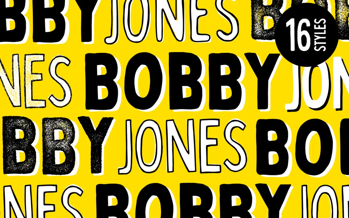
Bobby Jones is a bold, handcrafted display sans built on the idea that imperfection is the point. The strokes wobble, the corners round off unevenly, and straight lines aren’t quite straight. This isn’t sloppy drawing passed off as style — the irregularity is consistent enough across the set that it reads as a deliberate hand rather than a shaky one. The letterforms are thick, chunky, and built for scale: wide counters, heavy stroke weight, and a general refusal to sit quietly on the page.
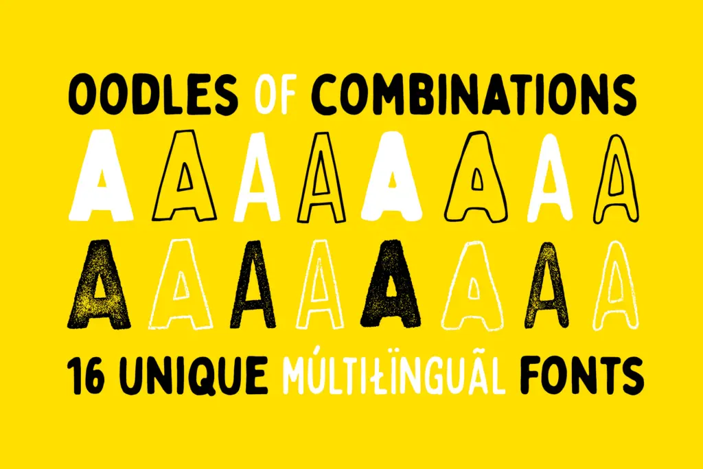
The collection spreads that core idea across eight structural variants, each offered in a soft (rounded) and a rough (textured) finish, for sixteen fonts total. You get the standard width, a condensed version for tighter spaces, and a textured layer that adds visible grain to the outlines, as if the letters were cut or stamped rather than drawn with a clean vector tool. It’s a smart way to extend one idea without diluting it — the family stays recognisable whether it’s wide and smooth or narrow and rough.
Character set and features
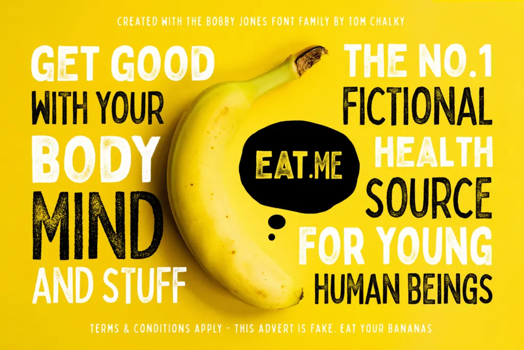
Each of the sixteen fonts carries its own individually handcrafted outline, which means the wobble isn’t copy-pasted from one weight to the next — condensed versions aren’t simply squeezed originals, and the rough textures aren’t just a filter applied uniformly. That’s a meaningful amount of manual work for a display pack, and it shows in how differently each cut behaves at large sizes. The seller notes multilingual glyph coverage across the set, useful if your project needs more than basic Latin support, though as with any hand-drawn display face, don’t expect the diacritics to disappear quietly into the design — they carry the same rough character as everything else.
What you won’t find here is nuance of contrast or refined spacing for small text. This is a family built entirely around personality at scale, not a workhorse for body copy or dense information design. The rough textures in particular only read clearly at larger sizes; shrink them down and the grain turns to noise.
Use cases
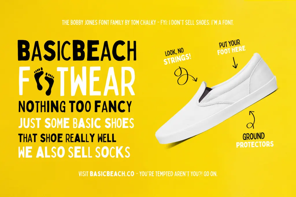
Bobby Jones is built for moments where a design needs to shout rather than inform: logos for brands with a playful or irreverent identity, apparel graphics, gig posters, packaging call-outs, social headlines, anything where a single word or short phrase needs to carry visual weight and mood at once. The condensed cuts help when you need that same voice in a tighter column — a spine, a sidebar, a cramped poster margin — without losing the handcrafted texture that defines the family.
It pairs poorly with anything that needs restraint. Use it for one headline, not a whole page of copy, and resist stacking multiple cuts from the set together unless you want visual noise stacked on visual noise. As a single, confident display voice for a project that wants texture and imperfection baked in, it does its job efficiently, and the sheer number of variants means you’re likely to find one cut that fits the brief without redrawing anything yourself.
What we liked, and what we didn’t
Strengths
- Sixteen individually hand-drawn variants rather than mechanically generated derivatives
- Condensed and rough cuts genuinely extend usability into tighter layouts and grungier contexts
- Strong, consistent point of view across the whole set makes mixing cuts within one project easy
Trade-offs
- Legibility drops fast below display sizes, especially in the rough textured cuts
- The intentional wobble limits it to projects that want an irreverent, informal tone
Bobby Jones is a confidently rough display pack that does one job well: loud, imperfect headline type with sixteen variations on the same idea. It's not built for body text or quiet design work, but as a grab-bag of textured, condensed, and rounded display options, it delivers more range than most single-font display releases.

Tmfonts writes independent reviews of typefaces: what each font does well, where it falls short, what it suits, and where it is sold.