
Elisabeth Darlington with Bows Font Free Download
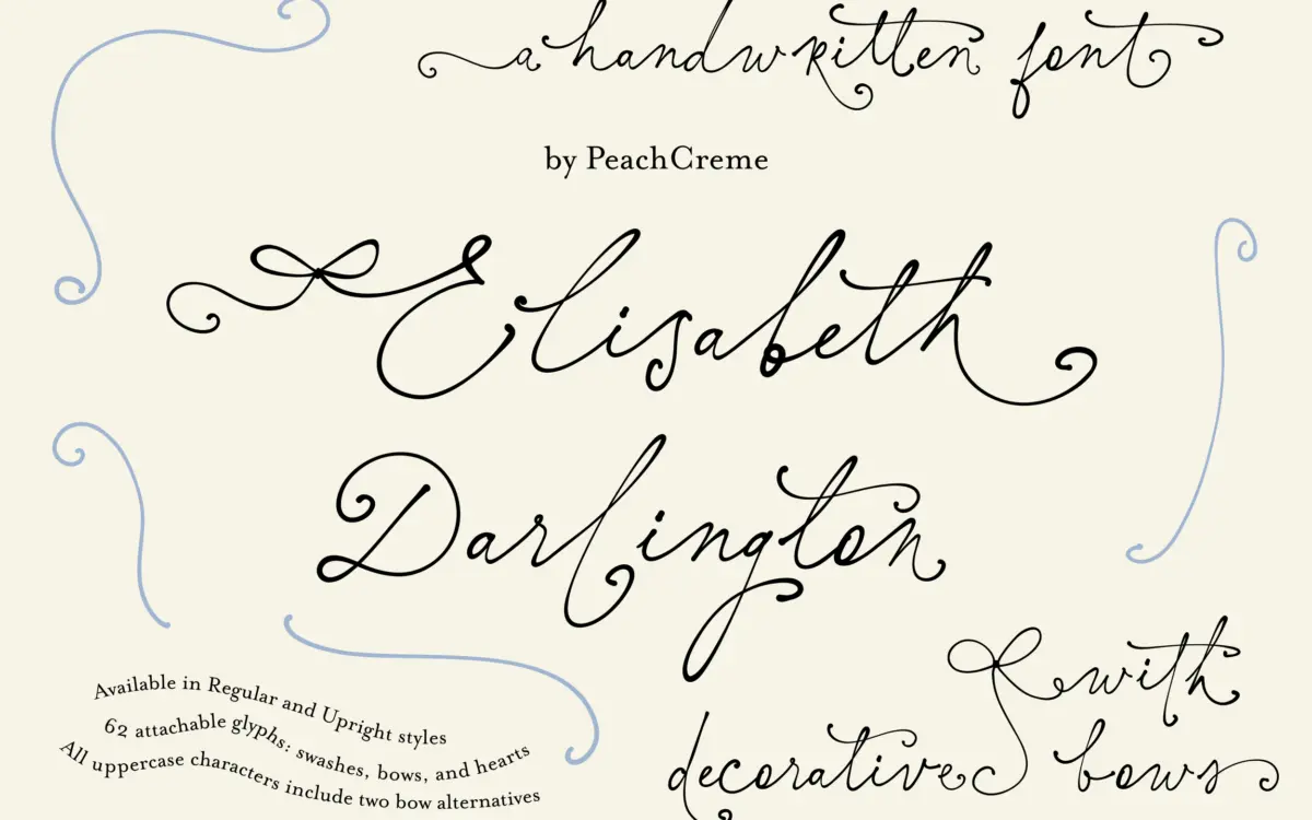
Is Elisabeth Darlington with Bows free to download?
Elisabeth Darlington with Bows is a commercial font sold on Creative Market, so the full version needs a paid license. Get it from the official listing: Elisabeth Darlington with Bows font download.
Need something free? These script fonts from Google Fonts are free for personal and commercial use:
Design style
Elisabeth Darlington sits in the connected-script tradition, drawn to imitate a gel pen rather than a broad-nib calligraphy tool. The joins between letters are the point: strokes carry weight into the next form rather than resting side by side, which gives the baseline a loose, handwritten drift instead of the stiffer rhythm of a lot of marketplace scripts. It comes in two cuts — a Regular with more slant and bounce, and an Upright that straightens the axis while keeping the same connective logic. That’s a genuinely useful pairing, since the Upright reads calmer in a paragraph while the Regular does the flourish work.
The bow theme is where the name comes from, and it’s built into the swash system rather than bolted on as a separate ornament set. Bows and ribbon flicks appear as extensions of the letterforms, so the decoration reads as part of the stroke rather than clip art dropped over type. The overall mood is soft and a little precious — this is not a script that will pass as neutral or restrained.
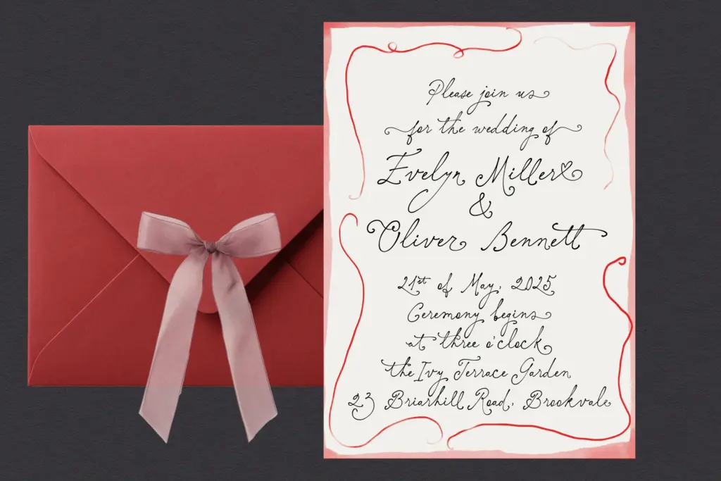
Character set and features
The font ships with 719 glyphs, which is a large working set for a script and reflects a deliberate split between two swash systems. Attachable swashes join onto lowercase letters and can be built out across a word. Non-attachable swashes are baked into certain letters as fixed alternates, following a slightly different visual logic from the attachable set — except for some capitals at the start of a word, where the two styles are designed to match. That’s a fiddly distinction to keep straight, and it means the font rewards someone willing to read the character map rather than just typing and hoping OpenType sorts it out.
There’s a practical wrinkle worth flagging: seven specific letters keep what the designer calls a gel-ink effect and don’t connect automatically with the attachable swashes. You’re expected to swap in alternates by hand for those. This is not a font you set and forget — it’s closer to a lettering kit that happens to be a font file. Language support covers Basic Latin plus Western and Central European sets, so it’ll handle most Latin-alphabet branding jobs without falling over on accented characters.
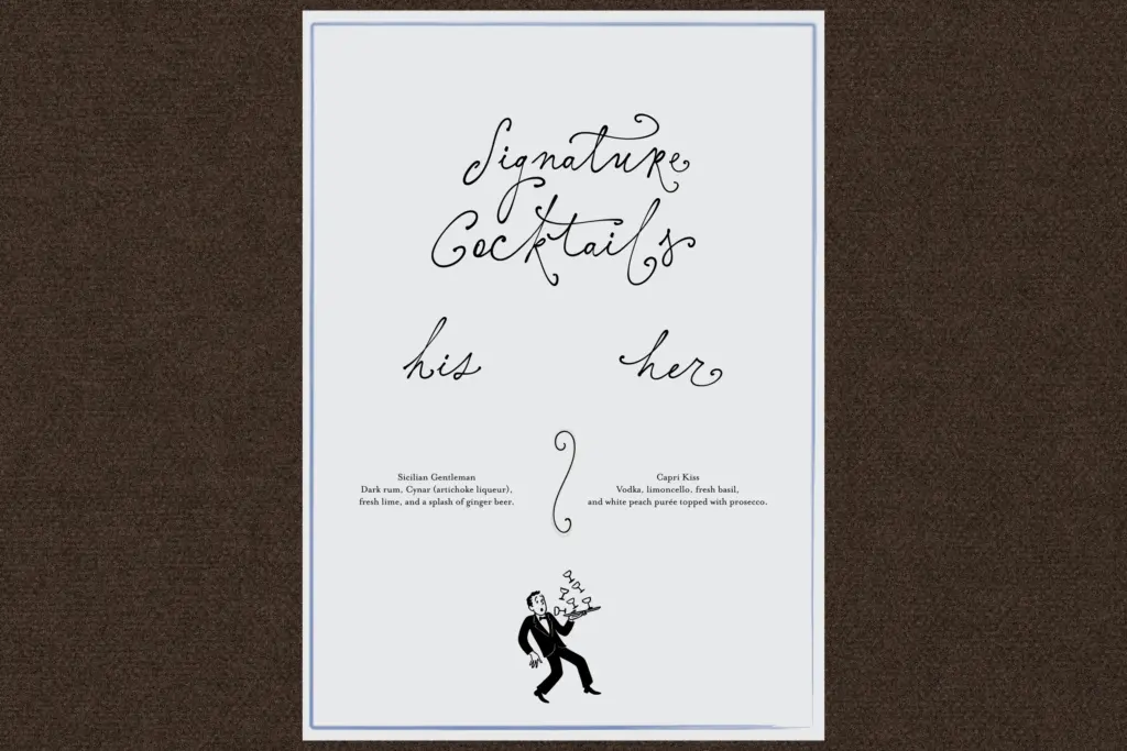
Use cases
This is squarely a short-text, high-decoration face: names on invitations, monograms, boutique logotypes, packaging labels, baby shower and bridal stationery. The bow swashes and the softness of the joins push it toward feminine-coded branding rather than anything neutral. At small sizes in body copy it will struggle — the connections and swash flourishes need room to breathe, so it’s built for headlines, names, and short phrases rather than paragraphs.
Because assembling the best-looking word means picking between attachable and non-attachable swashes, swapping the seven exception letters, and choosing Regular or Upright for the mood you want, it suits someone comfortable poking through a glyph panel — a hand-lettering hobbyist, a stationery designer, or a small studio doing one-off wordmarks. It’s less suited to someone who needs a script that looks finished the moment it’s typed.
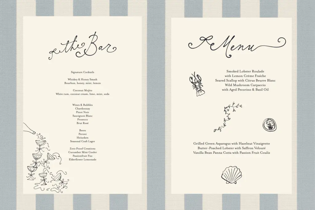
What we liked, and what we didn’t
Strengths
- The gel-ink connection style gives it a spontaneous, handwritten quality rather than mechanical joins
- Two swash systems plus Regular and Upright cuts offer real range for a single script family
- 719 glyphs and Central European support cover most Latin branding jobs
Trade-offs
- Seven exception letters don't connect automatically, requiring manual alternate swaps for clean results
- Dense swashes and connections make it unreliable at small sizes or in running text
Elisabeth Darlington delivers a genuinely handmade-feeling connected script with a distinctive bow motif built into its swash system, but it demands manual glyph swapping to look its best. It's a strong pick for short, decorative wordmarks and stationery, not for anyone wanting a script that just works out of the box.

Tmfonts writes independent reviews of typefaces: what each font does well, where it falls short, what it suits, and where it is sold.