
Chicago Athlete Font Free Download
Is Chicago Athlete free to download?
Chicago Athlete is a commercial font sold on Creative Market, so the full version needs a paid license. Get it from the official listing: Chicago Athlete font download.
Need something free? These slab serif fonts from Google Fonts are free for personal and commercial use:
Design style
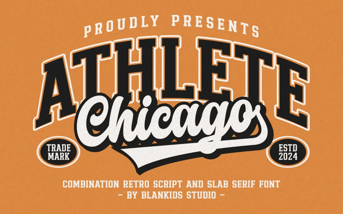
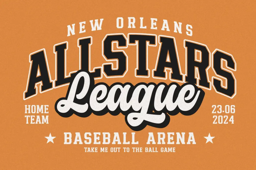
Chicago Athlete pulls from collegiate athletic lettering: the block-letter jerseys, the stitched patches, the varsity jacket chest logo. The pack bundles four faces — two slab serif styles and two connecting scripts — meant to be layered the way old team badges combine a bold main word with a looping secondary line underneath or above it.
The slab serif is the workhorse of the set. Strokes are heavy and even, serifs are short and square, and the letters sit close together, which is exactly what you want for a name that has to read as one solid unit from a distance, like a number on a football jersey. It doesn’t try to be subtle. There’s no contrast modulation to speak of, and the curves are kept simple so the letters hold up when stitched, printed thick, or reduced to a silhouette.
The two script styles are more casual, closer to a marker or brush-pen hand than to formal calligraphy. They’re built to sit alongside the slab, not to carry a design on their own — think of the cursive team nickname under a blocky city name. Given four styles in one file, the pairing is baked in rather than left to the designer to work out from scratch, which is useful if you don’t do a lot of type pairing yourself but limiting if you wanted more control over the combination.
Character set and features
Each style covers uppercase and lowercase letters, numerals, and standard punctuation, so you’re not stuck substituting characters or building words out of caps only. The seller notes OpenType support that opens correctly across Illustrator, Photoshop, InDesign, Canva, and CorelDraw — useful confirmation for anyone worried about compatibility, though there’s no mention of alternates, ligatures, or language-specific characters beyond the basic set, so don’t expect extended diacritic support for anything past everyday English.
The slab styles are legible enough at small sizes for short words — team names, initials, product labels — but they’re not designed for long lines of running text. The scripts are even more size-sensitive; they want to be used at a size where the connecting strokes and loops stay readable, not shrunk into a caption.
Use cases
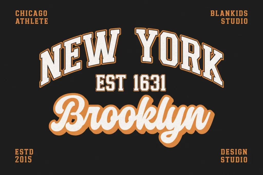
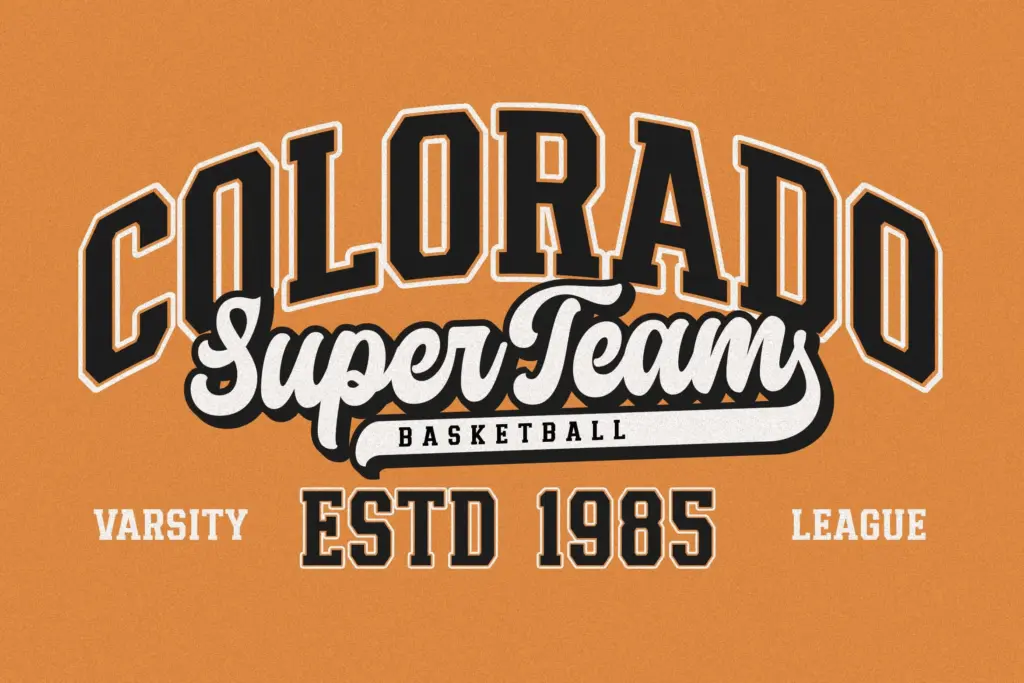
This is a font for identity work with an athletic or collegiate flavour: sports team logos, varsity-style apparel graphics, gym and fitness branding, craft beer labels that want that retro Americana feel, patch and badge designs, product packaging aimed at a nostalgic or streetwear audience. The four-style bundle means a designer can build a jersey-style lockup — bold slab main word, script secondary line — without hunting for a second typeface to pair it with.
It’s less suited to editorial layouts, long-form text, or anything asking for restraint. The style is loud and specific; if a project needs a slab serif that can also do body copy or quiet corporate signage, this isn’t it. Chicago Athlete does one job — retro sporty branding — and does it with conviction, but that’s also its ceiling.
What we liked, and what we didn’t
Strengths
- The slab serif's tight, even strokes hold up well when reduced or stitched into apparel graphics.
- Bundling four coordinated styles removes the guesswork of pairing a script with the main slab.
- Confirmed OpenType compatibility across major design software reduces setup friction.
Trade-offs
- No mention of alternates, ligatures, or extended language support beyond basic punctuation and numerals.
- The style is narrowly aimed at retro sporty branding and strains in editorial or corporate contexts.
Chicago Athlete does one thing convincingly: bold, close-set varsity lettering paired with a casual script for the secondary line. It's well suited to sports and apparel branding but has little use beyond that lane, and the character set won't stretch to long-form or highly multilingual work.

Tmfonts writes independent reviews of typefaces: what each font does well, where it falls short, what it suits, and where it is sold.