
Dear Maison Font Free Download
Is Dear Maison free to download?
Dear Maison is a commercial font sold on Creative Market, so the full version needs a paid license. Get it from the official listing: Dear Maison font download.
Need something free? These script fonts from Google Fonts are free for personal and commercial use:
Design style
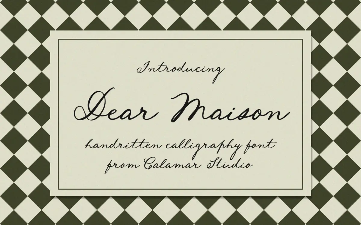
Dear Maison is a monoline-leaning cursive script that leans into a loose, handwritten quality rather than formal calligraphy. The strokes wobble slightly from letter to letter, the baseline dips and rises, and the overall effect reads like a personal note dashed off with a fine brush pen rather than a copperplate exercise. There’s some contrast between thick downstrokes and thinner connectors, but it’s kept modest, so the letters never feel engraved or stiff.
What makes it work is restraint. A lot of scripts in this category overdo the flourish and end up looking busy at anything but headline size. Dear Maison keeps its loops fairly tight and its x-height reasonably generous, so even with the informal wobble, words hold together as words rather than dissolving into decoration. It’s closer to a warm, confident hand than a studied script typeface, and that’s clearly the intent — the letterforms don’t try to hide their handwritten origin.
Character set and features
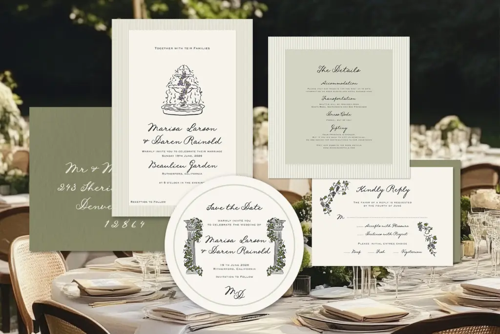
The set covers uppercase and lowercase basics, numerals and standard punctuation, with a handful of ligatures and alternate letters included. That’s enough to get through most short-form setting — names, dates, headlines, short phrases — without hunting for a workaround, but it’s not a font built for long-form alternates or contextual substitution the way some higher-end scripts are. The alternates on offer look like they’re there to break up repeated letters within a single word or line rather than to give you deep customisation.
Because the connecting strokes are doing real work to link letters, tracking needs a light touch. Pull letters too far apart and the joins start looking like accidents rather than intentional flow; keep it snug and the cursive logic holds. Kerning between the more extended capitals and their neighbouring lowercase letters is worth checking case by case — scripts like this tend to need occasional manual nudges, especially around ascenders and descenders that swing wide.
Use cases
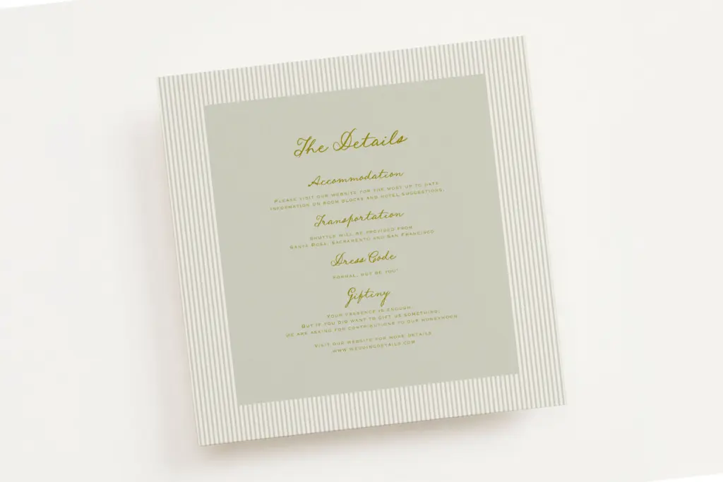
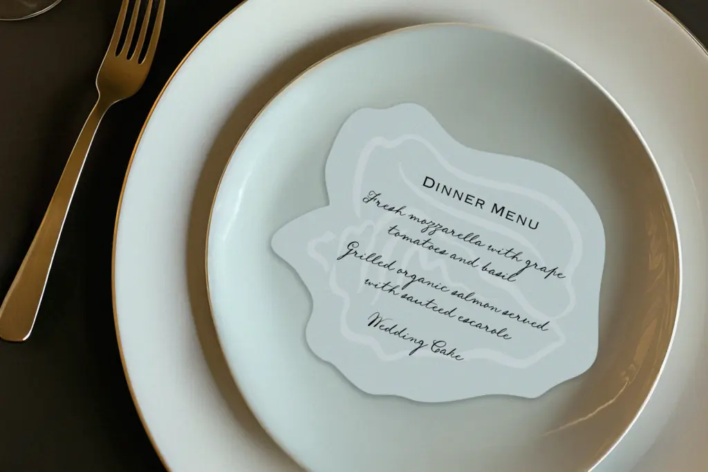
This is a font built for the occasion-stationery world: wedding invitations, save-the-dates, place cards, menu headers, the kind of setting where a handwritten line adds warmth without needing to carry a paragraph of text. It also does reasonable work as an accent script in branding — a logotype flourish, a signature-style wordmark, a header on a boutique product label — anywhere a brand wants to signal
What we liked, and what we didn’t
Strengths
- a
- b
- c
Trade-offs
- a
- b
placeholder

Tmfonts writes independent reviews of typefaces: what each font does well, where it falls short, what it suits, and where it is sold.