
The Rose Atelier Font Free Download
Is The Rose Atelier free to download?
The Rose Atelier is a commercial font sold on Creative Market, so the full version needs a paid license. Get it from the official listing: The Rose Atelier font download.
Need something free? These handwritten fonts from Google Fonts are free for personal and commercial use:
Design style
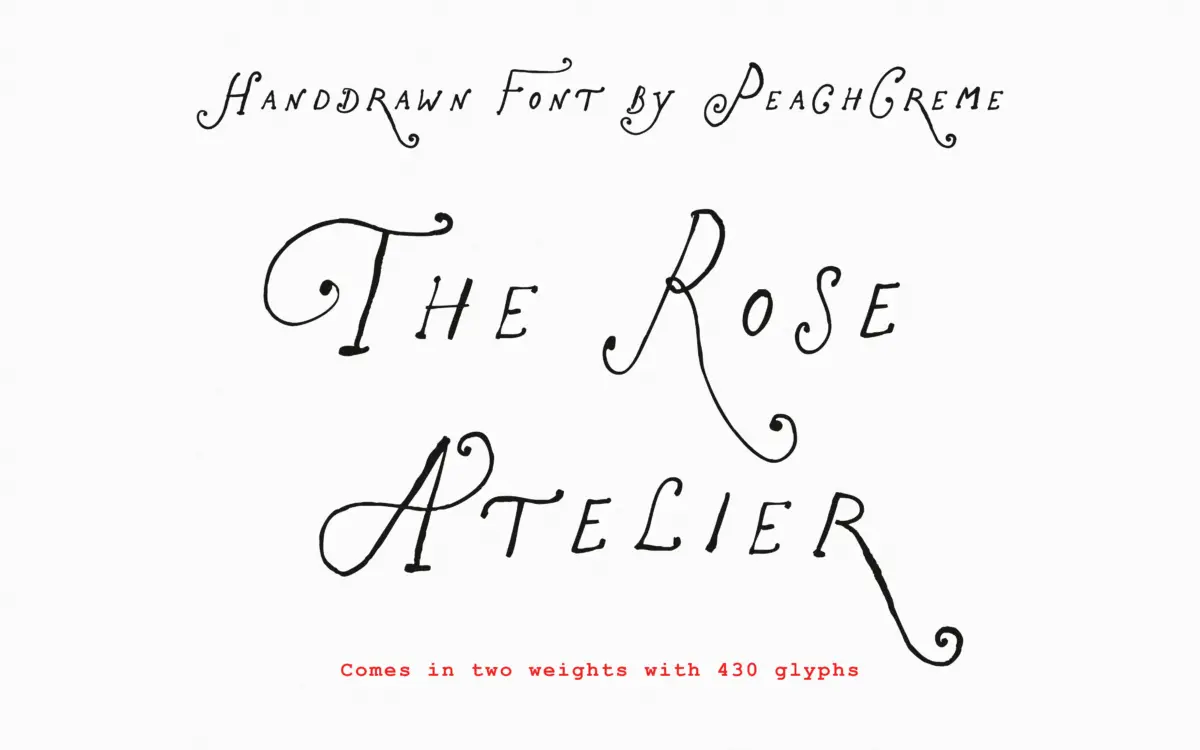
The Rose Atelier sits in the crowded field of hand-drawn display scripts built for feminine branding, but it earns its keep through the flourish work on the capitals. The strokes have a slight tremor to them, the kind that reads as genuinely drawn rather than digitally smoothed, and the curls loop back on themselves without collapsing into illegibility. Lowercase letters are calmer, closer to a casual monoline hand than a formal script, which keeps the overall texture from tipping into wedding-invitation cliché.
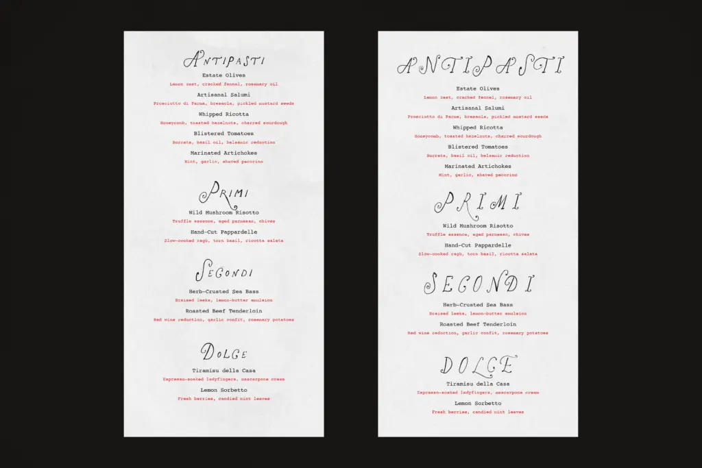
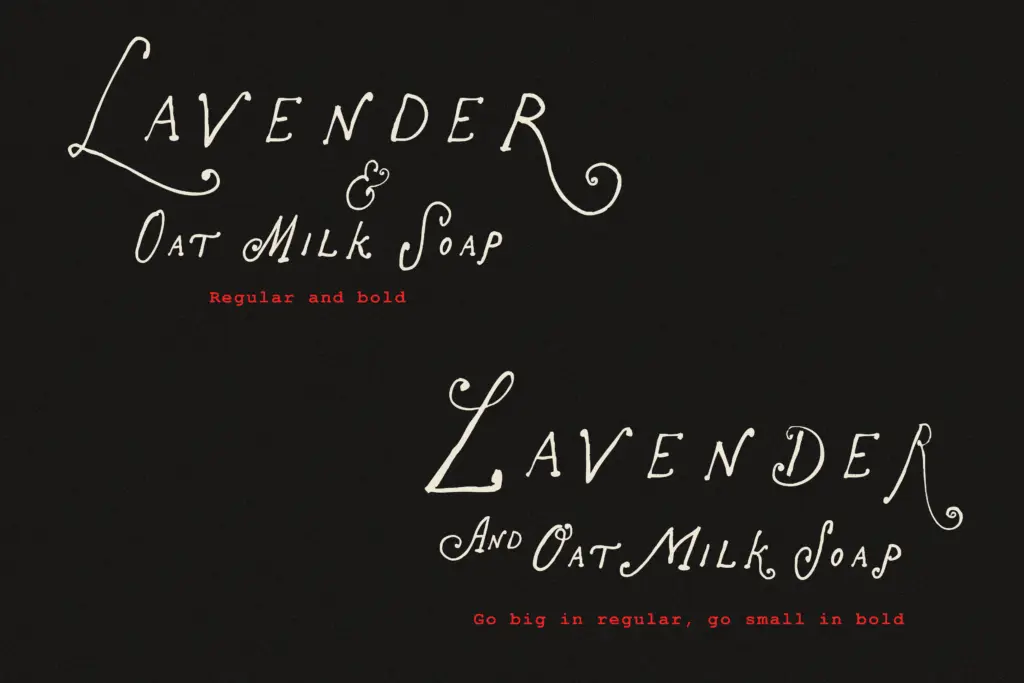
The Regular weight is light and airy, suited to pastel palettes and delicate paper stock. The Bold adds enough weight to hold its own on packaging or a shopfront sign, though it loses some of the fragility that makes the Regular distinctive. Neither weight has much contrast variation within a stroke — this is a font built on line quality and curl, not on calligraphic thick-thins.
Character set and features
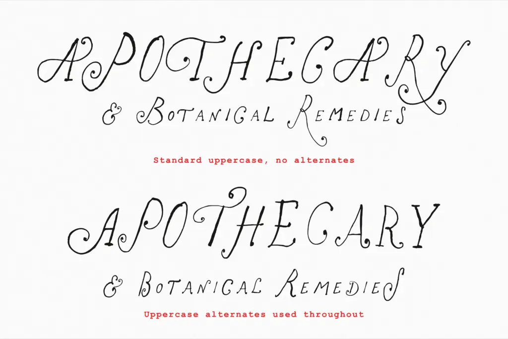
The headline feature is the alternate alphabet in Stylistic Set 1, a complete second version of every uppercase letter, every lowercase letter, and the full numeral set. This is more generous than most hand-drawn fonts, which usually limit alternates to a handful of showy capitals. Switching ss01 on gives you a genuinely different texture for the whole word, not just a swapped cap, and it’s usable as a standalone style rather than a garnish.
Stylistic Sets 2 through 5 are thinner promises — extra decorative variants, but only for selected letters, mostly uppercase with the occasional lowercase r or s thrown in. The seller is upfront that coverage is uneven here, and that’s worth repeating: these sets are for spot decoration on a specific word or initial, not for building out a full alternate system. Anyone planning a layout around ss04 for lowercase letters, for instance, should check letter coverage before committing to a design.
The ligature and alternate-swapping approach works best in software that supports OpenType features properly. Without that support, you’re stuck with the default set only, so it’s worth confirming your design tool before building a project around the mixed-style effect the font is sold on.
Use cases
This is a font for short, decorative bursts of text rather than paragraphs — logotypes, product labels, invitation headers, packaging flashes, the kind of boutique branding where a single word or short phrase needs charm rather than information density. The flourishes on the capitals make it a strong candidate for monogram-style branding, a shop name or a first initial given room to breathe.
It’s less suited to anything requiring sustained reading. The tremor in the strokes and the tightness of some flourishes mean it tires the eye in body copy, and it should be reserved for headline-length use paired with a plainer typeface for supporting text. For social graphics, stationery suites, and small-batch packaging where a handmade feel matters more than neutrality, it does the job well.
What we liked, and what we didn’t
Strengths
- A full second alphabet in ss01 covering uppercase, lowercase and numerals, not just a few showy caps
- Flourishes on capitals feel genuinely hand-drawn rather than templated
- Bold weight extends the font to packaging and signage without redrawing the character
Trade-offs
- Stylistic sets 2–5 cover only selected letters, so extra decoration can't be relied on consistently
- Not built for body text — the tremor in strokes and tight curls tire the eye beyond a few words
The Rose Atelier delivers real charm through its flourished capitals and a genuinely complete alternate alphabet, not just a token swap set. It's best kept to short decorative bursts — headlines, logos, labels — where its uneven extra stylistic sets and tired-eye tremor in longer text won't work against it.

Tmfonts writes independent reviews of typefaces: what each font does well, where it falls short, what it suits, and where it is sold.