
Portofino Gelateria Font Free Download
Is Portofino Gelateria free to download?
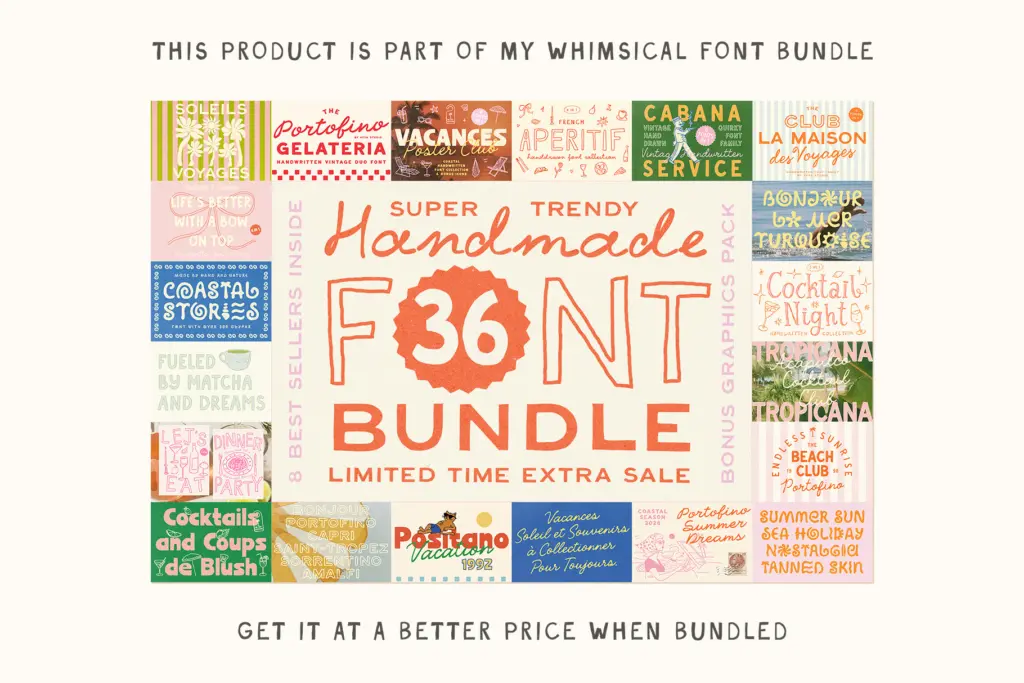
Portofino Gelateria is a commercial font sold on Creative Market, so the full version needs a paid license. Get it from the official listing: Portofino Gelateria font download.
Need something free? These script fonts from Google Fonts are free for personal and commercial use:
Design style
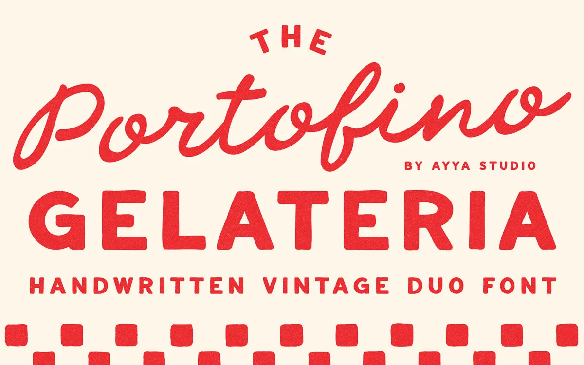
Portofino Gelateria is built around a familiar but well-executed idea: a loose, handwritten script paired with a plainer companion face, both drawn to look like they came off a chalkboard menu outside a seaside gelateria. The script carries the personality — letters lean and wobble slightly, joins are uneven, and stroke weight shifts as if the pen pressure changed mid-word. It reads as genuinely hand-drawn rather than digitally roughened, which is the harder trick to pull off and the one that matters most for this kind of face.
The companion sans (labelled Caps here) is quieter — a soft, slightly naive capitals set that avoids competing with the script for attention. It has the same unfussy, imperfect quality but with enough restraint to sit underneath a script headline without fighting it. Together they read as a set built for one job: evoking a specific decade and a specific coastline, rather than trying to be a general-purpose branding system.
Character set and features
Both fonts lean into irregularity as a design principle, so don’t expect the crisp repetition of a grid-based script — that inconsistency is the point, but it also means kerning pairs and letter spacing need checking on a case-by-case basis, especially in the script where ascenders and descenders can crowd tight-set headlines. The caps face is more forgiving and holds its rhythm better across longer words, which is exactly why pairing the two makes sense: use the script sparingly, let the caps do the reading work.
As a duo, the set is intentionally narrow in scope. There’s no indication here of extended language support or a large family of weights — this is two complementary styles, not a full system. Treat it as a focused pair rather than a flexible toolkit, and it performs better for it.
Use cases
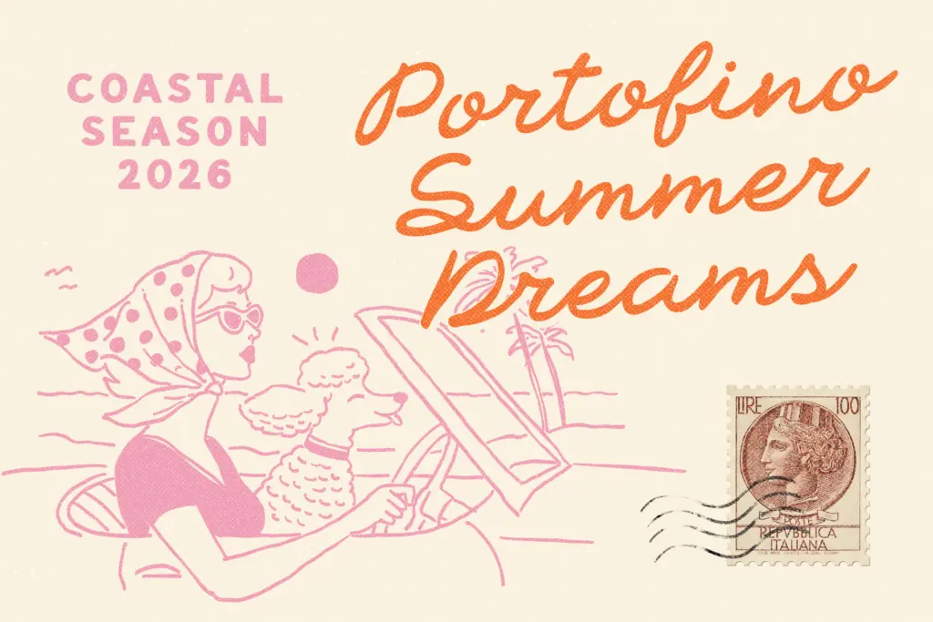
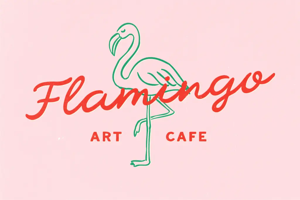
This is a logo and packaging font first. Gelaterias, cafés, wine labels, small Italian-inspired food brands — anywhere a single word or short phrase needs to look hand-lettered and slightly worn. It also suits wedding stationery that’s aiming for a relaxed, vintage-postcard mood rather than a formal engraved one, and works well on retro travel posters, postcard reproductions, and social content built around an Italian-summer aesthetic.
It’s less suited to anything requiring long-form setting: body copy, dense editorial text, or multi-paragraph layouts will expose the irregularity that works so well in a headline. Keep the script to short phrases — a name, a tagline, a single word on a cup sleeve — and let the caps carry supporting text. Used that way, the duo does exactly what it promises: it looks handmade, warm, and specific to a place, without trying to be more than that.
What we liked, and what we didn’t
Strengths
- The script reads as authentically hand-drawn rather than digitally distressed
- The companion caps face is restrained enough to support the script without competing
- Strong, specific mood that suits food and hospitality branding out of the box
Trade-offs
- Irregular spacing in the script means kerning needs manual attention at small sizes
- Narrow scope as a two-style duo rather than a flexible family for varied projects
Portofino Gelateria does one thing well: it looks genuinely hand-lettered, with a specific Italian-seaside mood baked into every wobble. It's a strong pick for short branding moments but not built for longer text or broad general use.

Tmfonts writes independent reviews of typefaces: what each font does well, where it falls short, what it suits, and where it is sold.