
Inktoner Font Free Download
Is Inktoner free to download?
Inktoner is a commercial font sold on Creative Market, so the full version needs a paid license. Get it from the official listing: Inktoner font download.
Need something free? These sans serif fonts from Google Fonts are free for personal and commercial use:
Design style
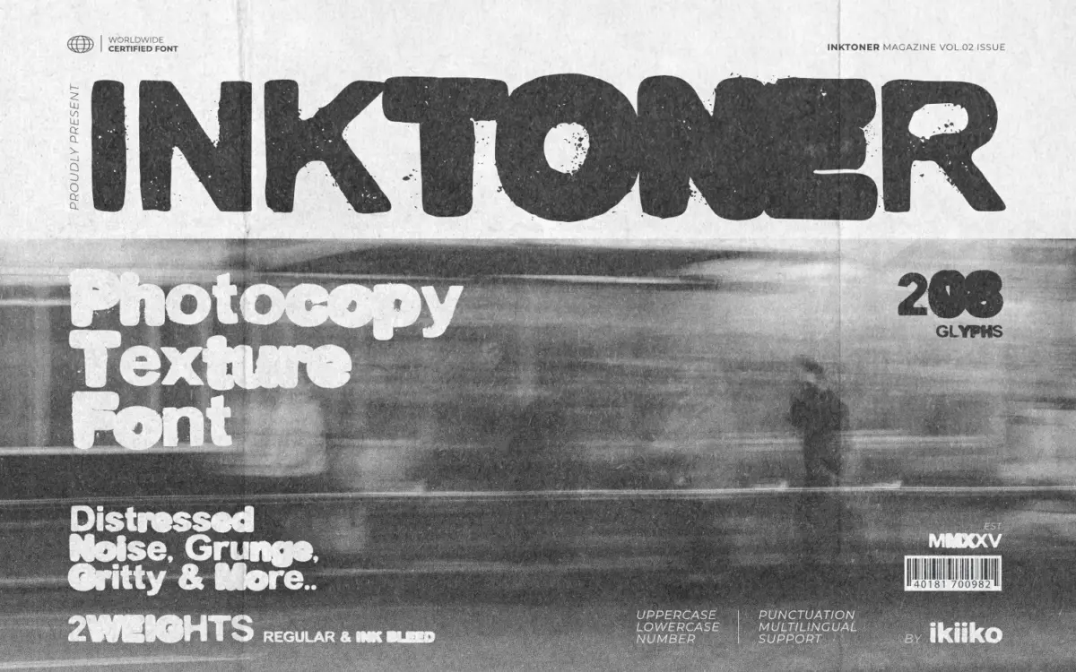
Inktoner is a bold sans built around a single idea: what happens to type after it has been through a bad photocopier a few too many times. The letterforms sit on a heavy, blocky sans skeleton, but the edges are broken up with ink bleed, speckling and the kind of noise you get from a worn toner drum. It reads less like a clean typeface with a texture layer bolted on and more like the distress is baked into the outlines themselves, which gives it more conviction than most “grunge” fonts that just add a filter over a normal face.
The two weights, Regular and Ink Bleed, are really two intensities of the same damage. Regular keeps most of the letter intact with light speckling at the edges; Ink Bleed pushes the ink spread further, so strokes fatten and edges blur until some counters nearly clog. Used together on the same word, one on top of the other with slight offset, you get the layered double-exposure look associated with cheap photocopiers and DIY zine printing. That combination is really the point of the font, more than either style used alone.
Character set and features
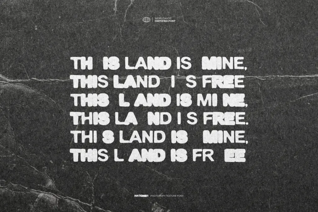
The set covers uppercase and lowercase, numerals, and punctuation, along with multilingual support for extended character needs. There’s nothing here in the way of ligatures or alternates mentioned in the brief, so what you’re working with is a straightforward two-weight family rather than a system with swash variants or contextual substitution. That’s fine for what it’s built to do, but it means the texture itself is the main source of variation — you won’t get different noise patterns letter to letter beyond what’s already drawn in.
Because the distress is fixed into the outlines rather than randomized, repeated letters in a word will show identical damage patterns. At display sizes this isn’t a problem — nobody’s going to notice a repeated ‘e’ has the same ink bleed twice — but it’s worth knowing that the grit is consistent rather than procedurally varied, so heavy repetition across a large block of text could start to look patterned rather than accidental.
Use cases
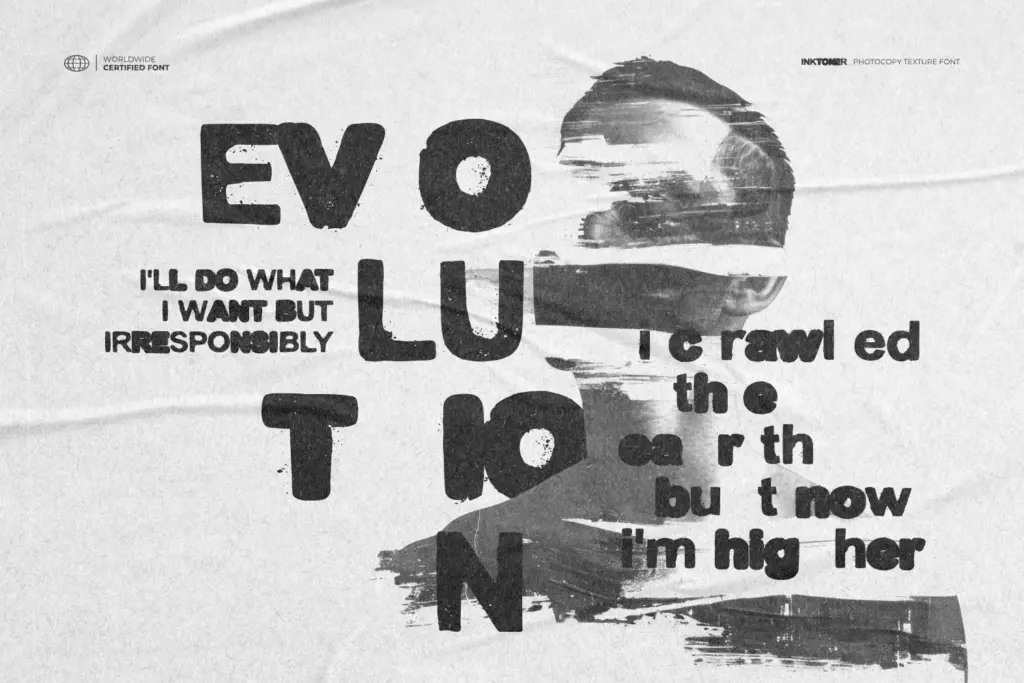
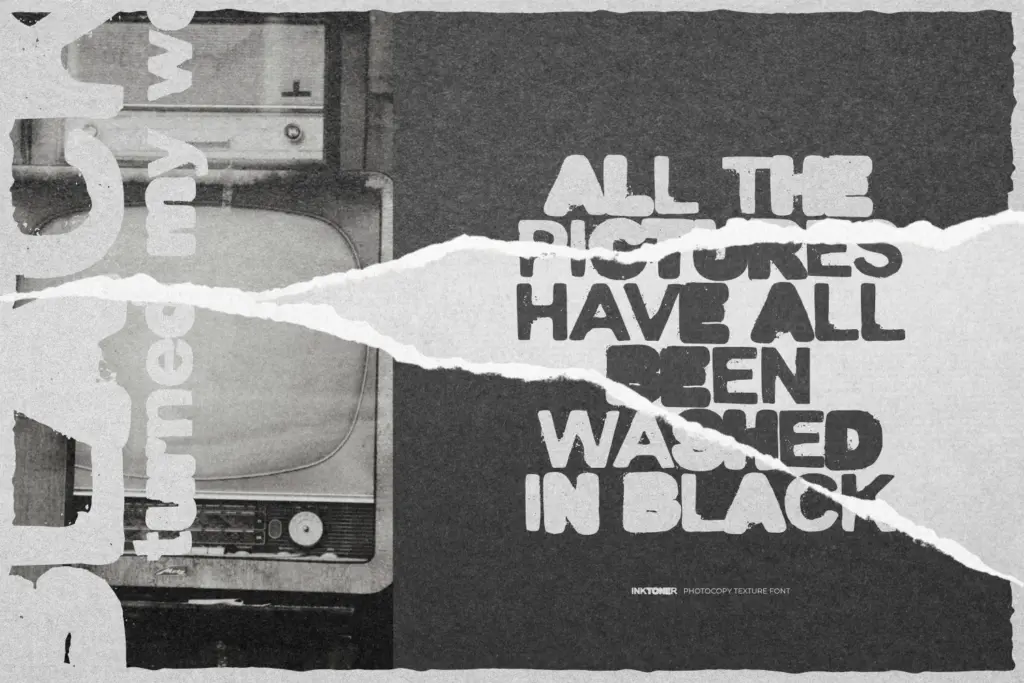
This is a headline font, not a text font, and it knows it. The distress and bold weight make it illegible at small sizes — the whole appeal depends on the letters being large enough that the ink bleed reads as texture rather than as damage to legibility. That makes it a good fit for poster type, movie title cards, book cover lettering, and single-word or short-phrase treatments where the grime is doing expressive work rather than communicating dense information.
It suits projects chasing a specific mood: 90s underground print culture, cheap zine aesthetics, DIY punk flyers, anything wanting to look photocopied rather than digitally clean. It’s less useful outside that lane — a corporate deck or a wedding invitation has no use for it, and pairing it with delicate serif body text would fight the whole premise. Best deployed as the loud, dirty headline against a much quieter, cleaner supporting typeface, and used sparingly rather than across a whole layout.
What we liked, and what we didn’t
Strengths
- The ink bleed and speckling are drawn into the outlines rather than applied as a generic overlay effect.
- Layering the Regular and Ink Bleed weights produces a convincing double-exposure photocopy look.
- Strong, specific mood that suits poster and movie-title work without needing extra treatment.
Trade-offs
- Illegible at small sizes, so it's restricted to short headline-scale use.
- Fixed distress patterns mean repeated letters show identical damage rather than organic variation.
Inktoner does one specific job well: convincing, baked-in photocopier grime on a bold sans skeleton, not a texture filter pretending to be distress. It's a headline tool for a narrow mood — zine, punk, 90s underground — and it should stay narrow rather than get asked to do body text or polite branding.

Tmfonts writes independent reviews of typefaces: what each font does well, where it falls short, what it suits, and where it is sold.