
Infamous Messy Handwriting Font Free Download
Is Infamous Messy Handwriting Font free to download?
Infamous Messy Handwriting Font is a commercial font sold on Creative Market, so the full version needs a paid license. Get it from the official listing: Infamous Messy Handwriting font download.
Need something free? These handwritten fonts from Google Fonts are free for personal and commercial use:
Design style
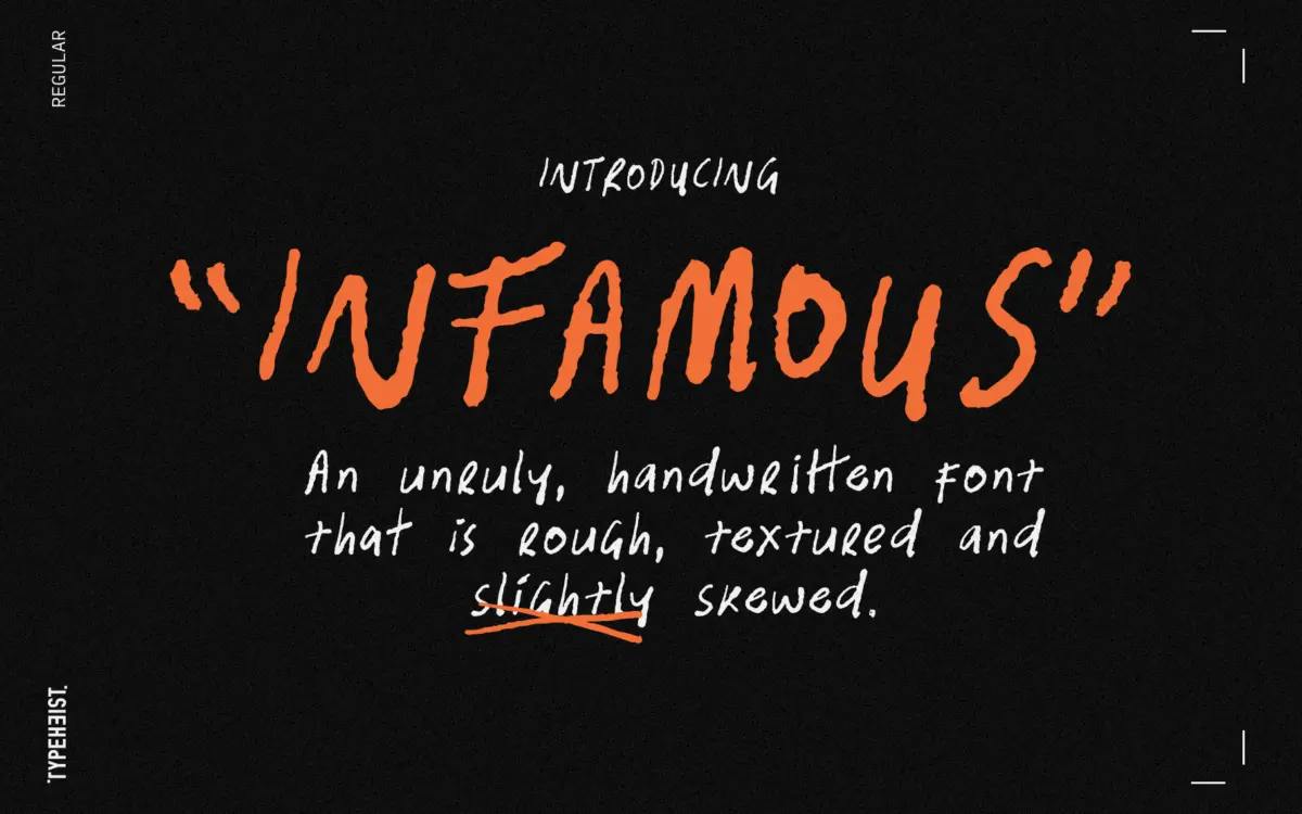
Infamous is handwriting that hasn’t been tidied up for public consumption. The baseline wanders, strokes vary in weight as if the pen pressure changed mid-word, and letters tilt at slightly different angles depending on their neighbours. It reads as deliberately rough rather than accidentally sloppy — there’s a consistent hand behind the texture, which keeps it from feeling like a random jitter effect applied to a script.
The skew is the defining trait. Verticals lean, but not uniformly, so words don’t sit in a neat parallelogram the way some slanted scripts do. That irregularity is the point: this isn’t a font trying to fake a marker or a ballpoint pen with polish, it’s trying to look like someone’s actual scrawl, warts and all. Ascenders and descenders sometimes overshoot, crossbars sit unevenly, and terminals fray rather than close cleanly. If you’ve used cleaner handwriting fonts before, the first thing you’ll notice is how much more this one commits to imperfection.
Character set and features
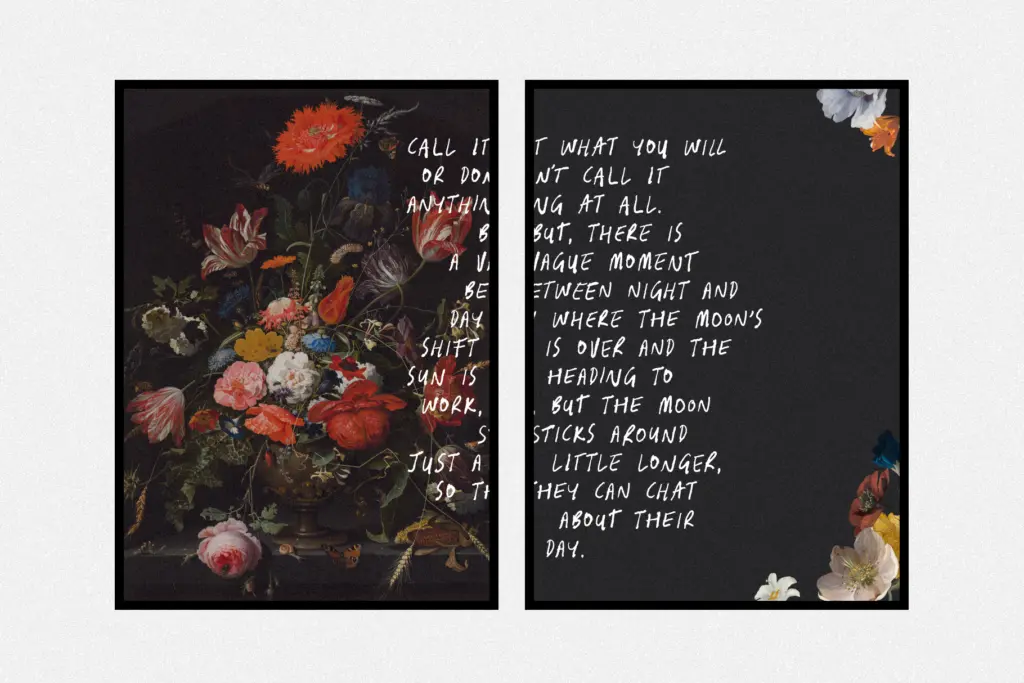
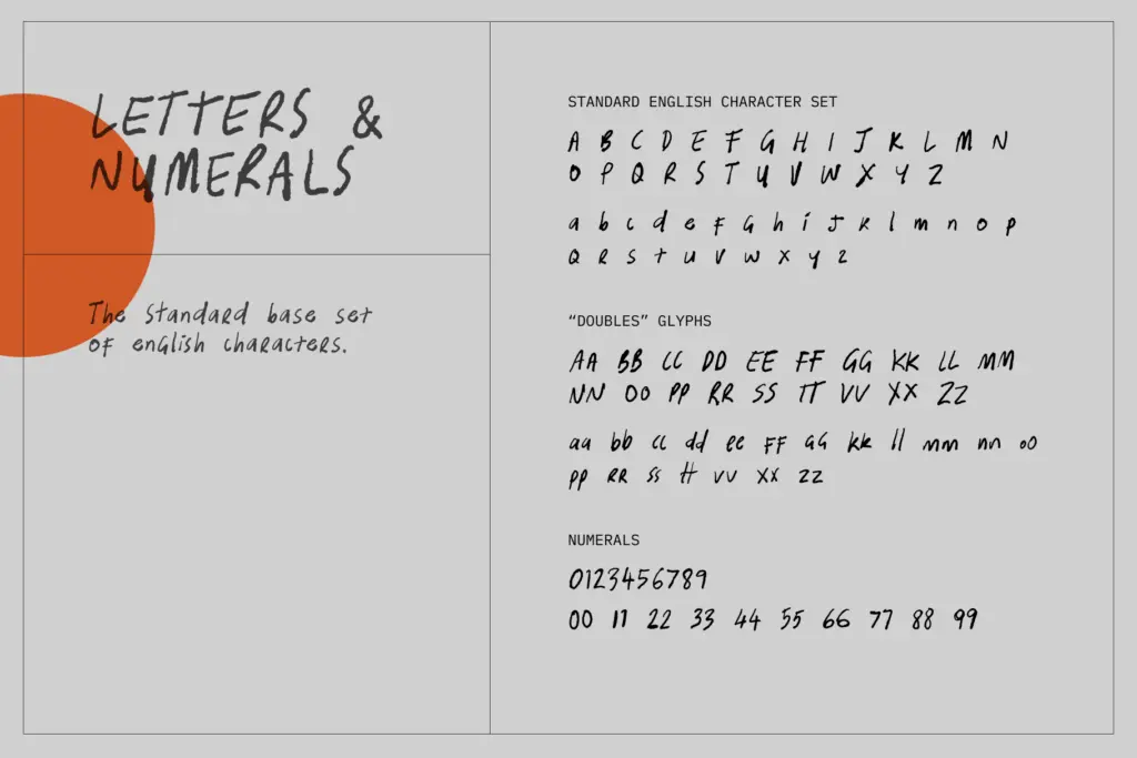
The set runs past 360 glyphs, which is generous for a font in this style and gives it more range than a typical single-weight handwriting face. Beyond standard English characters there’s support for Latin-1 and Extended accented characters, so it can handle several Western European languages without falling back to a default glyph. Custom ligatures are included too, which matters here — messy scripts live or die on how letter pairs connect, and ligatures let common combinations join in a way that looks handwritten rather than mechanically kerned.
The scribble characters, triggered through text shortcuts, are the more novelty-driven part of the set. They’re not typographic in the conventional sense — more decorative marks or gestural flourishes you can drop in for texture — and they’ll be useful to some buyers and irrelevant to others. Worth knowing they’re there before you commit a layout that depends on them, since they behave differently from standard glyph access and need a bit of testing to place well.
Use cases
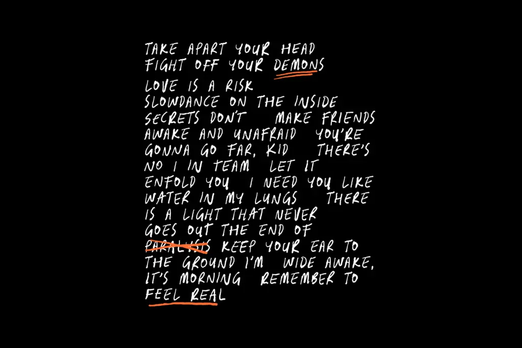
Infamous is a display font first. At small sizes the baseline drift and stroke variation work against legibility — body copy set in this face will fight the reader rather than inform them, so keep it to headlines, standalone words, or short lines. It suits band merchandise, streetwear graphics, gig posters, packaging that wants a DIY or punk edge, and social graphics where the point is attitude rather than information density.
It’s less suited to anything that needs to feel calm, formal or trustworthy — this is not a font for a law firm’s letterhead or a wedding invitation aiming for elegance. It’s also a font that can overwhelm a layout if used at length; a single word or short phrase set large tends to work better than a paragraph. Pair it with a plain, quiet sans or serif for supporting text, and let Infamous carry the one moment in the design that’s meant to feel unruly.
What we liked, and what we didn’t
Strengths
- Consistent hand behind the mess, so the irregularity reads as deliberate rather than random
- Generous glyph count with custom ligatures that keep letter pairs looking handwritten
- Latin-1 and Extended accented character support broadens its reach beyond English
Trade-offs
- Baseline drift and stroke variation make it unreadable at small sizes or in long text
- Scribble characters via text shortcuts need testing before they earn a place in a layout
Infamous does one thing — loud, unruly handwriting — and does it with more character than most novelty scripts. It's a display font through and through, so don't ask it to carry body copy or anything that needs a calm tone. For band graphics, streetwear and gig posters, it earns its keep.

Tmfonts writes independent reviews of typefaces: what each font does well, where it falls short, what it suits, and where it is sold.