
Gameday Font Free Download
Is Gameday free to download?
Gameday is a commercial font sold on Creative Market, so the full version needs a paid license. Get it from the official listing: Gameday font download.
Need something free? These sans serif fonts from Google Fonts are free for personal and commercial use:
Design style
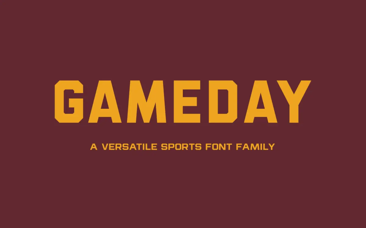
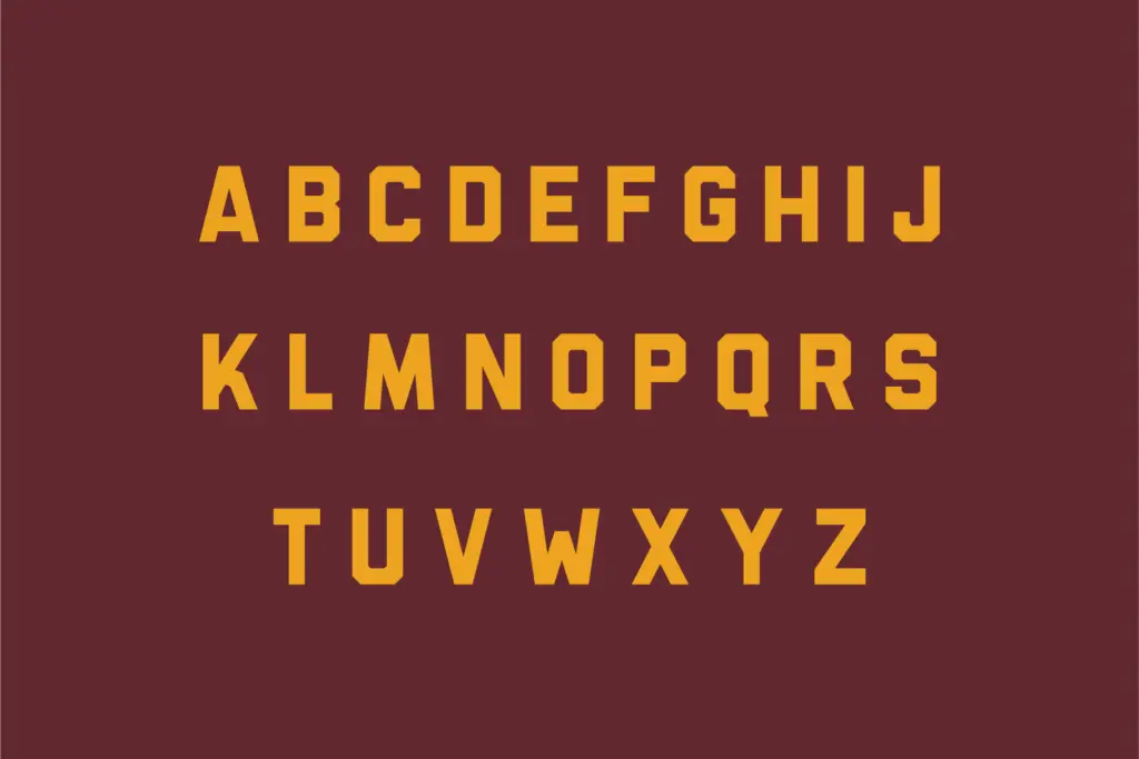
Gameday sits squarely in the athletic-lettering tradition — the kind of sans you see stitched onto jerseys, stencilled on stadium signage, or printed across a roster page. The letterforms are blocky and upright, with squared-off terminals and a heavy, confident stroke in its bolder cuts. There’s no attempt at warmth here; the whole design reads as functional and a little brash, which is exactly the register collegiate branding calls for. It doesn’t try to be clever with ligatures or swashes. It just commits to a stance and holds it across all five weights.
What keeps it from feeling generic is the consistency of the skeleton. Verticals are true verticals, curves are kept tight and mechanical rather than organic, and the counters stay open even in the Bold cut, so the letters don’t clog up when set at large sizes on textured backgrounds like mesh jerseys or embroidered patches. It’s a design built around one idea — team lettering — rather than a general-purpose grotesque wearing a sporty costume.
Character set and features
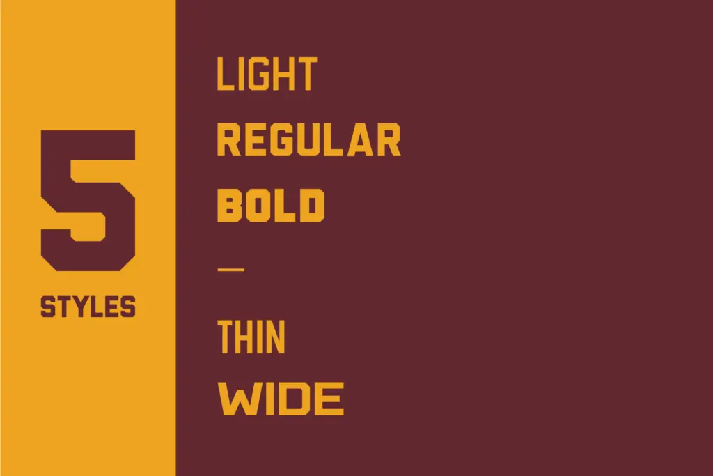
The family comes in five styles: Thin, Light, Regular, Bold and Wide. That’s a reasonably practical spread for a display sans. Thin and Light give you something usable for secondary text or subheads where the Bold or Wide would overpower the page, while Wide is clearly the workhorse for anything meant to read at a distance — banners, scoreboards, jersey numbers.
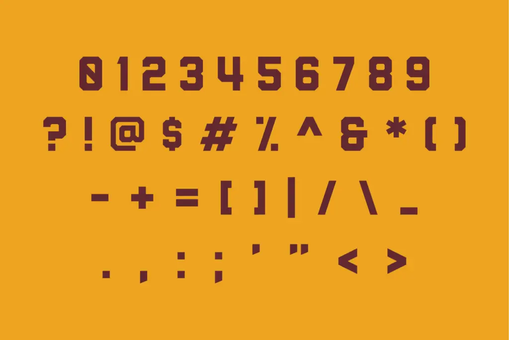
There’s nothing here in the way of alternate characters, ligatures or stylistic sets — this is a straightforward, no-frills sans, and it doesn’t pretend otherwise. That’s a fair trade for a face built to do one job cleanly, but designers expecting the kind of extras common in script or display families elsewhere will need to look past Gameday for that.
Use cases
The obvious home for Gameday is exactly what the name suggests: team names, jersey numbering, schedule graphics, tournament brackets, sports-adjacent social posts. The Wide and Bold styles have enough presence to anchor a logotype or a scoreboard headline, and the lighter weights are serviceable for supporting copy on the same piece — a roster list under a big Wide headline, for instance.
It’s less suited to long-form reading. The letterforms are drawn for short bursts of impact — team names, numbers, single words — not paragraphs, and at small sizes the squared, mechanical curves start to feel stiff rather than sturdy. It also doesn’t have much range outside its lane; this isn’t a font you’d reach for on a restaurant menu or a wedding invite, and it shouldn’t be asked to. Within sports and athletic branding, though, it does the job without fuss, and the five-weight spread means you’re not stuck improvising a hierarchy with a single style stretched too thin.
What we liked, and what we didn’t
Strengths
- Five weights (Thin, Light, Regular, Bold, Wide) give real range for headline-to-subhead hierarchy
- Open counters keep letterforms legible even on textured or embroidered surfaces
- Consistent, mechanical skeleton that reads as authentic to team-lettering conventions
Trade-offs
- No alternate characters or ligatures, so there's little room for customization within the family
- Not built for long-form or small-size text — it strains outside display and short-copy use
Gameday is a competent, purpose-built athletic sans that does exactly what collegiate and sports branding needs and nothing more. It's not a font for body text or general design work, but within its lane — jerseys, scoreboards, team logos — the five weights give you enough range to build a clean hierarchy.

Tmfonts writes independent reviews of typefaces: what each font does well, where it falls short, what it suits, and where it is sold.