
TAN Dialogue Font Free Download
Is TAN Dialogue free to download?
TAN Dialogue is a commercial font by TanType Co., sold on Creative Market, so the full version needs a paid license. Get it from the official listing: TAN Dialogue font download.
Need something free? These sans serif fonts from Google Fonts are free for personal and commercial use:
Design style
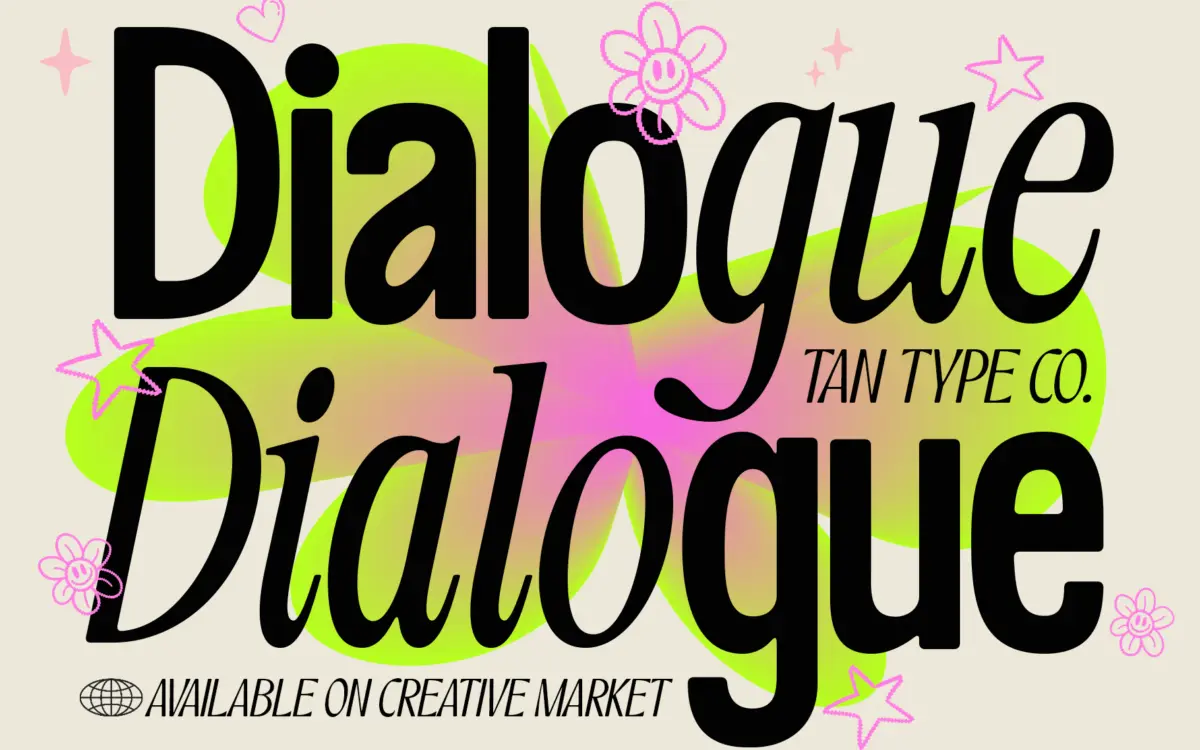
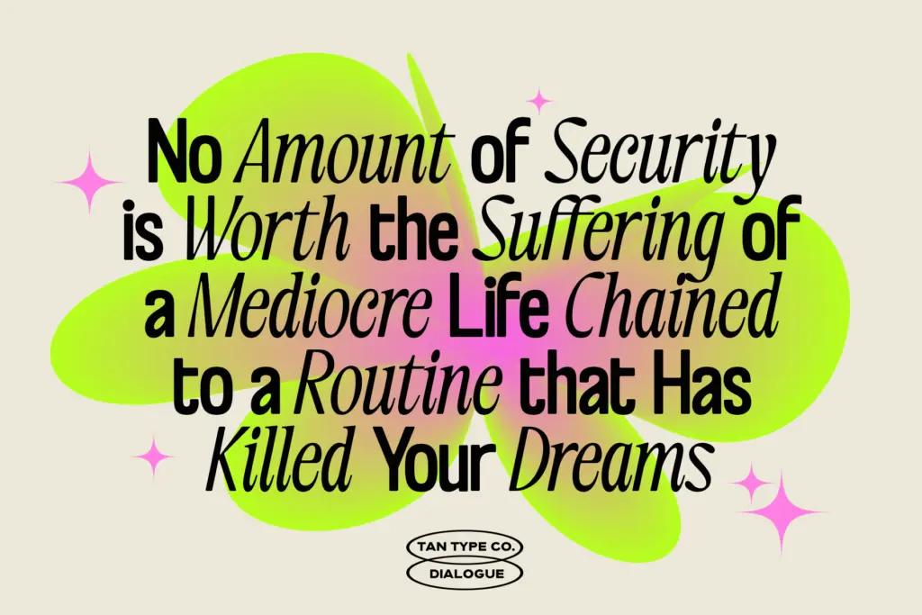
TAN – Dialogue is built as a two-voice system rather than a single typeface. One half is a bold, rounded sans with soft edges on its terminals — sturdy enough to anchor a wordmark but with none of the mechanical rigidity that comes with grotesque-style bold weights. The other half is a slim, classic italic with restrained flourishes and narrow proportions, closer in spirit to a transitional serif italic than to a script. The pairing is the whole idea here: the contrast in weight and structure is deliberate, and the two styles are drawn to share proportions even though their personalities pull in opposite directions. Set side by side, the bold sans reads as a headline voice and the italic as a caption or accent, which is exactly how the duo is meant to be used.
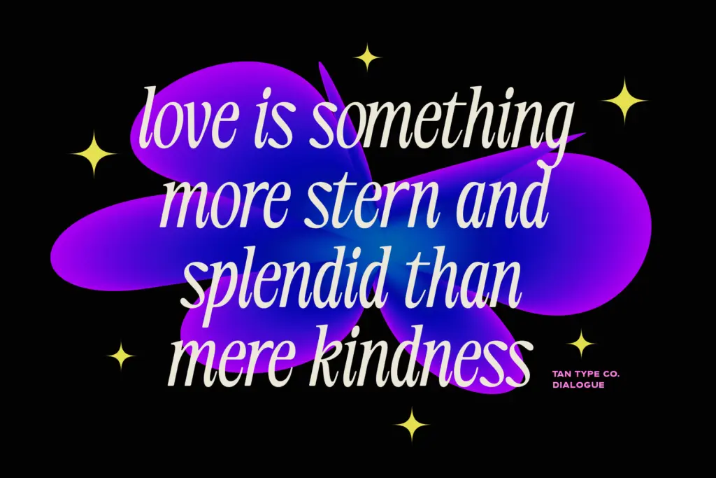
The drawing itself is competent rather than adventurous. The bold sans doesn’t try anything unusual with its letter skeletons — it’s a clean, warm grotesque with slightly softened corners, comfortable rather than distinctive. The italic is where the character lives, with its tighter aperture and calligraphic slant giving it a more refined, slightly formal air. Neither style is loud on its own; the tension between them is what does the work.
Character set and features
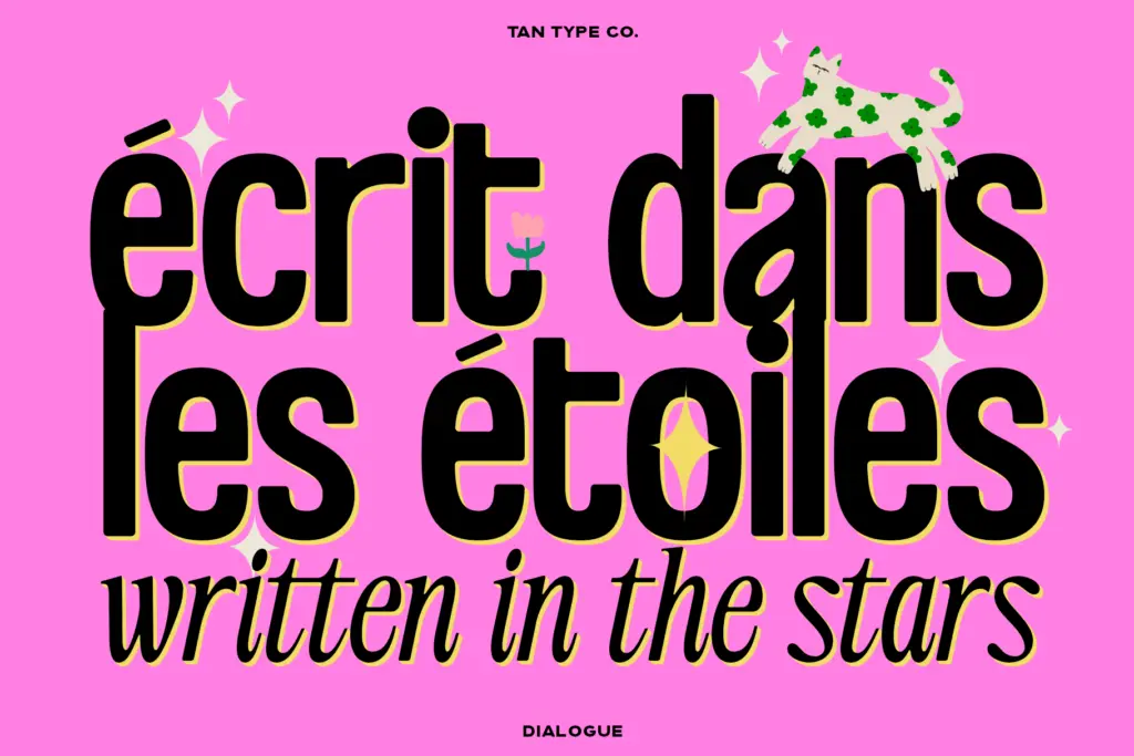
Both styles cover a standard Latin character set with multilingual support, so the font family should handle accented languages beyond basic English without falling apart. OpenType features are present, including ligatures, though the seller is upfront that not every design tool reads them — Canva in particular won’t expose the advanced features, so anyone planning to work primarily in Canva should expect a plainer version of the font than what a full OpenType-aware app like Illustrator or InDesign would render. That’s a real limitation worth knowing before you commit a layout to it.
There isn’t a documented range of weights beyond the two core styles, so this isn’t a family you lean on for a six-step editorial hierarchy. It’s a duo, and it behaves like one: two fixed voices, not a modular system.
Use cases
The bold sans works well as a logotype or short headline face — it has enough presence to hold up at large sizes and enough warmth to avoid feeling corporate. The italic is best kept to secondary roles: subheads, pull quotes, packaging taglines, the kind of text that needs a lighter touch next to a bolder anchor. Together they suit branding projects that want a
What we liked, and what we didn’t
Strengths
- The bold sans and italic are drawn to genuinely complement each other in weight and rhythm
- The italic brings a refined, classic character that lifts otherwise plain layouts
- Multilingual support extends its use beyond basic English-language projects
Trade-offs
- Advanced OpenType features, including ligatures, don't render in Canva, limiting some workflows
- The family offers only two core styles, so it can't carry a full multi-level hierarchy on its own
TAN – Dialogue is a solid, well-matched duo rather than a groundbreaking design — the bold sans is dependable and the italic adds a touch of refinement, but neither style pushes far on its own. It's a sensible pick for branding and editorial jobs that want a built-in contrast pairing without much fuss, provided you're not relying on Canva for the full feature set.

Tmfonts writes independent reviews of typefaces: what each font does well, where it falls short, what it suits, and where it is sold.