
Mint + Magnolia Font Free Download
Is Mint + Magnolia free to download?
Mint + Magnolia is a commercial font sold on Creative Market, so the full version needs a paid license. Get it from the official listing: Mint + Magnolia font download.
Need something free? These handwritten fonts from Google Fonts are free for personal and commercial use:
Design style
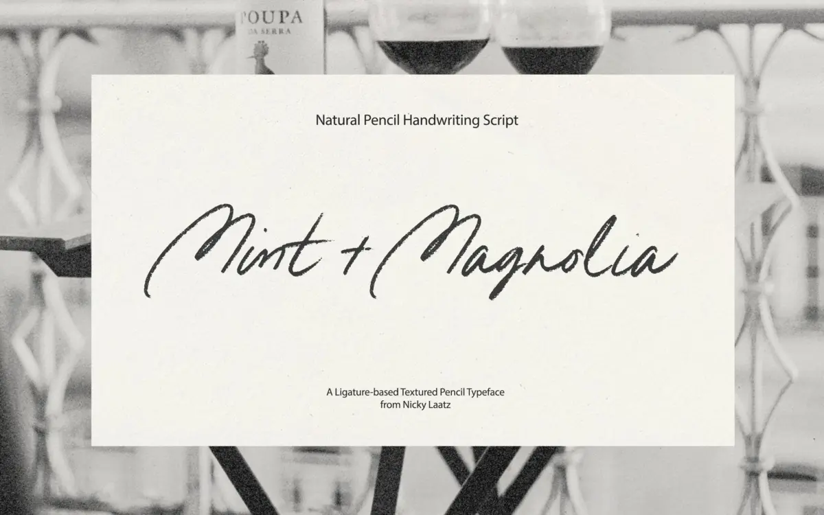
Mint + Magnolia is a handwritten script built to look like it came off the end of a pencil rather than a brush or a pen. The strokes have that slightly broken, grainy edge you get from graphite dragging across paper, and the letters lean casual rather than formal. It comes in two versions — a regular upright and a slanted variant — which read as two moods of the same handwriting rather than two distinct designs. Both are available as clean vector outlines and as SVG bitmap fonts, the latter carrying the actual pencil texture into the letterforms themselves rather than faking it with a filter afterward.
The slant adds some energy and forward motion; the upright version sits calmer and more legible in longer runs. Neither is trying to be elegant in the wedding-calligraphy sense — this is looser, more diary-entry than invitation-suite, though it can do invitation work if the rest of the design leans rustic or handmade rather than formal.
Character set and features
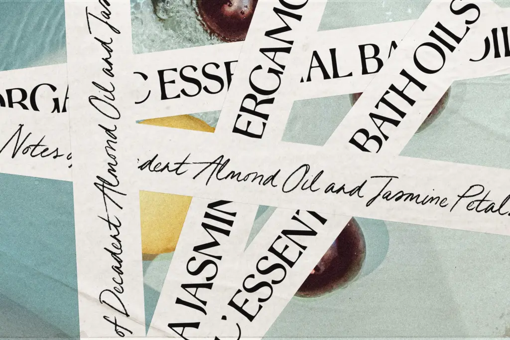
The headline feature is OpenType ligatures: double-letter combinations are drawn as joined, custom pairs rather than two identical letters sitting side by side, which is where a lot of the handwritten illusion actually lives. With ligatures switched on in an app that supports OpenType features, the script picks up natural-looking connections that would otherwise repeat awkwardly. Without that support, the letters are PUA-encoded, so the alternates are still reachable through Glyphs panel, Font Book, or Character Map — just a manual step rather than an automatic one, which is worth knowing before you commit to a layout that depends on them.
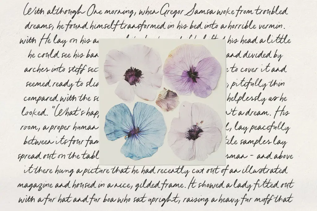
The SVG bitmap versions are the more interesting technical detail here. Rather than a smooth vector stroke, they render with actual pencil grain baked into the letter shapes, which reads as far more convincing at display sizes than a vector script with a texture overlay bolted on in Photoshop. The trade-off is that SVG fonts are raster-based, so they don’t scale infinitely without quality loss and they behave differently across apps — some design software handles color/SVG fonts inconsistently, which is a real limitation to test before building a whole project around them.
Use cases
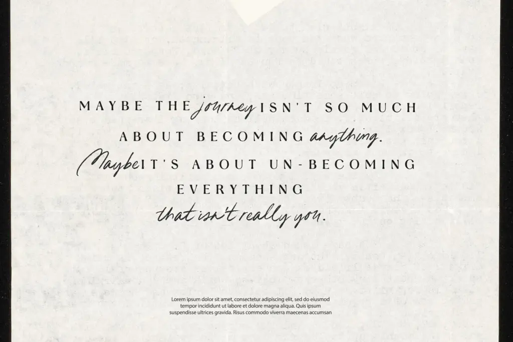
This is a font for projects that want to feel handmade rather than polished: packaging for a small-batch or artisanal product, a logotype for a brand built around warmth and informality, greeting cards, social graphics, journal-style headers, or a signature-style sign-off on invitations that are otherwise set in something plainer. The pencil texture works especially well paired with a quieter serif or sans body copy, since the script needs contrast to read as intentional rather than messy.
It’s not a script for dense paragraph setting or for anything that needs to project formality or luxury — the graphite roughness works against both. Keep it to short phrases, headlines, and accent text, and lean on the ligatures to get the connected, handwritten feel it’s built for.
What we liked, and what we didn’t
Strengths
- SVG bitmap versions bake real pencil texture into the letterforms instead of faking it digitally
- Custom OpenType ligatures solve the repeated-double-letter problem common to handwritten scripts
- Two styles (upright and slanted) give some range from a single handwriting concept
Trade-offs
- SVG bitmap fonts are raster-based and don't scale as cleanly as vectors, with inconsistent app support
- Without OpenType-aware software, accessing ligatures requires manually copying glyphs from Character Map or Font Book
Mint + Magnolia delivers a convincingly pencil-drawn script with a smart ligature system and a genuinely textured SVG option, not just a vector face pretending to be rough. It's built for short, casual, handmade-feeling work rather than formal or dense setting, and the SVG format's scaling and app-support limitations are worth testing before relying on them.

Tmfonts writes independent reviews of typefaces: what each font does well, where it falls short, what it suits, and where it is sold.