
Losta Masta Font Free Download
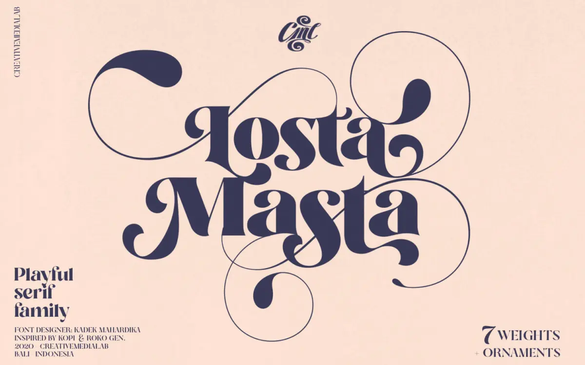
A Losta Masta free download from the foundry itself does not exist as far as we can find: Creativemedialab sells this curly retro serif as a paid family, and its official listings show no demo or personal-use version. What makes the search less painful is the price. The complete eight-font family costs less than many single display fonts.
Losta Masta free download: official sources and prices
We looked at the MyFonts page and the Creative Market listing, the two main official storefronts. Neither mentions a demo, trial or free personal licence. Sites that describe the font as free for personal use do not link that claim to Creativemedialab, so we do not link to them.
- MyFonts: single styles from $15, or all eight fonts for $25.
- Creative Market: Desktop licence $24 per seat, with Webfont, E-pub and App licences sold separately.
For that, you get seven weights from Thin to Black, a separate Ornaments font, OTF and TTF files, and the ligatures and alternates the family is known for. Check the current price on the listing before paying. The same foundry also sells Losta Bonita, Losta Nova and Losta Frida; they are separate families with their own licences, so make sure the product you buy is Losta Masta.
Get Losta Masta — official listing
Losta Masta specimen and verified specs
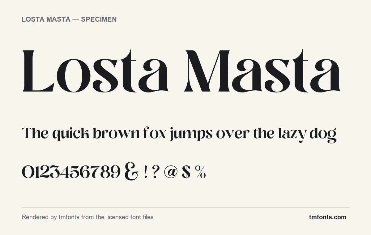
- Styles: 8 (Black, Bold, Extra Bold, Light, Medium, Ornaments, Regular, Thin)
- File formats: OTF, TTF
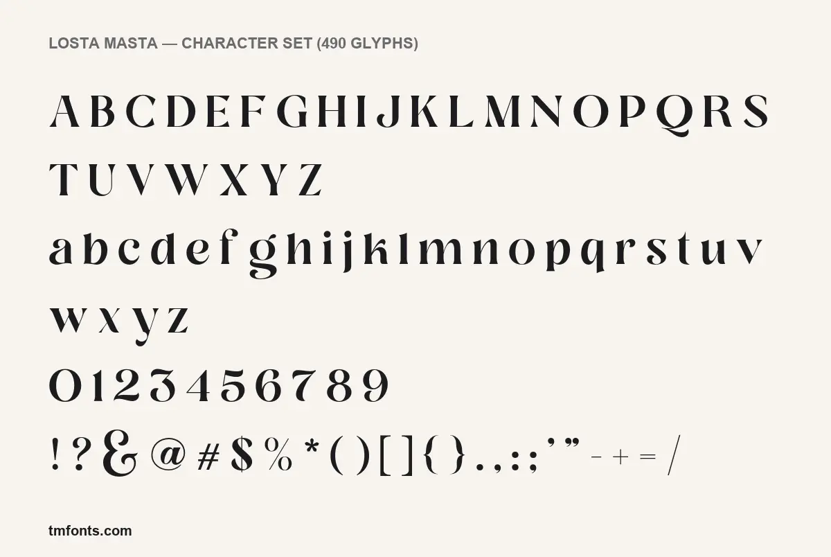
- Glyphs: 490
- Language support: Basic Latin (English), Western European
- OpenType features: discretionary ligatures, stylistic alternates, kerning, fractions, 6 stylistic sets
- PUA-encoded extras: 150 glyphs (usable in Canva and Cricut)
- Designer: Kadek Mahardika
Checked by tmfonts from the licensed font files.
The curves that give Losta Masta its bounce
Losta Masta is a high-contrast display serif drawn with a lot of swing. In the specimens rendered from the licensed files, there is a big gap between heavy and light: round strokes are fat and soft, connecting strokes are hairline thin. The lowercase is where most of the fun is. The t stands unusually tall, its top cut at an angle and reaching nearly as high as the capitals. The k has a small loop in its arm, the y finishes with a curl, and the numeral 3 has a flat top over a round, heavy belly.
Capitals are more restrained, so they work as quiet starters for lively lowercase words. The & is the exception, a large calligraphic loop that you could use on its own as a logo mark. In the big title line, the final a in “Losta” and “Masta” finishes with a long, wavy stroke along the baseline, a hint of what the alternates can do.
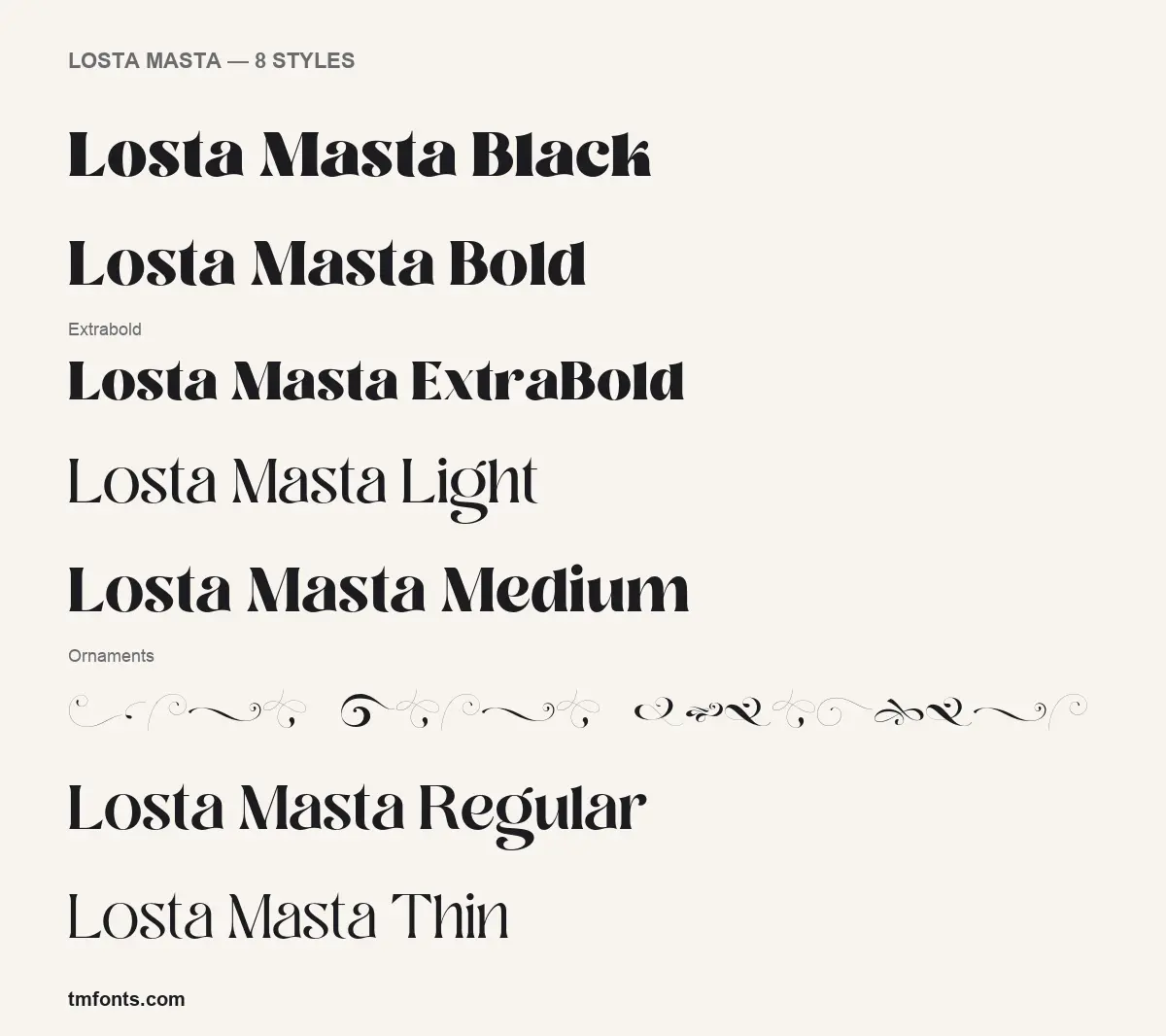
Weight changes the mood. Black, ExtraBold and Bold are dense and chunky, the kind of letter you’d expect on a retro sweet wrapper or a soul record. Light and Thin lose most of the contrast and read as a slim, elegant serif better suited to beauty brands or editorial headings. Creativemedialab describes it as a “unique, playful and versatile serif family” for magazines, postcards, logos and vintage designs.
Eight fonts, two formats: the full family
- Weights: Thin, Light, Regular, Medium, Bold, ExtraBold and Black.
- Ornaments: a separate font of swirls, scrolls and line flourishes, from hairline curls to heavier S-shapes.
- Formats: OTF and TTF.
- Glyphs: 490 in the Regular.
- Designer: Kadek Mahardika, named in the font files and on MyFonts.
- Released: MyFonts gives a debut date of April 5, 2020.
- Listing claim: more than 40 ligatures and more than 100 alternates.
Alternates, stylistic sets and Canva access
The files cover Basic Latin and the Western European accented set, enough for English, French, German, Spanish, Italian and similar languages. The OpenType features, in plain terms:
- Kerning: automatic spacing corrections between letter pairs. Works almost everywhere.
- Discretionary ligatures: decorative joined pairs that you switch on by hand.
- Stylistic alternates: swap one letter for a swashier version.
- Six stylistic sets: groups of alternates you apply in one click, so a whole headline changes at once.
- Fractions: turns 1/2 or 3/4 into proper fraction characters.
Illustrator, InDesign and Affinity apps expose all of these in their OpenType or Glyphs panels; Photoshop handles ligatures and stylistic sets from the Character panel and single swaps from the Glyphs panel. The foundry recommends Illustrator or Photoshop.
Canva and Cricut Design Space can’t switch OpenType features on, but 150 glyphs in Losta Masta are mapped to the Private Use Area (PUA), special code points that act as a back door. Open Character Map on Windows or the Character Viewer on a Mac, select Losta Masta, copy the alternate and paste it into your design. It only shows correctly while the text stays in Losta Masta.
Where it shines, and fonts that sit well beside it
Use the font for short, loud lines: a café or bakery logo, a candle or cosmetics label, a book cover title, an event poster, or names on a wedding invitation with an ornament underneath. The swelling strokes and tight curls clog up at small sizes, so keep it out of paragraphs and interfaces.
- Work Sans for supporting copy; its plain, slightly wide shapes leave the curls to Losta Masta.
- Source Serif 4 for longer reading text when the layout should stay all-serif.
- Jost in capitals with open tracking for small labels and subheads.
What the licence allows
Every project, personal or commercial, needs a paid licence, and an unofficial Losta Masta free download doesn’t change that, because it arrives without one. Creative Market’s Desktop licence is per seat and covers creating graphics, print pieces, logos and merchandise on your own computer; putting the font on a website, in an e-book or inside an app needs the matching Webfont, E-pub or App licence. MyFonts sells its own licence types for the same family. Read the licence that comes with your purchase for the exact limits. This is general information, not legal advice.
Getting Losta Masta onto your computer
- Download the zip from your purchase page and unzip it.
- Windows: select the OTF files, right-click, Install.
- Mac: double-click each file and choose Install Font, or drop them into Font Book.
- Install one format only (OTF is the better choice for design apps), then reopen your software.
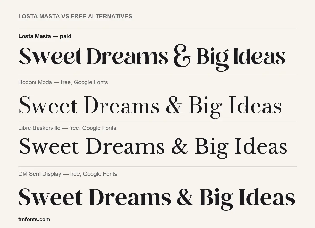
Bodoni Moda, Libre Baskerville and DM Serif Display compared
If a Losta Masta free download was meant to keep a project at zero cost, these three are free on Google Fonts under the SIL Open Font License. None has curls, swashes or an ornament set, so they replace Losta Masta’s contrast, not its playfulness.
- Bodoni Moda: a crisp Didone with vertical stress and flat hairline serifs. Similar contrast, but stiff and formal where Losta Masta is soft.
- Libre Baskerville: wide and sturdy, made for reading on screens. The calmest choice, and the only one of the three for body text.
- DM Serif Display: heavy and high-contrast with ball-like terminals, the nearest in weight and warmth to Losta Masta Bold, but without the alternate letters.
Losta Masta: common questions
Is there a legal way to get Losta Masta for free?
Not that we could confirm. The cheapest official option we found is the full family for $25 on MyFonts.
Which weight should I start with?
Regular or Medium for logos and titles. Use Black for packaging and posters, and Thin or Light for refined, airy headings.
How do I type the ornaments?
Switch the text to the Losta Masta Ornaments font and type, or pick shapes from the Glyphs panel.
Can I use it in a Cricut project?
Yes, once installed. Paste alternates from the PUA through Character Map or Character Viewer, since Design Space has no OpenType controls.
Where does the font come from?
Creativemedialab, an independent foundry in Bali, Indonesia; the designer is Kadek Mahardika.

Tmfonts writes independent reviews of typefaces: what each font does well, where it falls short, what it suits, and where it is sold.