
Arastin Font Free Download
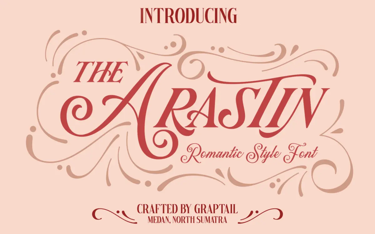
Is Arastin free to download?
Arastin is a commercial font sold on Creative Market, so the full version needs a paid license. Get it from the official listing: Arastin font download.
Need something free? These script fonts from Google Fonts are free for personal and commercial use:
Design style
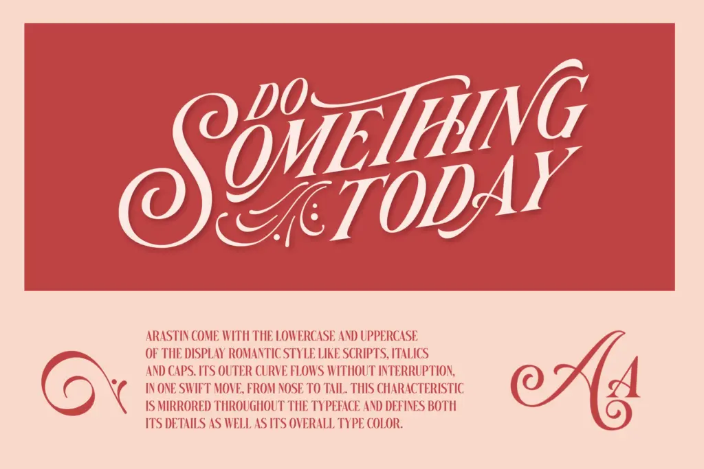
Arastin sits in that display-romantic territory where script logic meets an italic sans skeleton. The brief calls it a display romantic style, and that shows in how the letters behave: each one seems to describe a single unbroken curve, entering and exiting without a hard stop. Terminals taper rather than cut, and the overall rhythm favours a continuous, cursive gesture over the more geometric stacking you’d expect from a sans build. It reads as confident rather than fussy — there’s a clear throughline connecting the lowercase to the caps, so the type colour stays consistent across a headline instead of fracturing into mismatched parts.
What it isn’t is neutral. This is a font with a personality, closer to hand-lettered signage than to a workhorse sans. If you need something that disappears into a paragraph, this isn’t it — but that was never the intention.
Character set and features
The package splits into three related fonts — Pro, Script, and Std — plus an EPS ornament set, which gives you more room to manoeuvre than a single static font file would. Each version leans into a different register: expect the Script cut to push the connected, romantic quality furthest, while Std and Pro presumably dial it back toward something more usable as a standalone display face.
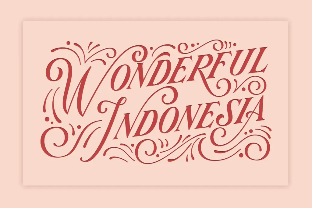
OpenType support includes stylistic alternates, a stylistic set, contextual alternates, and an

Tmfonts writes independent reviews of typefaces: what each font does well, where it falls short, what it suits, and where it is sold.