
Rosamila Display Font Free Download
Is Rosamila Display free to download?
Rosamila Display is a commercial font sold on Creative Market, so the full version needs a paid license. Get it from the official listing: Rosamila Display font download.
Need something free? These serif fonts from Google Fonts are free for personal and commercial use:
Design style
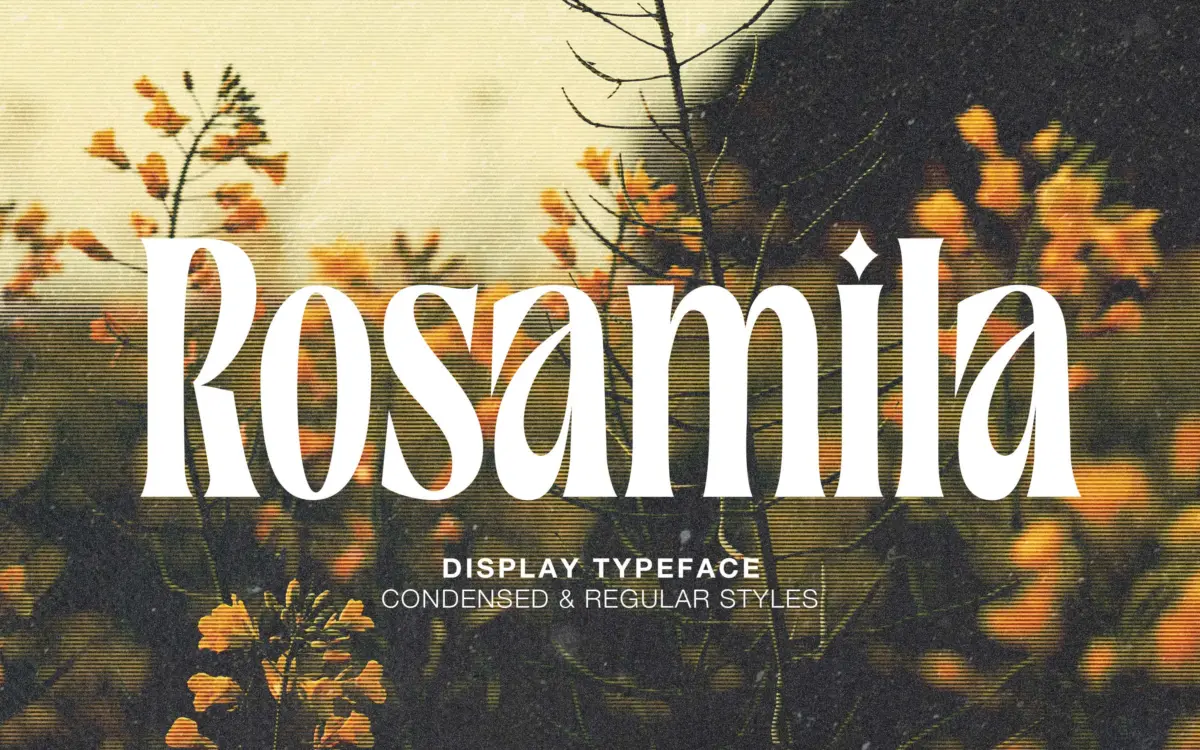
Rosamila Display sits in that familiar territory of high-contrast serifs built for headlines rather than paragraphs. The strokes swing between thick, confident stems and fine hairlines, giving it the kind of drama that reads as upscale at a glance. Terminals are tapered rather than bracketed, which keeps the letterforms feeling drawn rather than engineered. It’s the sort of serif that wants to be the biggest thing on the page, not a supporting voice.
The two styles on offer, Condensed and Regular, give it a bit more range than a single-cut display face. The Condensed version tightens the rhythm and is useful where you need a serif with presence but limited horizontal room, while the Regular spreads out and lets the contrast breathe. Neither is built for density of text, and the design doesn’t pretend otherwise. Curves favour a slightly romantic, feminine mood, something closer to a fashion masthead than a corporate wordmark, and that mood is consistent across both weights.
Character set and features
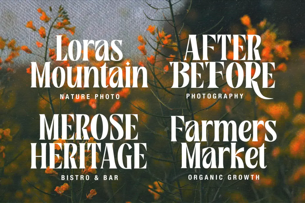
The ligatures are the headline feature here, and they’re clearly where the design effort went. Connecting strokes between certain letter pairs soften the rigidity of a display serif and give it a more handwritten, custom-lettered feel when used well. That said, accessing them requires software with proper OpenType feature support, and for anything beyond that, PUA Unicode mapping — which means less technical users or those working in simpler apps may never see the ligatures at all and will be stuck with the base letterforms. It’s worth checking your workflow before committing to a layout that depends on them.
Beyond the ligatures, this is a fairly standard display character set: uppercase, lowercase, numerals, and basic punctuation, built to carry a few words rather than long runs of copy. There’s no indication of extended language support or a built-in italic, so treat it as a single-minded display tool rather than a full family.
Use cases
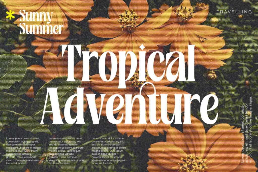
Where Rosamila Display earns its keep is in short-form, high-visibility settings — wedding stationery, invitation suites, fashion branding, boutique packaging, and the kind of social media graphic that leans on a single striking headline. The contrast and the ligature flourishes do real work at large sizes, where the thin strokes stay crisp and the connecting forms have room to be read as a deliberate flourish rather than noise.
It struggles the moment you push it smaller or longer. The hairlines thin out and lose definition below display sizes, and the ligatures that look elegant at 80pt can start to feel cluttered in a paragraph or a product label stacked with text. Pair it with a plain, restrained sans or a quieter serif for supporting copy, and keep Rosamila itself to logotypes, invitation headers, and hero text where its contrast has space to work. Used that way, across either the Condensed or Regular cut, it does the job it was clearly built for — just don’t ask it to do more.

What we liked, and what we didn’t
Strengths
- High-contrast strokes give it real presence at display sizes
- Ligatures add a custom-lettered feel when the software supports them
- Condensed and Regular cuts offer some flexibility in tight layouts
Trade-offs
- Ligatures depend on OpenType or PUA support, so they won't appear in every app
- Hairline strokes lose clarity quickly below headline sizes
Rosamila Display is a competent, mood-driven headline serif with ligatures that do real work at large sizes but add clutter once you shrink it down. It's built for short bursts of type — invitations, logotypes, social graphics — not for carrying a layout. Worth having in the toolkit if your work leans toward fashion or wedding branding, less useful outside that lane.

Tmfonts writes independent reviews of typefaces: what each font does well, where it falls short, what it suits, and where it is sold.