
Quine: a high-contrast modern serif for editorial and brand headlines
Design style
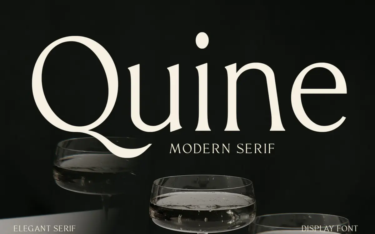
Quine sits in the modern serif tradition that runs from Didone-era display faces through to today’s fashion-magazine mastheads. The hallmark is contrast: thick vertical stems snap against hairline-thin serifs and connecting strokes, giving the letterforms a sharp, almost engraved quality. Curves transition cleanly from thick to thin without the wobble that undermines a lot of high-contrast serifs drawn without enough care, which suggests real attention went into the stroke modulation rather than just applying a contrast filter to a monoline skeleton.
The terminals are where the typeface tries to say something distinct — a few letters carry small flared or bracketed details rather than the plain ball terminals you’d expect. It’s a subtle move, not a loud one, and it keeps Quine from reading as generic. The overall proportions lean classical rather than geometric: moderate x-height, measured widths, nothing cramped. At a glance it reads as confident and a little formal, the kind of serif that wants to sit above a product name rather than next to it.
Character set and features
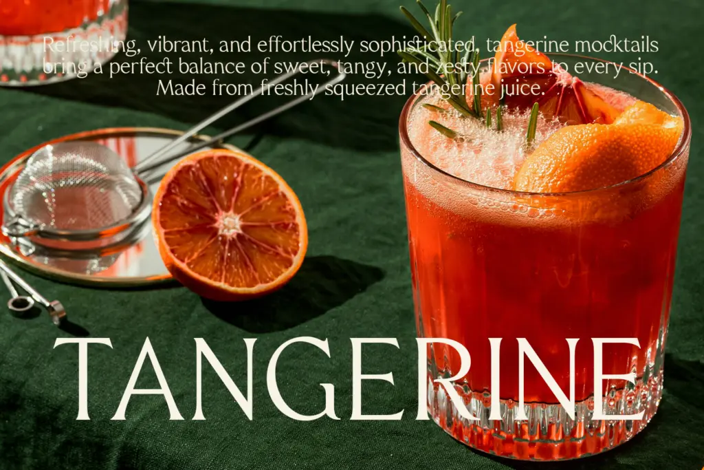
As a display-leaning modern serif, Quine’s strength is concentrated in its capitals and larger figures, where the contrast and terminal details actually register. Lowercase follows the same logic but, as with most high-contrast designs, the thin strokes thin out fast at smaller sizes, so the personality is more visible in a headline than in a caption. The brief doesn’t specify an extended OpenType feature set, so treat it as a solid single-style serif rather than a kit with swash alternates and ligature sets — judge any such extras on their own merits if you buy it, rather than assuming them.
Where it holds up well is in short-to-medium runs of text: a product name, a pull quote, a headline stacked over two or three lines. The rhythm between letters feels intentional rather than mechanically spaced, which matters more in a contrast serif than in a sans, since uneven spacing shows up immediately around those thin strokes.
Use cases
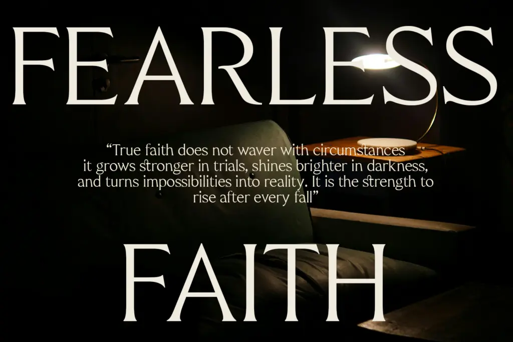
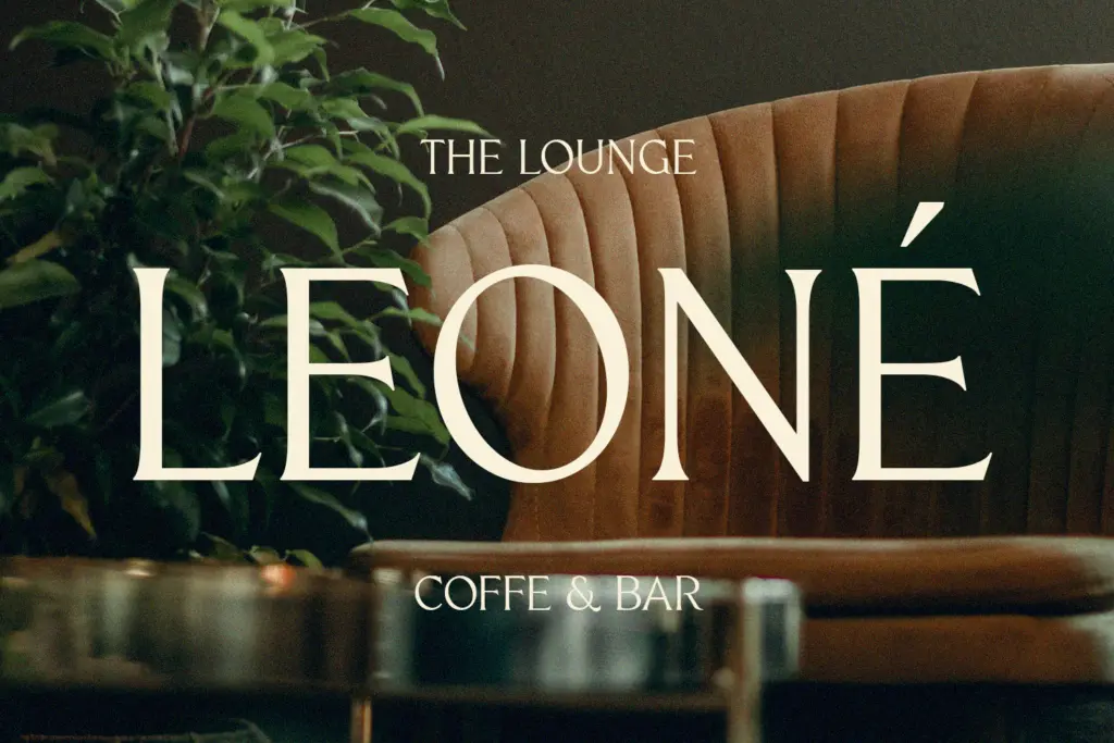
Quine’s natural home is anywhere a brand wants a serif with some edge rather than default refinement — editorial headlines, fashion and beauty packaging, premium product labelling, title cards. It will do fine work on a masthead, a cover line, or a wordmark where the contrast can be shown at a decent size. It’s less suited to body copy or anything that has to survive at small sizes on a low-resolution screen; the hairlines are the first thing to break down when you shrink it, which is standard for this style of serif but worth planning around.
Pair it with a plain, quiet sans or a simple grid for supporting text — Quine is doing the talking already, and a second loud typeface competing for attention will just muddy the hierarchy. Used at headline scale, with enough negative space around it, it earns its contrast. Used at body size, it won’t.
What we liked, and what we didn’t
Strengths
- Clean thick-to-thin transitions without the wobble common in amateur contrast serifs
- Distinctive terminal flourishes that give it a recognisable signature at headline size
- Measured, classical proportions that read as confident rather than overworked
Trade-offs
- Thin strokes lose definition quickly below display sizes
- No confirmed extended feature set, so don't expect swash alternates or ligatures out of the box
Quine is a competently drawn high-contrast modern serif with a few distinctive terminal details that keep it from reading as generic. It's built for display use — headlines, mastheads, packaging — and loses its character fast once you push it down to text size.
Verdict

Tmfonts reviews typefaces in depth — every font is tested in real branding, editorial and screen layouts before a word gets written. 555+ fonts reviewed and counting.