
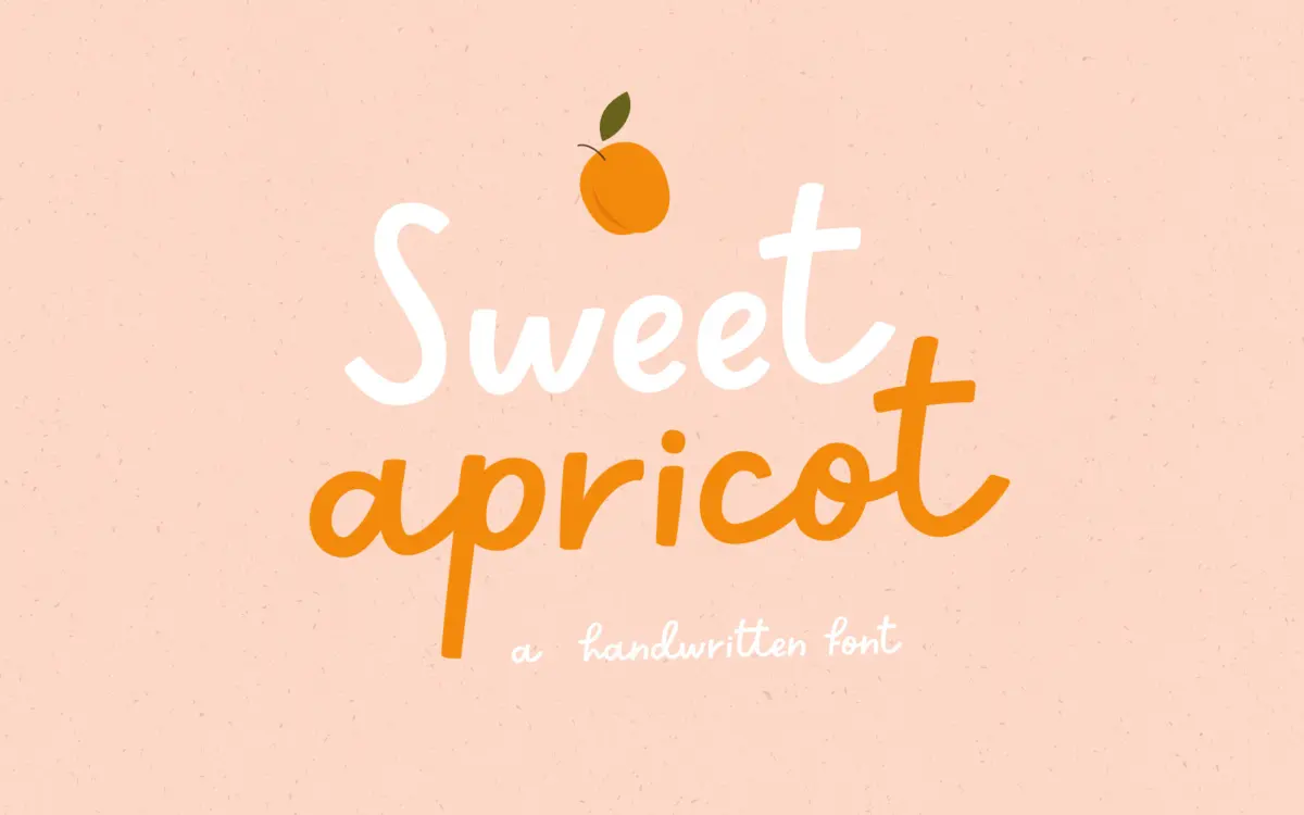
Sweet Apricot: a bouncy handwritten script for kids’ projects and casual branding
Design style
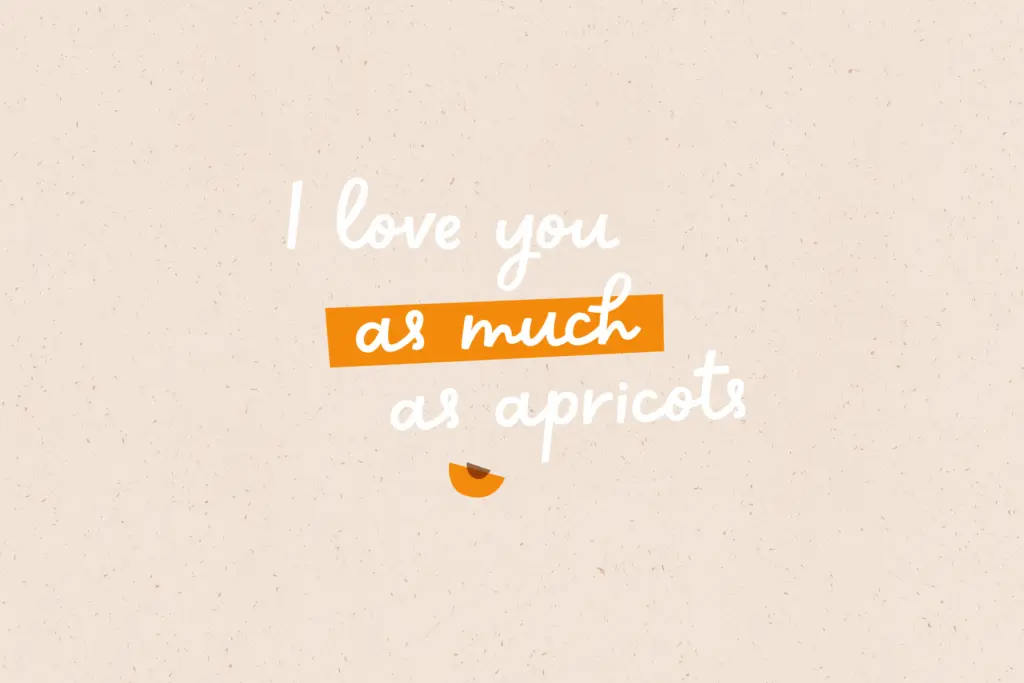
Sweet Apricot is a handwritten script built on an uneven, childlike baseline rather than a polished calligraphic one. Strokes vary in weight the way a felt-tip or crayon would vary, thickening slightly at the turns and thinning out on the exit strokes. The letters lean forward at an irregular angle, which gives the face its sense of motion — it reads as something scrawled quickly and happily rather than drawn with a ruler.
There’s no attempt at calligraphic discipline here, and that’s the point. Letterforms wobble a little from one instance to the next in feel, even though they’re fixed glyphs, because the drawing keeps small asymmetries that a more formal script would smooth away. Round letters are slightly flattened, ascenders and descenders loop generously, and the overall rhythm favours warmth over precision. It sits closer to a kid’s handwriting exercise than to a wedding invitation script, and it doesn’t pretend otherwise.
Character set and features
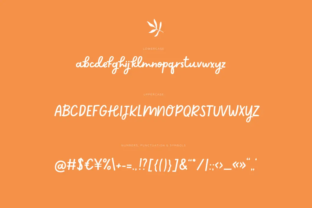
The font comes as a single weight in OTF format, paired with a set of 28 supporting illustrations supplied as transparent PNGs and AI files. Those extras — small decorative elements rather than a second typeface — suggest the font was built with a specific packaging-and-stationery use case in mind, where the lettering needs a few matching ornaments nearby rather than a full icon library.
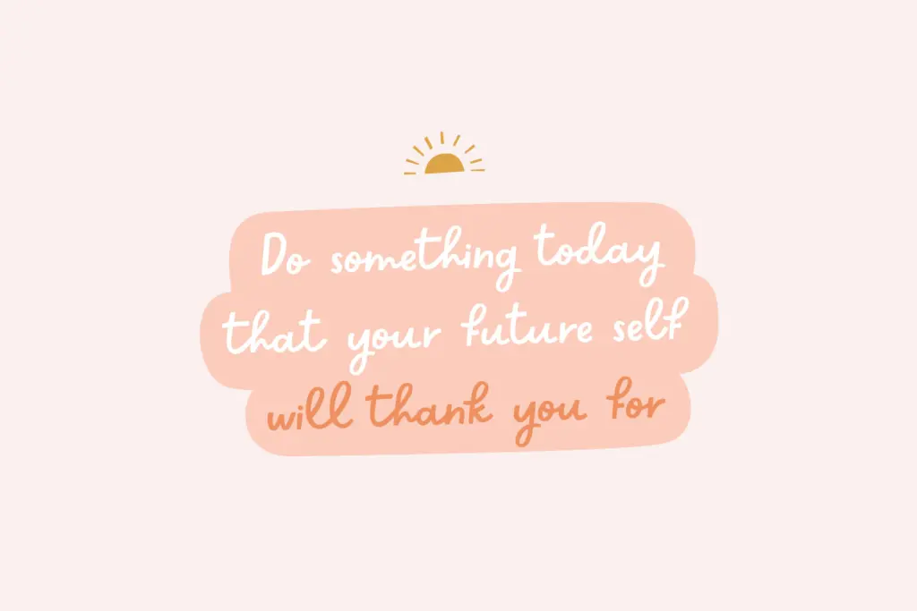
As a script built for display use, Sweet Apricot is happiest at larger sizes: headlines, short greetings, cover lines, single words. The irregular baseline and varying stroke weight that give it character also mean it loses clarity quickly once you shrink it down to body text sizes — the looping ascenders and descenders need room to breathe, and tight line spacing will cause collisions. This isn’t a fault so much as a boundary; treat it as a display face and it performs exactly as intended.
Use cases
This is a font for projects that want to feel approachable and unpolished in a deliberate way. Children’s book covers and interior titling are an obvious fit, as are greeting cards, party invitations for kids’ events, and packaging for toys, snacks or anything aimed at a young audience. The included illustration elements make it easy to build out a small, coordinated set of social graphics — Instagram covers, highlight icons, simple posters — without having to source separate artwork.
It also works for brands chasing a friendly, slightly homemade tone: a bakery, a children’s clothing line, a hand-lettered logotype for a small creative studio. What it isn’t suited for is anything requiring restraint or formality — long-form text, legal documents, corporate branding, or any context where legibility at small sizes matters more than personality. Used within its lane, as a headline or a logotype paired with a plain sans for supporting text, it does its job cleanly and without overreaching.
What we liked, and what we didn’t
Strengths
- The uneven, crayon-like stroke weight gives it a genuinely childlike feel rather than a generic 'cute script' look
- Comes with 28 matching illustration elements, useful for building out social or packaging graphics quickly
- Reads clearly at display sizes for short headlines and logotypes
Trade-offs
- Legibility drops fast below display sizes due to the loose baseline and looping ascenders/descenders
- Single weight and script-only design limits it to short, large-scale text rather than full layouts
Sweet Apricot does one job well: a cheerful, handmade-feeling script for kids' and casual branding work, backed by a small set of matching illustrations. It's not built for small text or formal use, and buyers should know that going in.
Verdict

Tmfonts reviews typefaces in depth — every font is tested in real branding, editorial and screen layouts before a word gets written. 555+ fonts reviewed and counting.