
Handcrafted Vintage Script: a restored 1800s script for period-accurate branding
Design style
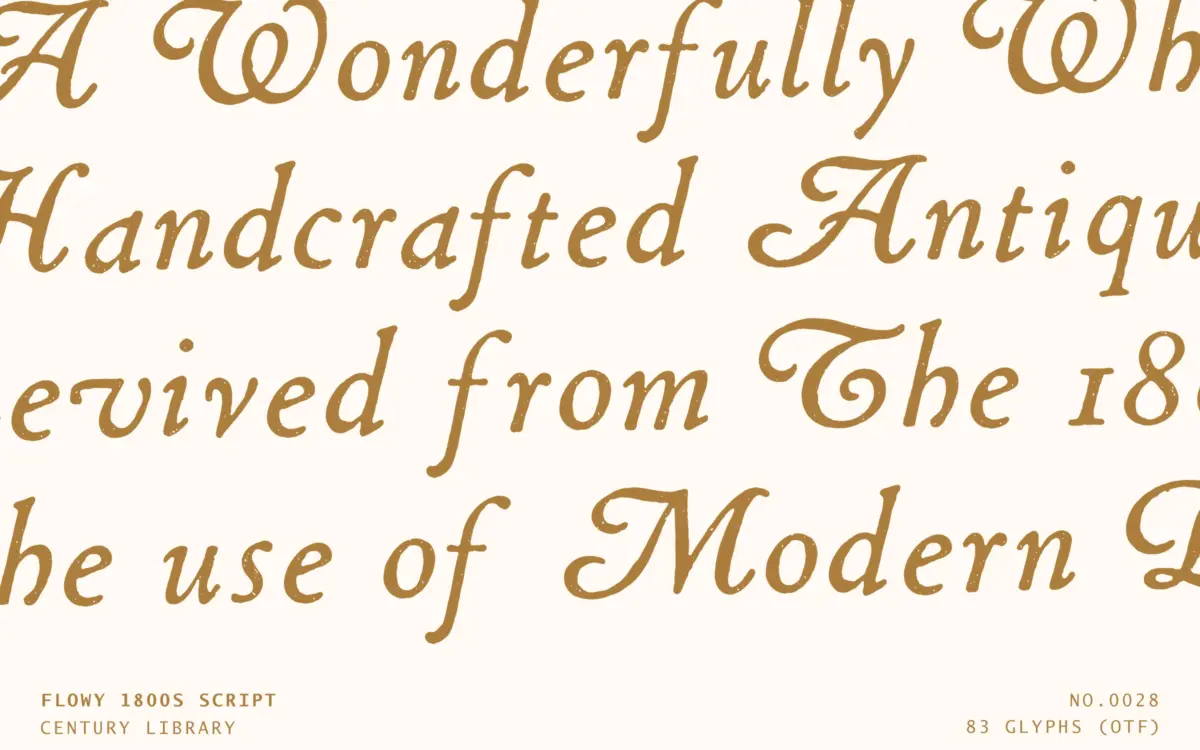
This is a restoration job, not a new drawing, and it reads that way in the best sense. The source is a hand-drawn script from the 1800s, and Century Library has kept the irregularity that makes period scripts feel written rather than built. Strokes swell and thin in places a contemporary script wouldn’t bother with, baseline contact points wobble slightly letter to letter, and the whole lowercase has a loose, slightly forward lean that never quite repeats itself exactly the same way twice.
That unevenness is the point, but it’s worth naming plainly: this is not a clean, calibrated script built for corporate consistency. Some joins are tighter than others, a few letters sit a touch heavier than their neighbours, and at a glance it can look like a font that needs a steady hand to deploy well. If you’re after a script that behaves identically at every size and weight, this isn’t it. If you want something that looks like it came off a letterpress plate and was scanned in rather than vectorised from scratch, the texture is exactly what’s being sold.
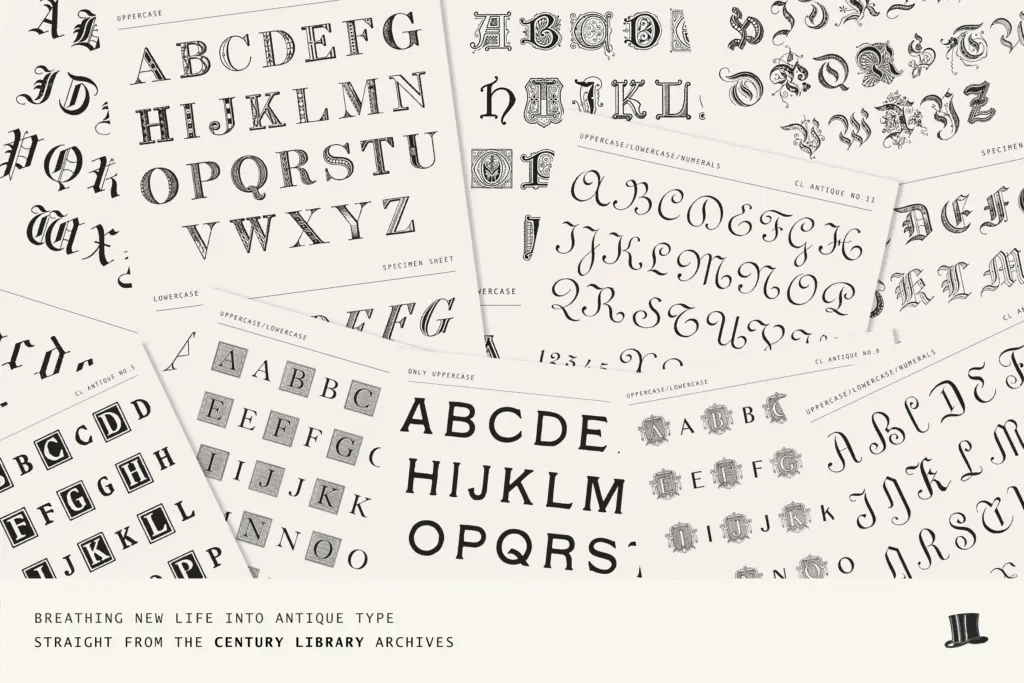
Character set and features
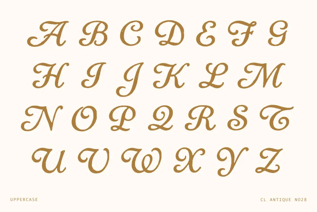
The set covers uppercase and lowercase, numerals, and a reasonable range of punctuation, along with ligatures and stylistic alternates. The ligatures matter more here than in most scripts — because the letterforms are irregular, awkward letter pairs (double letters, certain ascender-descender collisions) need the ligatures to avoid looking broken rather than charming. Alternates give some control over repetition, which is useful since a script this characterful will show its seams quickly if the same letterform appears twice in a short word.
There’s no multilingual support, which the foundry is upfront about — it’s built from the original 1800s glyph set, so accented characters and extended Latin aren’t part of the package. For English-only copy this won’t register as a limitation, but anyone setting multilingual stationery or export packaging should check their character needs before committing to it as the primary script.
Use cases
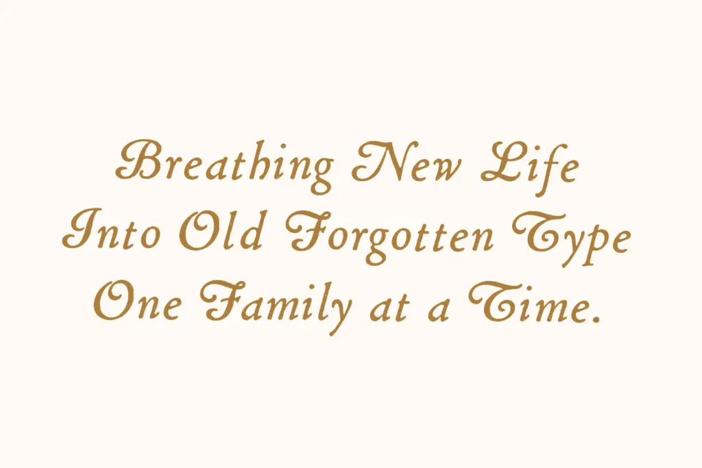
This sits comfortably in the same bracket as other antique revival scripts aimed at heritage branding — wine and spirits labels, bakery and apothecary packaging, wedding stationery with a period theme, editorial drop caps and pull quotes for history or lifestyle content. The restored, imperfect quality does real work in these contexts: it signals handmade and old rather than digital and new, which a cleaner script simply can’t fake.
It’s less suited to anything requiring crisp legibility at small sizes or in dense paragraphs — this is a display and accent script, not a text face, and should be set large with room to breathe. Logo use works well provided the brand wants warmth and history rather than sharpness. Pair it with a plain, restrained sans or serif for body copy; asking it to do all the typographic work on a page will tire the eye fast given how much movement is built into the letterforms.
What we liked, and what we didn’t
Strengths
- Irregularity feels authentic to its 1800s source rather than artificially roughened
- Ligatures and alternates genuinely help manage repeated letterforms
- Strong fit for heritage packaging, wedding stationery and editorial accents
Trade-offs
- No multilingual character support limits it to English-language use
- Inconsistent letterforms mean it needs generous size and spacing to avoid looking broken
A genuinely characterful restoration that earns its vintage billing through real irregularity rather than a filter effect. It needs careful setting and isn't for small-size or multilingual work, but for heritage branding and stationery it delivers texture a cleaner script can't fake.
Verdict

Tmfonts reviews typefaces in depth — every font is tested in real branding, editorial and screen layouts before a word gets written. 555+ fonts reviewed and counting.