Handwritten
3.9
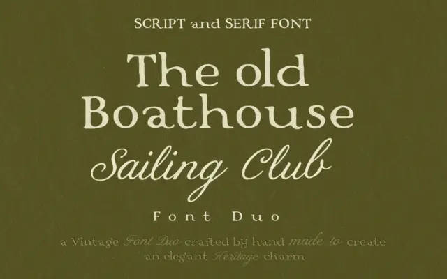
Vintage Serif & Calligraphy Script: a heritage duo for quiet-luxury branding
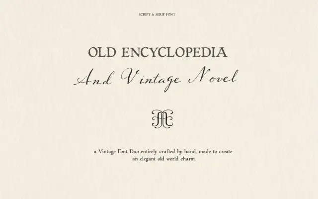
Design style This is a two-piece set built around a single mood: old money without the shout. The serif half…
 Tmfonts

Design style This is a two-piece set built around a single mood: old money without the shout. The serif half…
Tmfonts
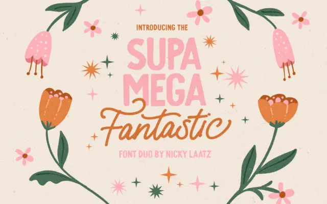
Design style Supa Mega Fantastic Font Duo pairs a monoline script with a chunky all-caps sans, both drawn in the…
Tmfonts
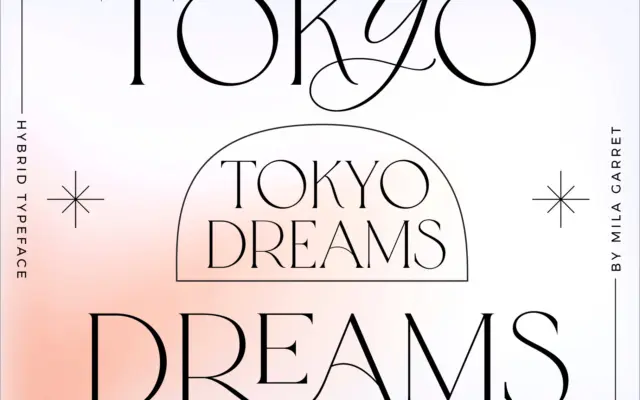
Design style Tokyo Dreams is built around one central idea: a plain serif skeleton that can be dressed up or…
Tmfonts
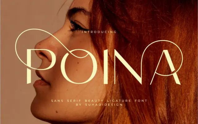
Design style Poina is an uppercase-only sans serif built around ligatures rather than a full running text system. The letters…
Tmfonts
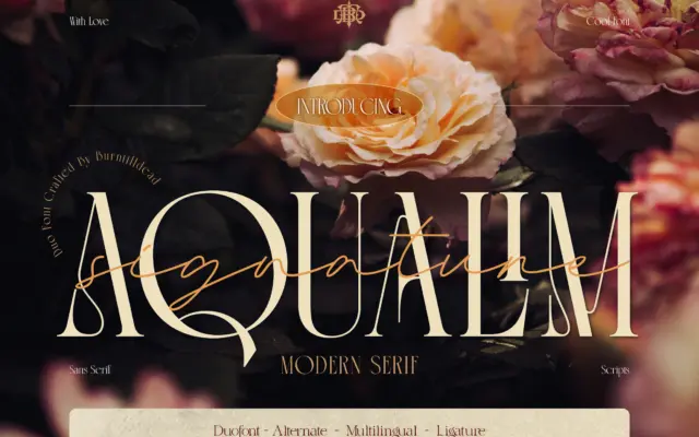
Design style Aqualim Signature is a two-part release: a serif built for structure and a companion script that carries the…
Tmfonts
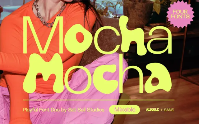
Design style Mocha is a four-font set built around a simple contrast: a plain-spoken sans and a rounded, hand-drawn bubble…
Tmfonts
Design style This is a two-font bundle built around a single idea: everything should look like it was written by…
Tmfonts
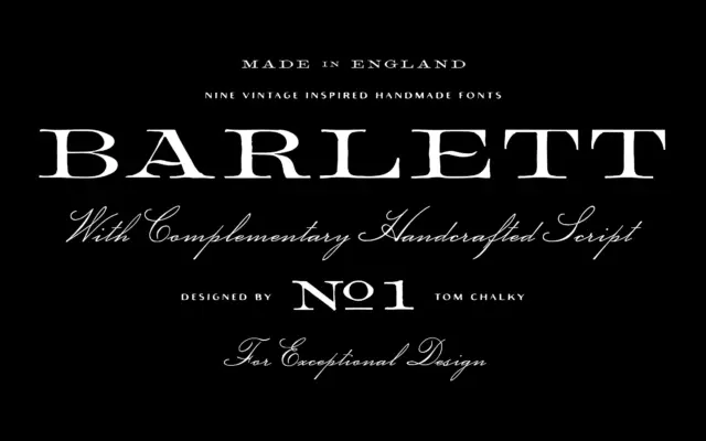
Design style Barlett No.1 works from a familiar reference point: 1800s English serif types, the kind you find on old…
Tmfonts
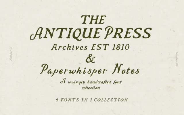
Design style This is a two-part release built around a familiar but effective idea: a sturdy letterpress-style serif paired with…
Tmfonts