
Awesome Ways: a ligature-heavy script for handwritten branding work
Design style
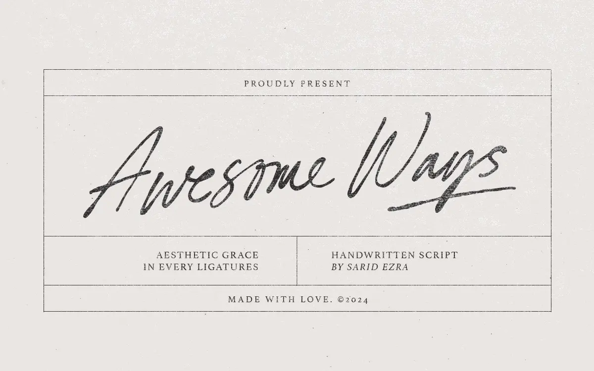
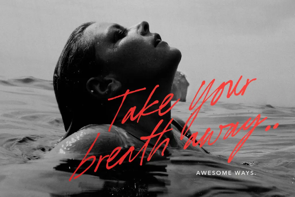
Awesome Ways sits in the casual-script camp: a connected, brush-influenced hand with a loose, slightly tilted baseline rather than the tight calligraphic discipline you’d get from a formal copperplate. Strokes carry moderate contrast, thickening through the downstrokes and thinning out where the pen would lift, which gives it a plausible handmade feel without pushing into the exaggerated flourish territory some script fonts chase. The letters lean forward at a consistent angle, and the joins between characters are drawn to look continuous rather than stitched together, which is the main thing a script like this needs to get right.
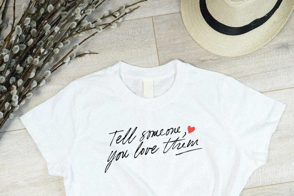
It reads as friendly and a little informal — closer to a quick note scrawled on packaging than an invitation engraved in copperplate. That’s a design choice, not a flaw, but it does mean the font has a personality that won’t suit every brief. It wants warmth and casualness, not formality.
Character set and features
The headline feature here is the ligature set, and it’s substantial. Rather than relying on a handful of standard pair-kerns, Awesome Ways builds in alternate joins for common letter combinations so that words don’t read as a string of identical repeated letterforms stuck together. This matters more in scripts than in any other category, because the eye is quick to spot where a
Verdict

Tmfonts reviews typefaces in depth — every font is tested in real branding, editorial and screen layouts before a word gets written. 555+ fonts reviewed and counting.