
Frontier & Extra: a handcrafted Western serif for rustic branding
Design style
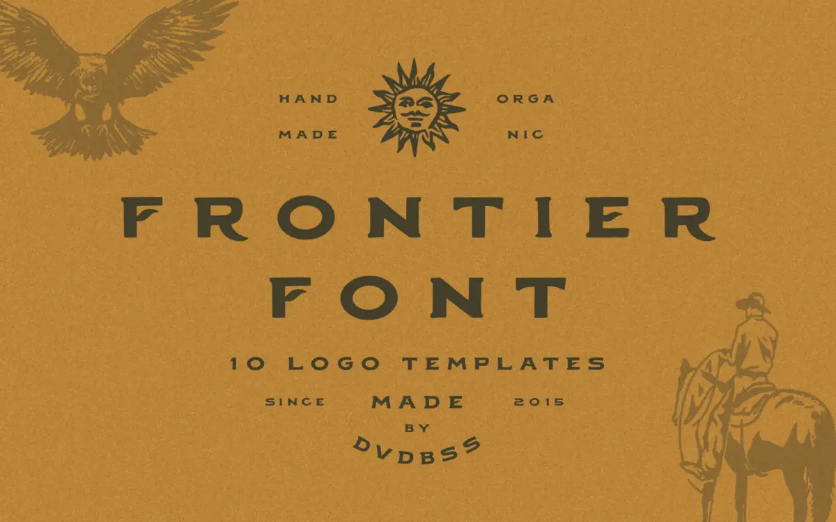
Frontier is a slab-adjacent serif built on Western sign-painting conventions: wide proportions, blunt serifs, and the slightly irregular stroke weights you’d expect from a hand-lettered saloon sign rather than a type foundry drawing board. The letters carry visible texture — edges that waver just enough to read as drawn rather than vectored clean. It’s not a subtle font. Counters are open, x-height is generous, and the overall tone leans heavy and declarative, the kind of letterform that wants to sit on a crate label or a leather patch rather than run as body text.
The handcrafted roughness is the whole point here, and it’s executed with some restraint — the irregularities are consistent enough that a line of text doesn’t look chaotic, just worn. Where it falls short of more considered revival serifs is in the fine joinery: some transitions between stems and serifs feel slightly abrupt at larger sizes, as if the roughening was applied uniformly rather than drawn letter by letter with real variation.
Character set and features
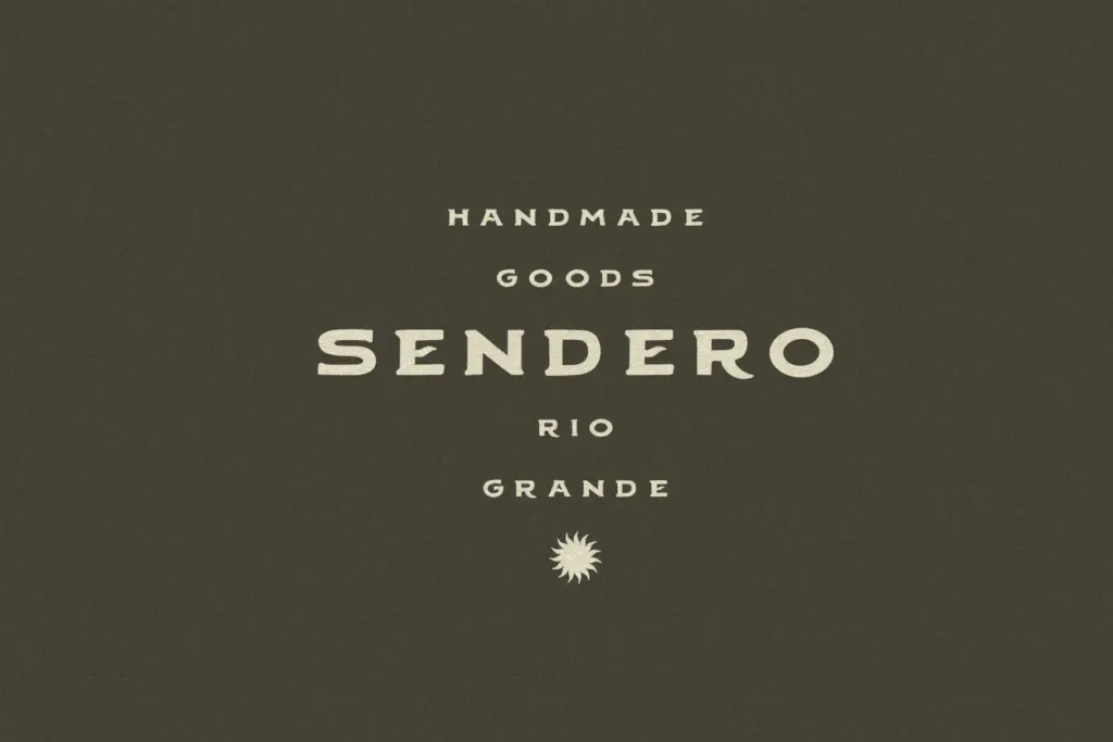
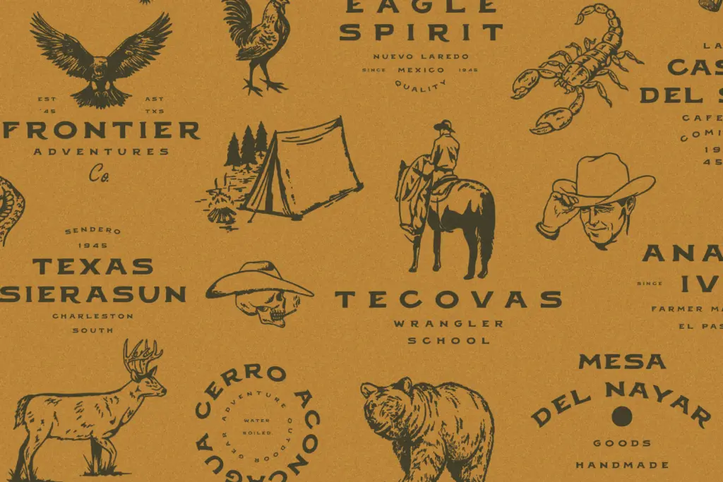
Frontier covers the standard Latin character set with uppercase, lowercase, numerals and basic punctuation, enough for the short, punchy uses it’s aimed at — words and phrases rather than paragraphs. The accompanying extras are really the bulk of the offering: ten premade logo templates built around Western and outdoor branding themes, plus fifteen hand-drawn illustrations in the same rustic register — things like badges, crests and decorative flourishes that are clearly meant to be dropped straight into a logo composition alongside the type.
This bundling tells you how the font is meant to be used: not as a standalone text face you build a full identity around from scratch, but as one ingredient in a pre-assembled kit. There’s no mention of extended language support or OpenType substitution features, so treat this as a display tool with a fixed vocabulary rather than a flexible, feature-rich family.
Use cases
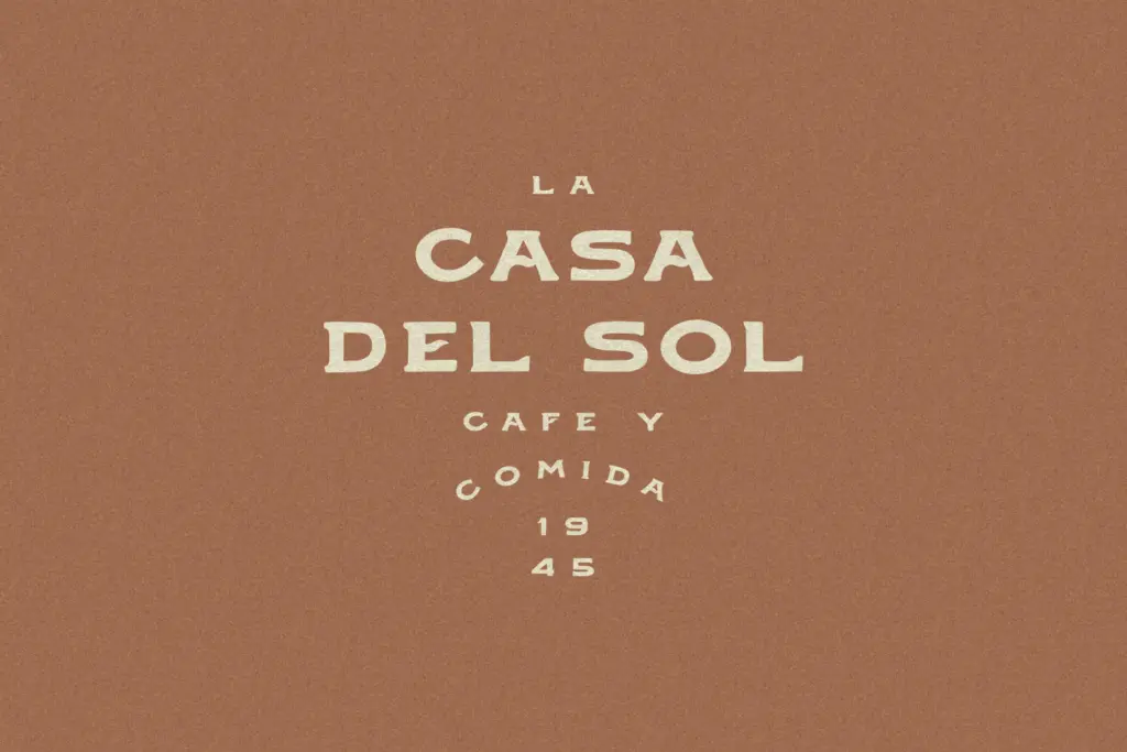
Frontier suits short-form Western and outdoor branding: brewery and distillery labels, campsite and ranch logos, leather goods, farmers’ market signage, anything trading on a frontier or homestead aesthetic. The bundled logo templates make it a fast option for small businesses that need a finished-looking mark without commissioning custom lettering — paste in a name, adjust the illustration, done.
It is not built for body copy, long-form editorial work, or anything needing a neutral, quiet voice. The roughened serifs lose their charm below a certain size, where the texture reads as noise rather than character. Pair it with a plain sans or a clean serif for supporting text, and keep Frontier itself to headlines, wordmarks and badge lockups where its weight and texture can do their job without fighting for legibility.
What we liked, and what we didn’t
Strengths
- Strong, consistent Western sign-painting character
- Bundled logo templates and illustrations speed up real branding work
- Works well as a badge or wordmark face for rustic identities
Trade-offs
- Not suited to body text or extended reading
- Limited character set and feature set beyond basic Latin punctuation
Frontier does one job well: short, rugged Western branding with a hand-drawn edge. The bundled templates and illustrations make it a quick route to a finished logo, but the font itself is narrow in purpose and loses charm at small sizes or in long text.
Verdict

Tmfonts reviews typefaces in depth — every font is tested in real branding, editorial and screen layouts before a word gets written. 555+ fonts reviewed and counting.