
Butter And Crumb Font Duo Free Download
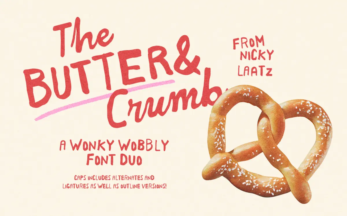
Is Butter And Crumb Font Duo free to download?
Butter And Crumb Font Duo is a commercial font sold on Creative Market, so the full version needs a paid license. Get it from the official listing: Butter And Crumb Font Duo download.
Need something free? These handwritten fonts from Google Fonts are free for personal and commercial use:
Design style
Butter And Crumb is a two-part set built around deliberate imperfection. The caps face is a rough, wobbly display letter — strokes that wander off their baseline slightly, terminals that don’t quite close, edges that look drawn rather than vectored. The companion script is fatter and chunkier, closer to a marker or brush than a pen, with thick, confident strokes that lean into the same hand-done irregularity. Together they read as a pair rather than a system: one does the shouting, the other does the talking underneath it.
This is not a refined, market-tested script. The wobble is the point, and Nicky Laatz has leaned into that rather than smoothing it out. Letters within a word don’t sit in a perfectly even rhythm, which is exactly what gives it the hand-painted, slightly rebellious feel the name promises. If you want something buttoned-up and reliable, this isn’t it. If you want something with a bit of mess in the right places, it delivers.
Character set and features
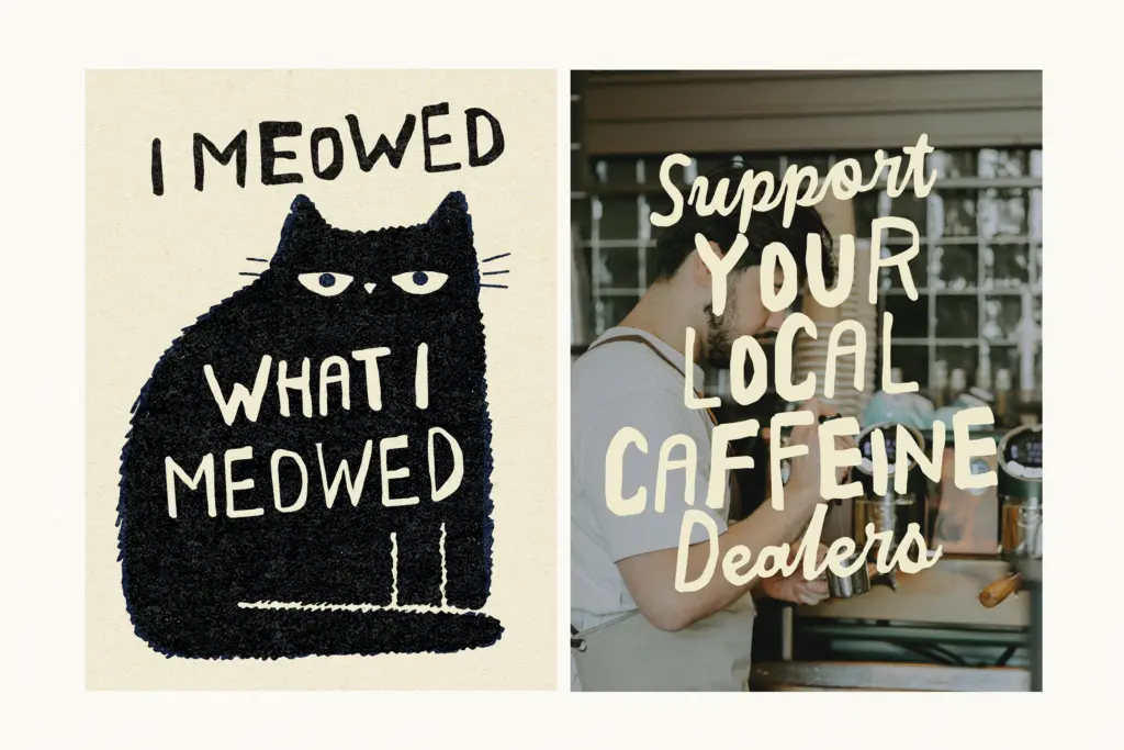
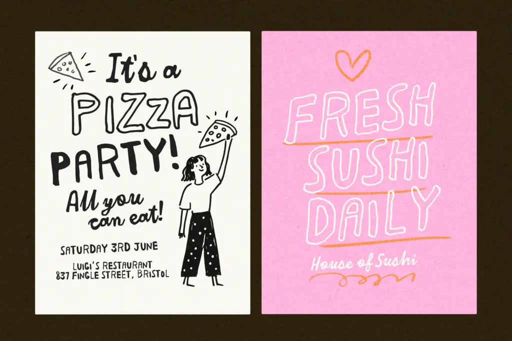
The duo comes with alternates and ligatures on both styles, plus outline versions of the letterforms — useful for layering a hollow version behind or over a solid one, a trick that suits poster and packaging work more than body text. PUA encoding means the alternates and ligature sets are reachable even in apps that don’t support OpenType features natively, though anyone using a proper design app should still access them through the standard glyph palette or stylistic sets for a cleaner workflow. Language support extends to several Northern European and Iberian languages beyond basic English, so accented characters are accounted for rather than an afterthought.
Because both faces are intentionally uneven, legibility drops off fast at small sizes or in long lines. The script in particular needs generous size and spacing to keep its thick strokes from clogging together — this is a headline and short-message font, not a paragraph font. Used at the sizes it’s designed for, the roughness reads as texture rather than noise, but push it too small and it just looks blurry.
Use cases
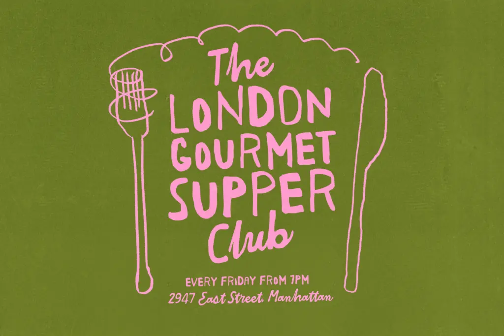
This pairing is built for informal, personality-driven work: greeting cards, birthday and party graphics, playful branding for food or lifestyle products, social posts that want to feel handmade rather than corporate. The name itself gives away the target market — bakery and dessert branding, cosy food packaging, anything trying to feel warm, a little childish, and unpolished on purpose. The outline versions add some flexibility for layered poster compositions or embroidery-style treatments where a hollow letter reads better than a solid one.
It’s less suited to anything that needs to look considered or premium — corporate branding, editorial systems, or long-form set text will all fight against the wobble rather than benefit from it. Used within its lane, though, as a display pairing for short, cheerful messages, it does a specific job well and doesn’t pretend to do more than that.
What we liked, and what we didn’t
Strengths
- The wobbly caps and chunky script feel genuinely paired rather than bundled together
- Alternates, ligatures and outline versions give real flexibility for poster and packaging layouts
- Covers several European languages beyond English, not just an afterthought
Trade-offs
- Legibility drops sharply at small sizes or in longer lines of text
- The intentional roughness limits it to informal, playful contexts only
Butter And Crumb is a confidently messy display pairing that knows exactly what mood it's going for. It won't work for anything needing restraint or small-size legibility, but for cosy, playful branding it has real charm.

Tmfonts writes independent reviews of typefaces: what each font does well, where it falls short, what it suits, and where it is sold.