
Strange Muse Font Free Download
Is Strange Muse free to download?
Strange Muse is a commercial font sold on Creative Market, so the full version needs a paid license. Get it from the official listing: Strange Muse font download.
Need something free? These script fonts from Google Fonts are free for personal and commercial use:
Design style
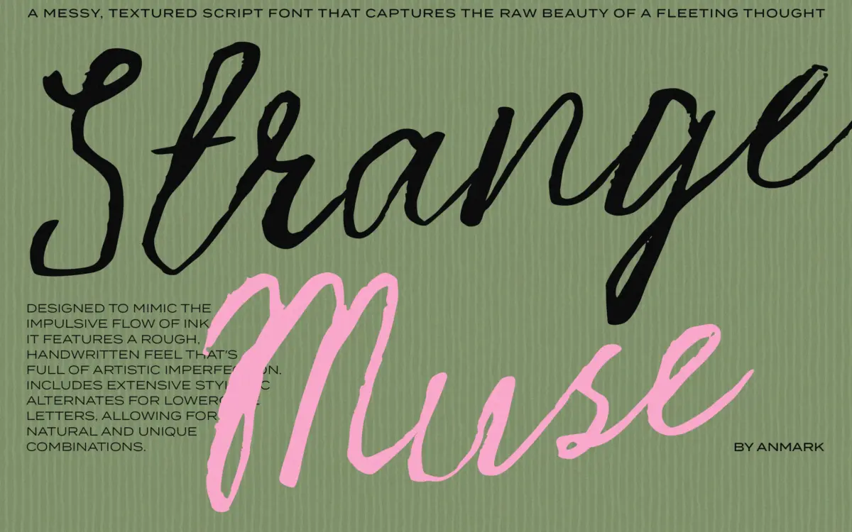
Strange Muse leans hard into the raw side of script lettering. Strokes vary in pressure the way a dry brush or bad pen does, with ink dropout at the thin spots and blotting at the joins. Nothing sits at a consistent angle for long. Letters lean, straighten, then lean again, which is clearly deliberate rather than sloppy execution, but it means the face reads as gestural first and typographic second. There’s no attempt at the smooth, calligraphic contrast you’d get from a formal script — this is closer to a marker dragged across paper by someone in a hurry.
That said, the roughness has a rhythm to it. Ascenders and descenders swing wide, giving the words some vertical drama, and the baseline wanders just enough to keep a line of text from looking mechanically set. It’s an aesthetic choice that will either suit a project completely or fight against it — there’s not much middle ground.
Character set and features
The font includes stylistic alternates for the lowercase, which is the feature doing the real work here. Swapping in alternates breaks up repeated letters within a word or across a layout, so you don’t get the same ‘a’ or ‘s’ shape marching past you three times in a headline. This is worth using deliberately rather than leaving to chance — set the same word with default glyphs and it can look repetitive in a way that undercuts the handmade illusion the font is going for.
Given the messy-ink concept, expect the character set to be Latin-only with no claims to multilingual support, and expect kerning to need occasional manual nudges — scripts with this much stroke variance rarely space themselves perfectly across every letter pair. Treat it as a display face you finesse by eye, not one you set and forget.
Use cases
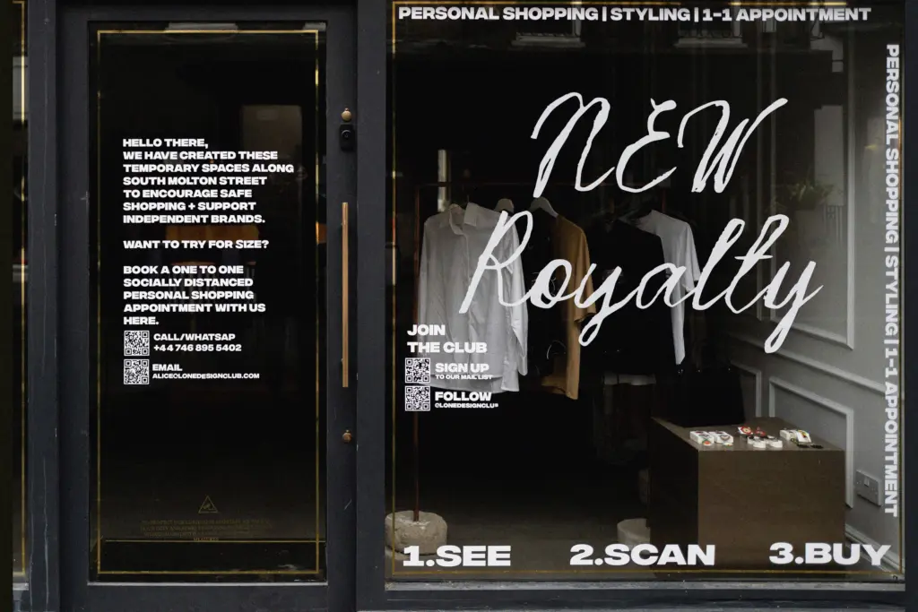
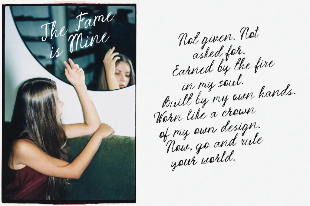
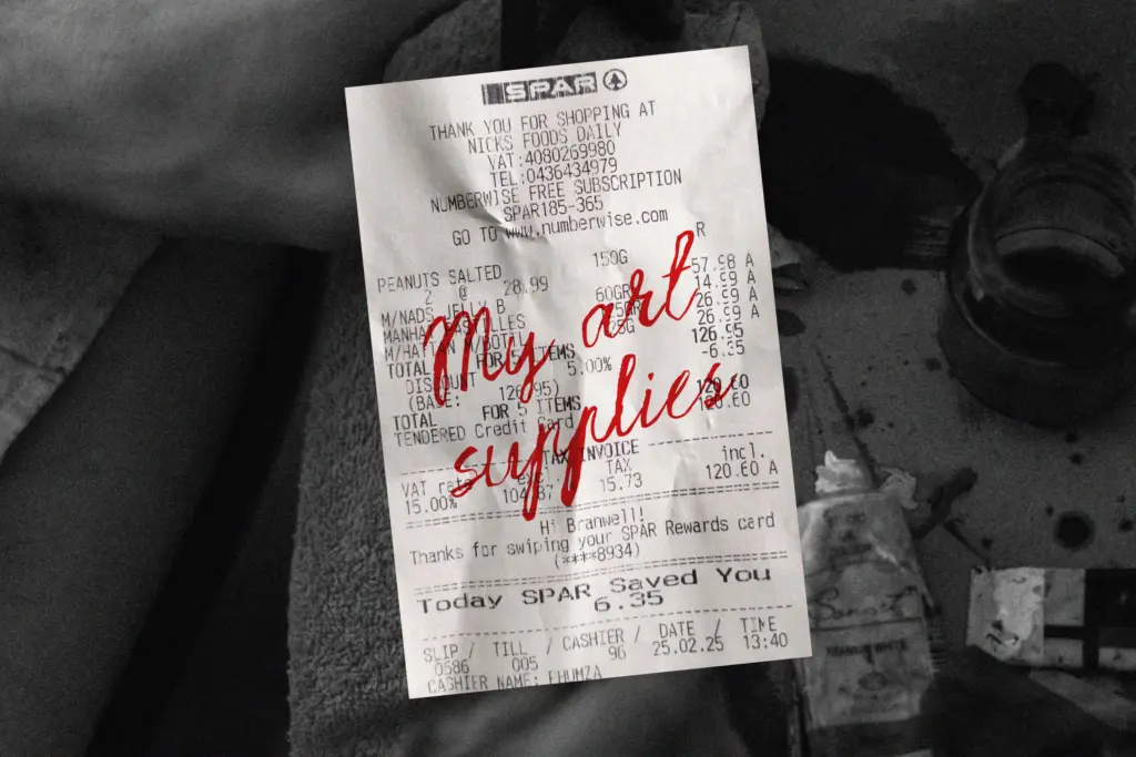
Strange Muse is built for short bursts of text: a logotype, a monogram, a single line on an invitation, a quote card for social media. At that scale the ink texture and alternate glyphs read as intentional and the energy comes through clearly. It suits fashion and beauty branding that wants some attitude — perfume labels, boutique logos, editorial pull quotes — anywhere the brief calls for handwriting that looks like it happened rather than was designed.
It is not a font for body copy, long-form invitations, or anywhere a reader needs to move through several lines comfortably. The stroke weight shifts and baseline wobble that look expressive in a headline become fatiguing once you’re past a sentence or two. Pair it with a plain sans or serif for supporting text and let Strange Muse do the shouting in one or two words at a time. Used that way — sparingly, at size, with alternates swapped in by hand — it does the job it was drawn for.
What we liked, and what we didn’t
Strengths
- Stylistic alternates let you break up repeated letterforms convincingly
- Uneven stroke weight and wandering baseline give it real gestural energy
- Reads well at large display sizes for logos and single-line quotes
Trade-offs
- Legibility drops sharply beyond a word or two of text
- Likely needs manual kerning adjustments given the stroke variance
Strange Muse is a confidently rough script that earns its keep in short, bold applications like logos and quote graphics. It loses composure fast in longer settings, so it needs a disciplined hand and a plain partner typeface to look intentional rather than chaotic.

Tmfonts writes independent reviews of typefaces: what each font does well, where it falls short, what it suits, and where it is sold.