
Take Me To Tuscany Font Free Download
Is Take Me To Tuscany free to download?
Take Me To Tuscany is a commercial font sold on Creative Market, so the full version needs a paid license. Get it from the official listing: Take Me To Tuscany font download.
Need something free? These script fonts from Google Fonts are free for personal and commercial use:
Design style
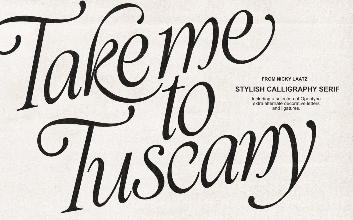
Take Me To Tuscany is a calligraphic italic built on exaggerated contrast: thick, ink-loaded downstrokes against fine hairline entries and exits. The slant is pronounced, the loops are large, and the whole lowercase alphabet leans toward decoration rather than restraint. Where a working script often trims its flourish to keep pace legible, this one keeps the flourish and asks the designer to manage the pacing instead.
The joins between letters are drawn with genuine calligraphic logic — you can see the pen angle change through a stroke rather than a uniform vector taper — which gives it more warmth than the flatter script fonts built from geometric curves. It reads as handwritten rather than digitally smoothed, and that is its main asset. The capitals carry the most ornament: extended entry strokes, swash tails, and terminals that curl well past the letter’s own width. Used at their intended scale, in a headline or a monogram, they carry real presence.
Character set and features
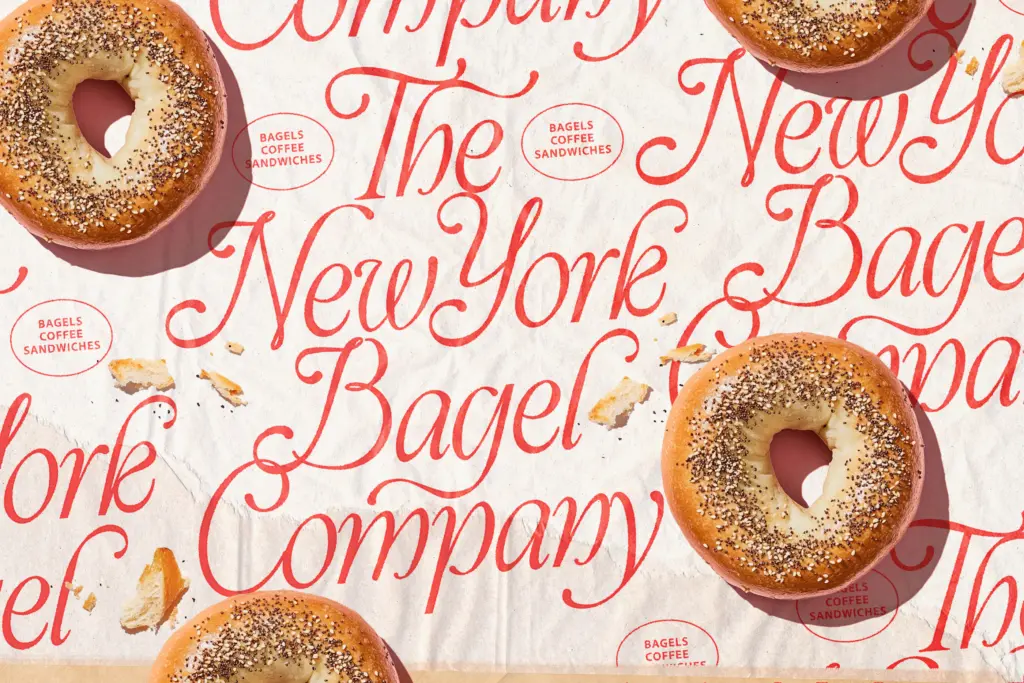
The bonus variant styles are the practical news here. Rather than one fixed weight and slant, the family ships with several close variants — small shifts in weight and angle — so a designer can swap between them to solve spacing problems without redrawing anything. This matters more than it sounds: with a script this ornate, a single word set in one style will often have a letter or two that collides awkwardly with its neighbour, and having an alternate cut on hand is a real fix rather than a gimmick.
Swash capitals and connecting flourishes are the headline features, and they do the job the seller claims — the letters do maintain their basic skeletal structure under the ornament, so words stay decipherable even at the more extravagant end of the swash set. But this is not a font for setting paragraphs. The seller’s claim of
What we liked, and what we didn’t
Strengths
- Genuine calligraphic stroke logic gives it warmth over generic script fonts
- Bonus variant styles offer real, practical flexibility for spacing and composition
- Swash capitals keep enough structure to stay legible despite the ornament
Trade-offs
- Not suited to body copy or small sizes — legibility drops fast beyond a few words
- Its heavy ornamentation limits it to a narrow, heritage/luxury aesthetic niche
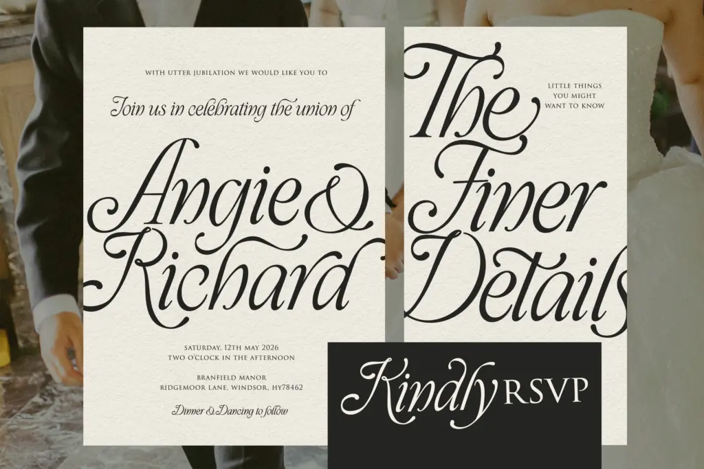
A well-drawn ornamental script that earns its keep on invitations, labels, and short branding lines. It's a specialist tool — decorative, slow to read in quantity, and best kept to a handful of words per use.

Tmfonts writes independent reviews of typefaces: what each font does well, where it falls short, what it suits, and where it is sold.