
The Native Record Font Trio Free Download
Is The Native Record Font Trio free to download?
The Native Record Font Trio is a commercial font sold on Creative Market, so the full version needs a paid license. Get it from the official listing: The Native Record Font Trio download.
Need something free? These script fonts from Google Fonts are free for personal and commercial use:
Design style
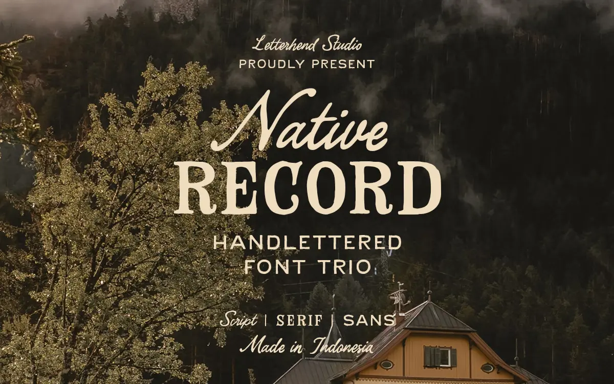
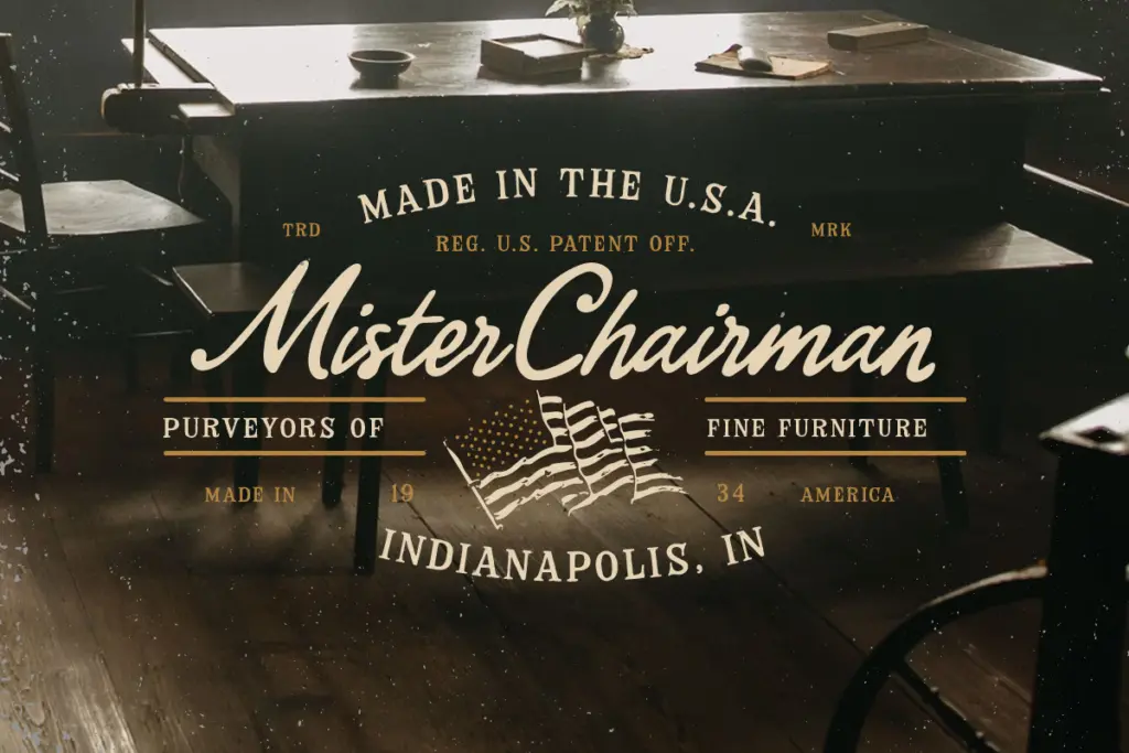
The Native Record is built as a three-part system rather than a single face: a hand-lettered script, a companion serif and a plain sans, all cut with the same worn, slightly uneven hand that reads as old-west signage rather than digital polish. The script carries most of the personality — strokes that swell and thin unevenly, joins that don’t quite line up the way a vector tool would default to, and a baseline that dips and rises like it was painted on a barn board rather than set in a grid. The serif is the more restrained of the three, with chunky, slab-ish feet and a bit of ink-trap roughness at the joins, while the sans strips things back further for a plain, blocky utility letter. None of the three is trying to be neutral. They all lean into a farmhouse, Americana mood, and that’s the whole point of buying a trio like this instead of a single script.
Character set and features
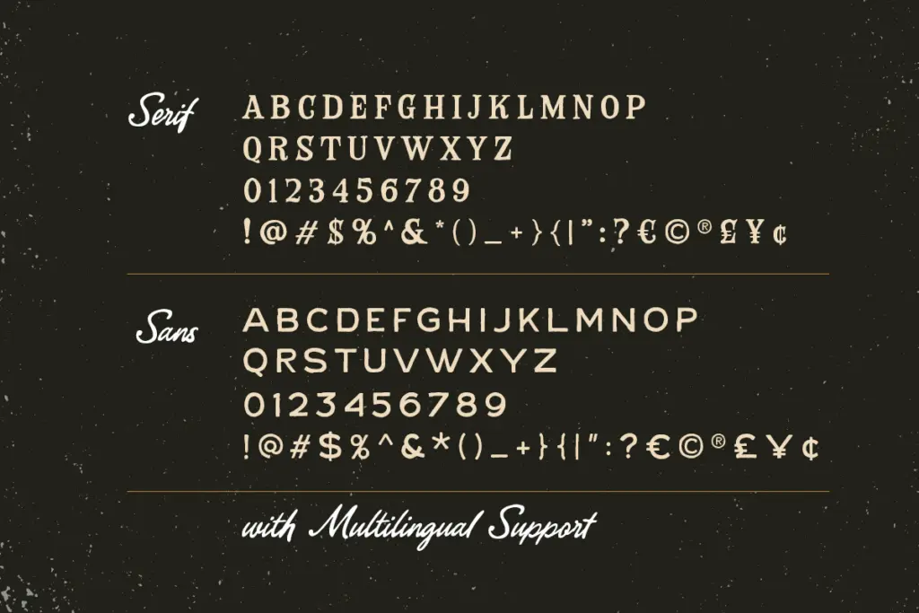
Each style comes with uppercase and lowercase, numerals and punctuation, and the script includes alternates and ligatures to break up repeated letter shapes — useful because hand-lettered scripts get monotonous fast without them. Multilingual support and PUA encoding mean the accented and special characters are reachable through the Private Use Area, which matters if you’re setting anything outside basic English and need glyph panel access rather than guessing keystrokes. The serif and sans are more workmanlike in their character sets, doing the job of anchoring the script rather than showing off. What’s harder to judge without hands-on testing is how deep the alternate set actually goes — a trio like this lives or dies on whether there are enough swash and word-final variants to avoid the letters visibly repeating in a short line of text, and that’s worth checking in a type tester before committing.
Use cases
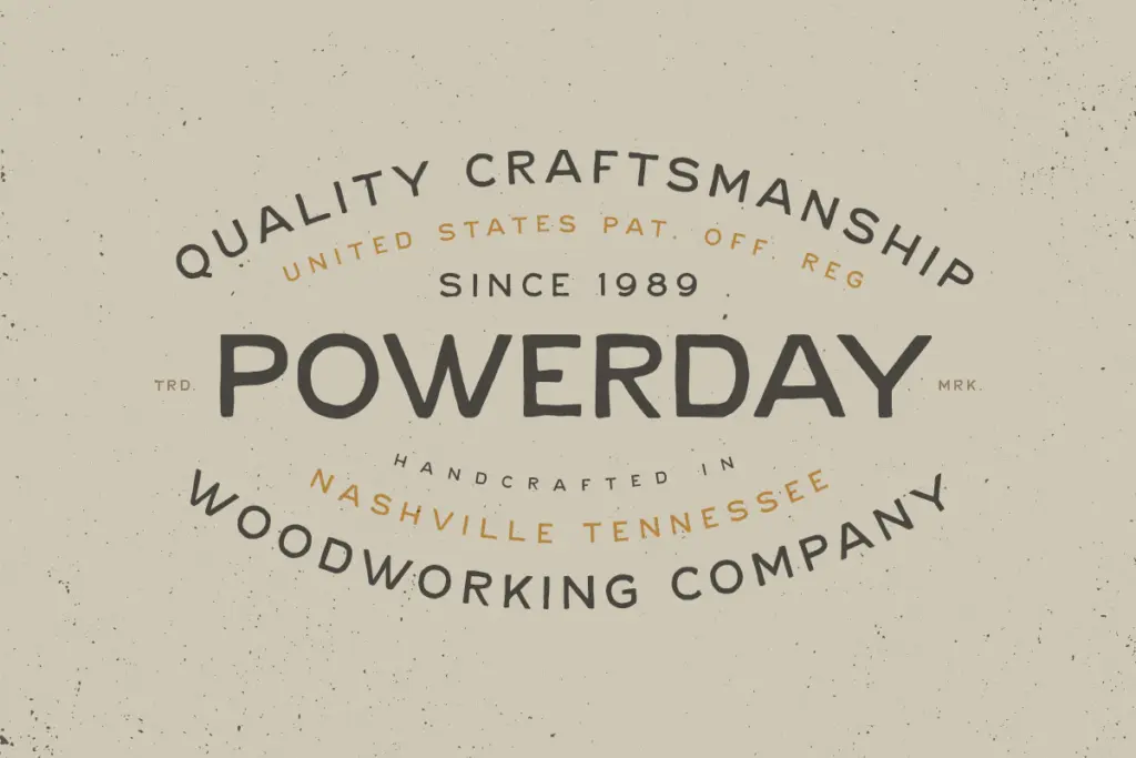
This is a badge-and-label system before it’s a body-text system. The combination suits product labels, country and western album covers, farm-to-table packaging, rustic wedding stationery, and logotypes that want to signal heritage, handcraft or an old-west register without going full blackletter or full grunge. The script works best at display sizes — headlines, wordmarks, hero text on a poster — where its irregularities read as character. Push it down to body copy and the uneven baseline and stroke contrast will fight legibility; that’s what the sans and serif partners are for, handling supporting text, addresses, ingredient lists or subheads where the script would get exhausting. The serif can also stand in as a secondary display face on its own, for a slightly less loud alternative to the script. Anyone building a brand identity that needs one hero mark and several supporting weights will get real mileage out of having all three drawn to match. Anyone looking for something clean, contemporary or corporate should look elsewhere — this is a specific, thematic tool, not a general-purpose family, and it will look out of place the moment a project doesn’t call for rustic warmth.
What we liked, and what we didn’t
Strengths
- Three matched styles (script, serif, sans) cover both hero lettering and supporting text needs.
- Alternates and ligatures in the script help avoid obvious letter repetition in short lines.
- Consistent rustic, hand-worked character across all three styles for cohesive branding.
Trade-offs
- The script's uneven baseline and stroke contrast make it unsuitable for anything below display sizes.
- The overall look is narrowly thematic and won't suit projects outside rustic or heritage branding.
The Native Record Font Trio delivers a coherent hand-lettered look across three complementary styles, which makes it genuinely useful for country and heritage branding jobs. The script is the star and works best kept large; the serif and sans do the supporting labor well. It's a specialist tool for a specific mood, not a do-everything family.

Tmfonts writes independent reviews of typefaces: what each font does well, where it falls short, what it suits, and where it is sold.