
Kindness Matters Font Free Download
Is Kindness Matters free to download?
Kindness Matters is a commercial font sold on Creative Market, so the full version needs a paid license. Get it from the official listing: Kindness Matters font download.
Need something free? These handwritten fonts from Google Fonts are free for personal and commercial use:
Design style
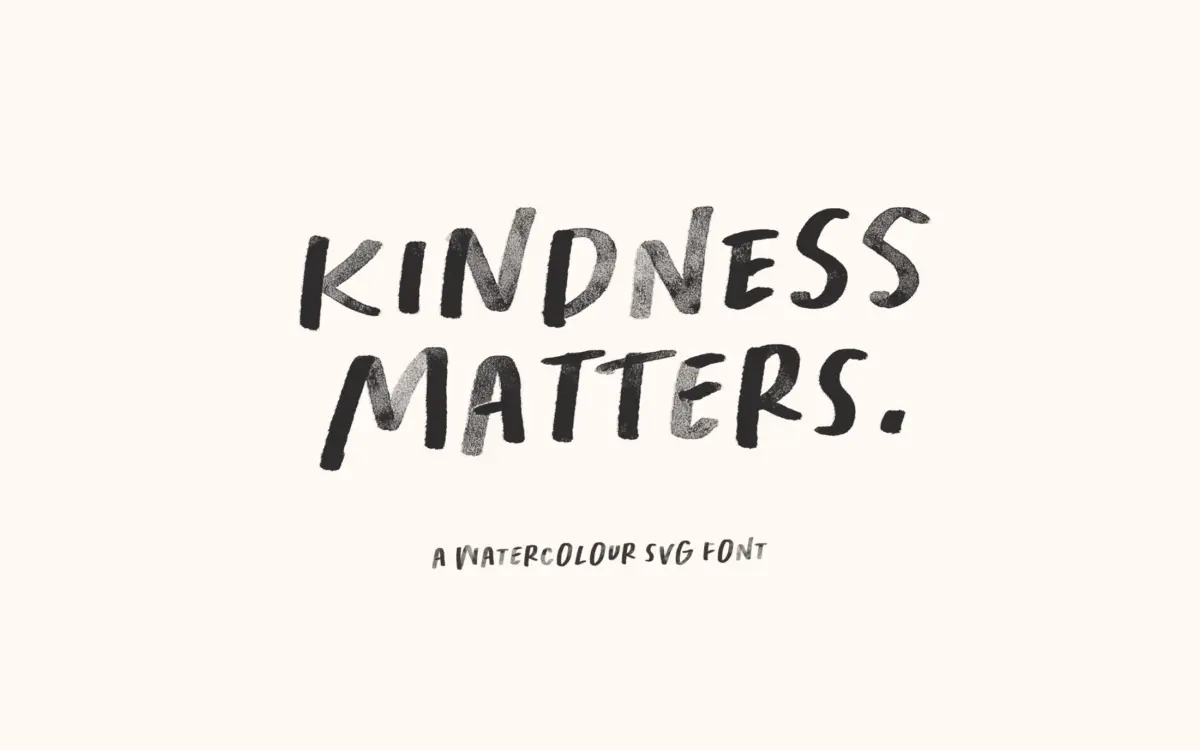
Kindness Matters is a handwritten, all-caps display face built around a watercolour texture baked directly into the letterforms. The SVG version carries visible pigment bleed, mottled edges and paint-brush irregularity in every stroke, so no two letters read as mechanically identical even though they come from the same glyph. The letters themselves are loose and rounded, with a childlike wobble to the baseline and stroke widths that shift as if drawn with a wet brush pressed unevenly onto paper. This is not a font that pretends to be handwriting rendered digitally clean — it leans into the mess, and that’s the point.
A plain regular version is included alongside the SVG face, stripped of the texture, which gives you a fallback for apps that don’t support colour fonts or for situations where you need a flatter mark. It’s a serviceable backup rather than a font in its own right — the charm here lives in the textured version.
Character set and features
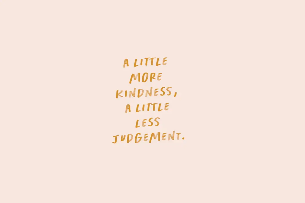
The set is English-only, uppercase, which limits it to short bursts of text rather than anything requiring mixed case or extended reading. Four bracket-triggered underline glyphs are tucked into the OpenType ligature feature, accessed by typing paired brackets — a nice touch for anyone building a hand-lettered logotype or quote card who wants a scribbled underline without hunting for a separate asset. Two duotone Photoshop styles are bundled too, letting you drop a watercolour overlay onto the SVG glyphs with one click, which pushes the texture further than the base font alone.
Because it’s an SVG font, it only renders its intended texture in software that supports colour/SVG glyphs — current Photoshop and Illustrator versions, mainly. Outside that pipeline you’re working with the plain regular face, so the software you design in matters more here than with a typical typeface.
Use cases
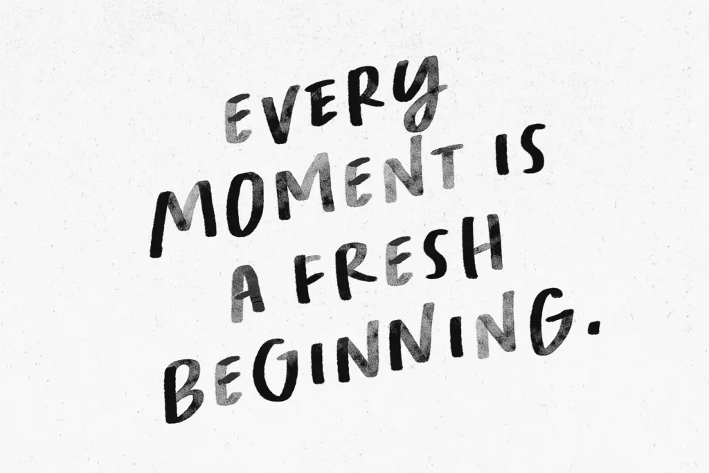
This is a font for short, declarative lines: a quote pulled from a longer piece, a birthday card greeting, a social post overlay, a poster headline. The watercolour texture and hand-drawn irregularity do real work at large sizes, where the paint bleed and brush variation are visible and add warmth. At small sizes or in dense text, both the texture and the all-caps handwriting style stop working — the letters blur together and the charm turns to noise, so this is not a font for paragraphs or captions.
It suits greeting cards, social graphics, quote graphics, and book covers or packaging that want a handmade, slightly whimsical voice rather than a polished one. Brands chasing a friendly, informal, DIY aesthetic will get more mileage from it than anything trying to look premium or restrained. Given the English-only, uppercase-only character set and the software dependency for the textured version, it’s best treated as a specialty display tool for a specific mood — not a workhorse typeface for a whole identity system.

What we liked, and what we didn’t
Strengths
- Genuinely convincing watercolour texture that reads well at large display sizes
- Bracket-triggered underline ligatures add a useful hand-lettered flourish without extra assets
- Includes a plain regular fallback for software without SVG font support
Trade-offs
- All-caps, English-only character set limits it to short phrases rather than running text
- Texture and legibility both degrade at small sizes, restricting it to headline and display use
Kindness Matters is a charming, texture-heavy display font that does one job well: short, warm, hand-painted-looking lines for cards and social graphics. It's not built for body text or complex layouts, and its best qualities only show up in software that supports SVG glyphs.

Tmfonts writes independent reviews of typefaces: what each font does well, where it falls short, what it suits, and where it is sold.