
Ugly Dave Font Free Download
Is Ugly Dave free to download?
Ugly Dave is a commercial font sold on Creative Market, so the full version needs a paid license. Get it from the official listing: Ugly Dave font download.
Need something free? These handwritten fonts from Google Fonts are free for personal and commercial use:
Design style
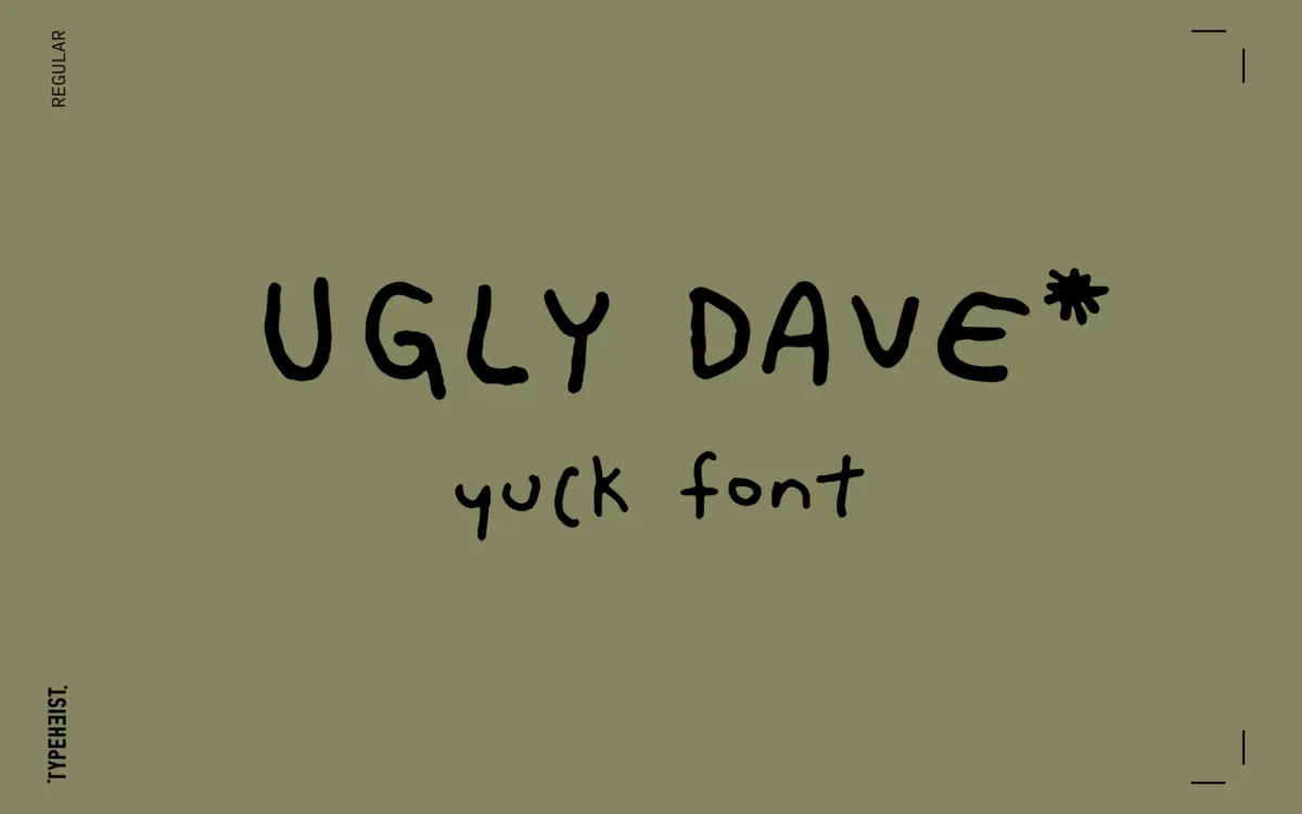
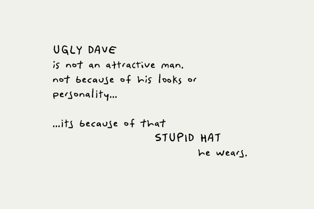
Ugly Dave sets out to look wrong on purpose. The strokes wobble, baselines drift, and letterforms lean at inconsistent angles, the way handwriting looks when someone is rushing, distracted, or simply has never had tidy penmanship. There’s no attempt at the studied imperfection you see in a lot of hand-lettered fonts, where a designer engineers randomness to feel organic. This is cruder than that, closer to a scrawl on a napkin. It reads as a joke typeface, and it knows it.
The letter construction is loose and childish, with strokes that don’t always meet cleanly and proportions that shift from one character to the next. That’s the point, but it means the typeface has almost no formal elegance to fall back on. It’s not aiming for charm in the way a casual script does. It’s aiming for the visual equivalent of a shrug.
Character set and features
The family includes a Regular weight plus an Alternates set, which gives you some room to break up repetition when the same letter shows up more than once in a line — a genuine practical touch for a font built around irregularity, since without alternates the wobble would start to look programmatic rather than random. English characters and accented glyphs are covered, so basic multilingual typing in Latin-based languages should work without hunting for missing marks. Files come in OTF, WOFF, and WOFF2, covering desktop and web use without much fuss.
There isn’t a bold or italic companion, and no numerals or punctuation set beyond the basics to speak of in the brief — this is a one-weight, one-mood typeface. It doesn’t pretend to be a full family, and treating it as anything more than a single flavour of scribble will disappoint.
Use cases
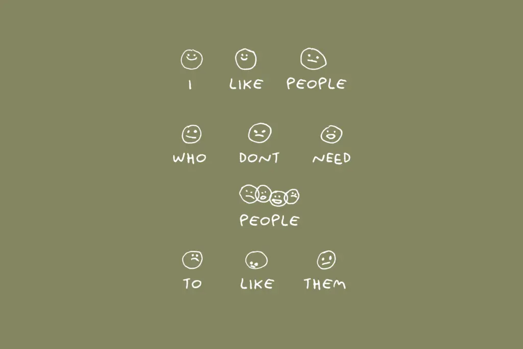
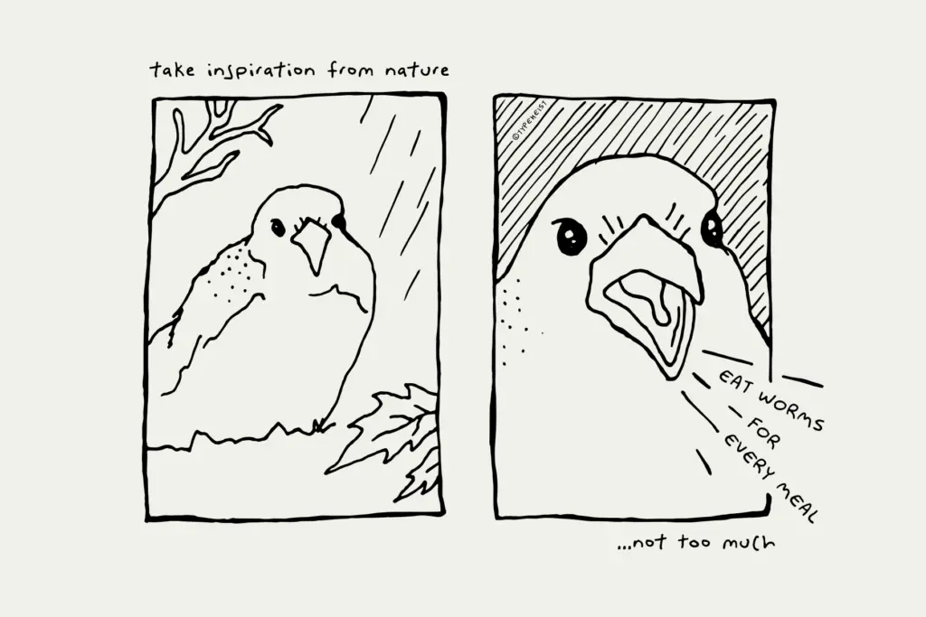
Ugly Dave works where the joke is the message: t-shirts and merch that riff on bad handwriting, meme graphics, gag greeting cards, packaging for a brand that’s leaning into an anti-polish aesthetic, or a poster that wants to look hand-scrawled and unserious. It could work as a texture element in a collage-style layout, dropped in as a note or annotation among cleaner type, where the contrast does the work.
It is not a font for body copy, and it shouldn’t be asked to carry a paragraph of any length — the irregularity that makes it funny at a glance turns into real strain on the eyes past a sentence or two. It’s also not a fit for anything that needs to read as sincere, professional, or elegant; the entire premise cuts against those goals. Treat it as a single punchline you reach for occasionally, not a typeface you build a brand system around, and it does its job.
What we liked, and what we didn’t
Strengths
- Alternates set breaks up repeated letters so the scrawl doesn't feel mechanical
- Covers accented Latin characters for basic multilingual typing
- Comes in web-ready formats alongside the desktop OTF
Trade-offs
- No bold, italic, or numeral variety to extend the single mood it offers
- Legibility drops quickly past a word or two, ruling out anything but short bursts of text
Ugly Dave does exactly what it says: it looks like bad handwriting, on purpose, and it commits to the bit. It's a narrow tool for a narrow job — jokes, merch, and anti-design moments — and falls apart fast outside that lane.

Tmfonts writes independent reviews of typefaces: what each font does well, where it falls short, what it suits, and where it is sold.