
Acrylic Hand Font Free Download
Is Acrylic Hand free to download?
Acrylic Hand is a commercial font sold on Creative Market, so the full version needs a paid license. Get it from the official listing: Acrylic Hand font download.
Need something free? These handwritten fonts from Google Fonts are free for personal and commercial use:
Design style
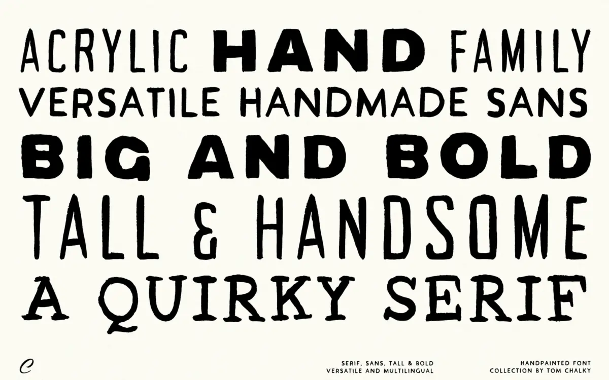
Acrylic Hand is built around a dry-brush aesthetic — the kind of mark you get from a stiff bristle running low on paint, with edges that fray rather than seal. The collection gives you three related styles: a tall sans, a regular-width sans, and a thick sans, plus a serif that reads as the odd one out in tone, looser and more idiosyncratic than its sans siblings. The strokes carry visible texture throughout, with breaks and rough transitions at the terminals that read as intentional rather than accidental.
This is not a polished brush script trying to look effortless. It leans into the opposite: visible effort, visible tool, visible hand. The tall sans in particular has a poster quality, letters stretched vertically so they hold their own at large sizes without feeling stretched-thin. The thick weight does the heavy lifting for anything that needs to shout, while the regular width is the more usable middle ground for shorter runs of text.
Character set and features
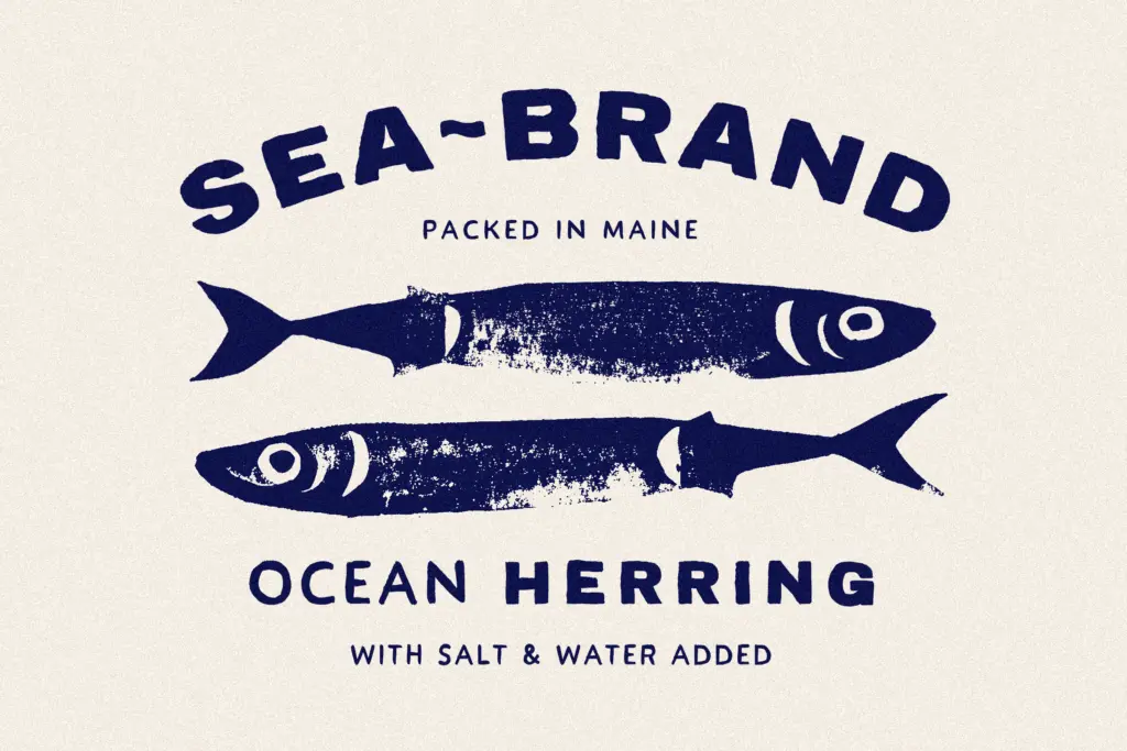
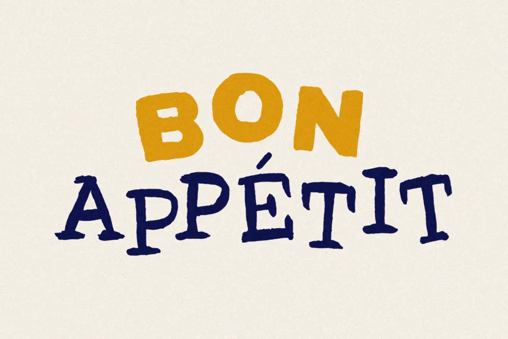
Each of the four styles functions as its own standalone font rather than a single family with shared metrics, so mixing them means designing each line separately rather than relying on automatic pairing. The serif is the most textured of the set — its serifs are stubby and irregular, almost carved rather than drawn, which gives it a distinct personality but also makes it the hardest of the four to use for anything beyond a word or two.
The brief doesn’t specify extended language support or OpenType features like ligatures or alternates, so treat this as a display set built for headline-length words rather than a system with contextual substitution. That’s consistent with how brush collections like this are typically built: each letter is drawn once, and the
What we liked, and what we didn’t
Strengths
- The tall sans has real poster presence at large sizes without feeling gimmicky.
- The dry-brush texture is consistent and convincing across all four styles.
- Four distinct weights give some flexibility for headline hierarchy within one purchase.
Trade-offs
- No stated support for ligatures, alternates, or extended language coverage, so treat it as headline-only.
- The heavy texture makes anything beyond a word or two hard to read comfortably.
Acrylic Hand delivers a convincingly rough, hand-brushed texture across four related display styles, and the tall sans is the standout for poster and packaging headlines. It's a one-note collection best kept to short bursts of text — anyone hoping for a workable running-text companion will need to look elsewhere.

Tmfonts writes independent reviews of typefaces: what each font does well, where it falls short, what it suits, and where it is sold.