
Seriously Nostalgic Serif Font Free Download
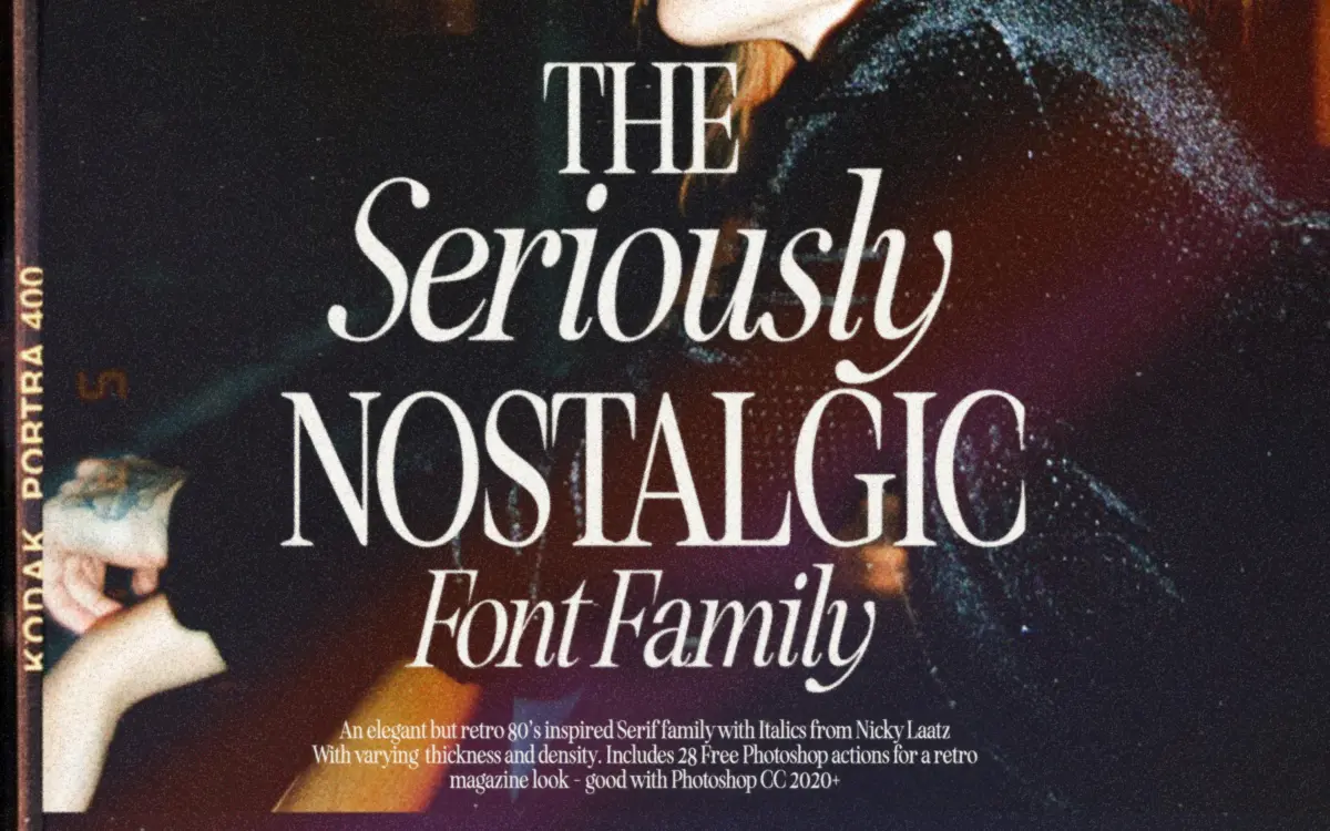
Is Seriously Nostalgic Serif free to download?
Seriously Nostalgic Serif is a commercial font sold on Creative Market, so the full version needs a paid license. Get it from the official listing: Seriously Nostalgic Serif font download.
Need something free? These serif fonts from Google Fonts are free for personal and commercial use:
Design style
Seriously Nostalgic Serif is built around a specific memory: the glossy magazine mastheads and cosmetics ads of the 1980s, where serifs had just enough contrast to look expensive without tipping into old-world formality. Nicky Laatz has drawn a serif with high waists, tight apertures and a slightly clipped, confident stance. It doesn’t try to look handmade or distressed. The nostalgia here is about proportion and attitude, not texture.
The family comes in two contrast levels — a crisper, higher-contrast cut and a softer one with less stroke variation — plus a complementary italic. That’s a sensible way to split the difference between a font that reads as a fashion serif and one that stays legible in body settings. The condensed variants push the letterforms narrower without losing the vertical stress that gives the design its period character, which is the more interesting part of the package: condensing a serif usually flattens its personality, and here it mostly survives the squeeze.
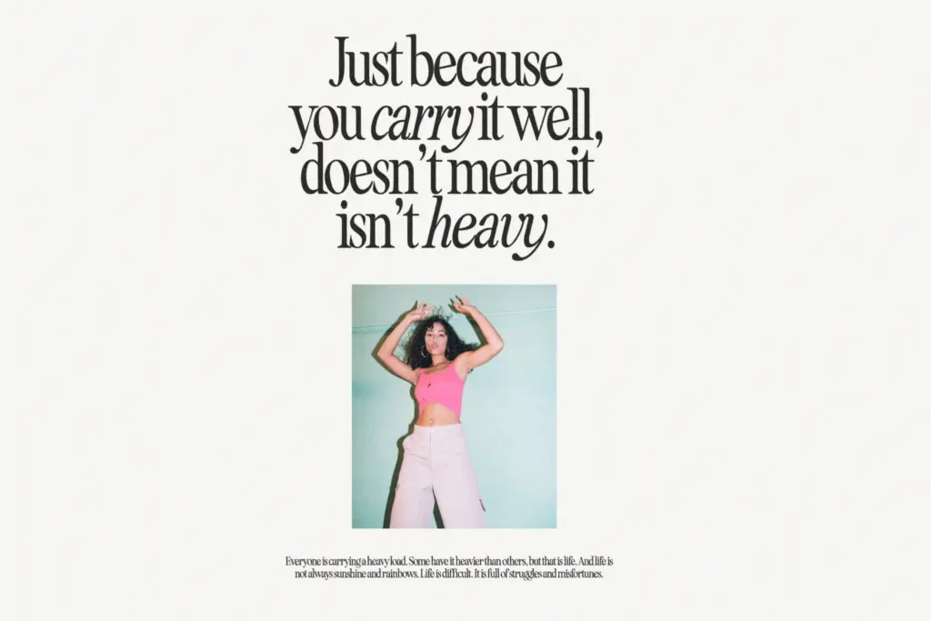
Character set and features
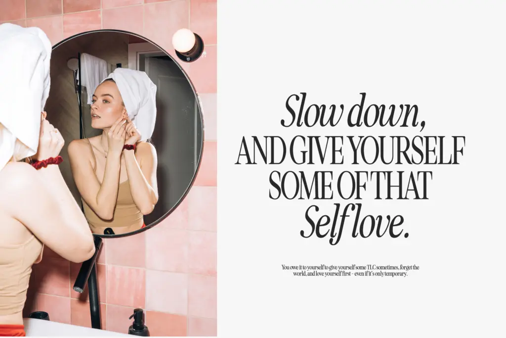
As a display serif family, the useful range is in its variety of cuts rather than in exotic character coverage. Having two contrast levels and an italic gives a designer real room to mix weights and widths within a single piece — a condensed high-contrast headline over a wider, softer subhead, for instance, without reaching for a second typeface. That mix-and-match structure is clearly the point of the release, and it works better than most
What we liked, and what we didn’t
Strengths
- Multiple contrast levels and widths genuinely work together as a mix-and-match system
- The condensed cuts keep their serif character instead of flattening out
- Italic complements the roman without feeling like an afterthought
Trade-offs
- High contrast and tight apertures make it unreliable at small text sizes
- The period reference is narrow, so it won't suit projects outside that retro-editorial mood
Seriously Nostalgic Serif nails a specific eighties-editorial mood with real structural thought behind its multiple cuts. It's a headline and branding tool first, not a text face, and buyers should plan accordingly.

Tmfonts writes independent reviews of typefaces: what each font does well, where it falls short, what it suits, and where it is sold.