
Berantakan Tapi Gapapa Font Free Download
Is Berantakan Tapi Gapapa free to download?
Berantakan Tapi Gapapa is a commercial font sold on Creative Market, so the full version needs a paid license. Get it from the official listing: Berantakan Tapi Gapapa font download.
Need something free? These handwritten fonts from Google Fonts are free for personal and commercial use:
Design style
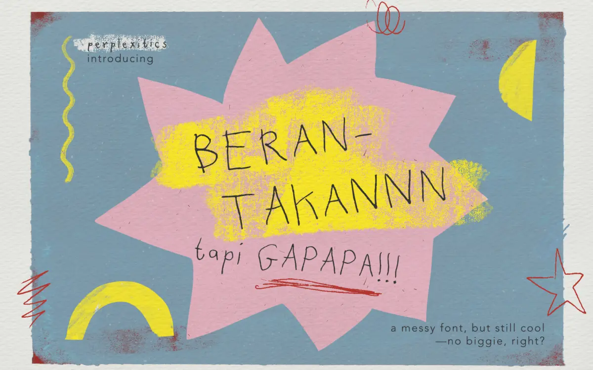
Berantakan Tapi Gapapa translates roughly to “messy but it’s okay” in Indonesian, and the name is an honest description of the design brief. This is a handwritten doodle font built around visible imperfection: strokes wobble, baselines drift, and letters look like they were drawn quickly with a felt-tip marker rather than traced from calligraphy. The name suggests a certain self-awareness about the roughness, and the drawing follows through on that idea rather than apologising for it.
The letterforms lean childlike more than they lean crafted. There’s no attempt at consistent stroke contrast or a disciplined x-height — the whole point is that it looks unplanned. That’s a legitimate design position, but it means the font lives or dies entirely on tone. If you want warmth and a bit of chaos, it delivers. If you want handwriting that reads as considered or premium, look elsewhere.
Character set and features
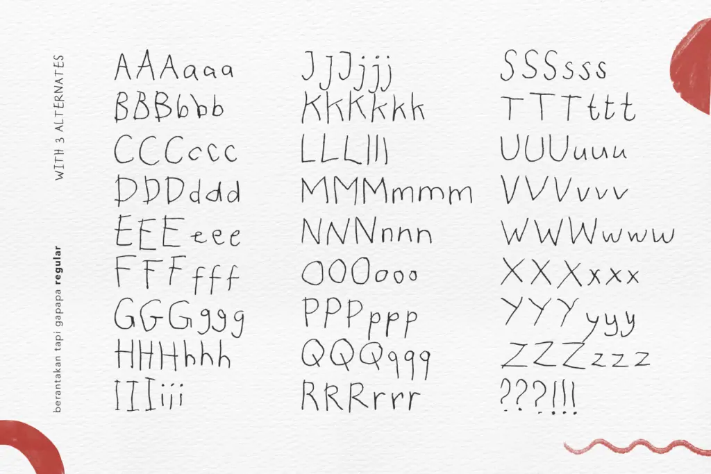
The package covers uppercase, lowercase, numerals, and punctuation, with alternate letterforms included both within the base font and as three separate alternate files. That’s a sensible way to handle a doodle font, since swapping in different glyph variants for repeated letters is what keeps a messy face from looking mechanically repetitive across a paragraph. Multilingual support extends to a broad range of Latin diacritics, so accented European languages are covered.
What’s missing from the brief is any indication of true alternates or ligatures beyond the three alt files, or any OpenType contextual substitution that would randomise glyphs automatically. That means the variation has to be applied manually — you pick which alt file or which glyph to drop in, rather than the font doing it for you as you type. For short headlines that’s no burden. For long-form setting, it turns into manual labour, and skipping it risks the repetition the alternates were meant to prevent in the first place.
Use cases
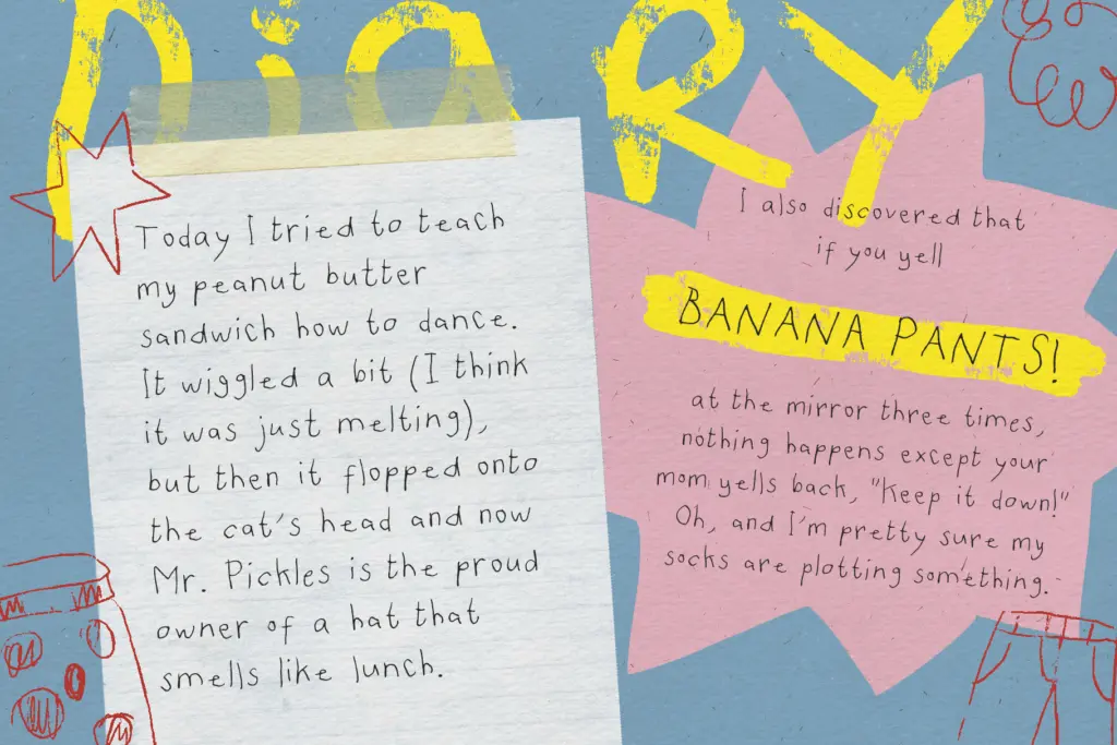
This is a font for surfaces where charm matters more than polish: hand-lettered social posts, zine layouts, scrapbook pages, craft packaging, kids’ activity sheets, and quick DIY signage. It suits brands that want to signal approachability and a bit of irreverence — a coffee cart, a small-batch product label, a children’s event flyer — anywhere a stiff, corporate hand would feel wrong.
It is not a body-text font. The irregularity that makes it charming at display sizes becomes fatiguing and hard to track in a paragraph of running copy, so keep it to headlines, short captions, and standalone words. It also isn’t the right choice if the brand needs to read as trustworthy or formal — the wobble undercuts any claim to precision. Used sparingly, as an accent voice against a plainer sans or serif for body copy, it does its job well: injecting a scrappy, human moment into an otherwise tidy layout.
What we liked, and what we didn’t
Strengths
- Alternate letterforms and separate alt files help break up repetition in short display text
- The wobble reads as intentional rather than sloppy, giving it real doodle character
- Broad diacritic support makes it usable across several European languages
Trade-offs
- No automatic glyph substitution, so avoiding repetitive letters means manual swapping
- Loses legibility quickly at paragraph length or small sizes
Berantakan Tapi Gapapa is a competent messy-doodle display font that does one job — casual, childlike charm — reasonably well. It's not built for body text or formal branding, and the alternates require manual effort rather than automatic variation, but for short-form, playful design work it earns its keep.

Tmfonts writes independent reviews of typefaces: what each font does well, where it falls short, what it suits, and where it is sold.