
Optika Font Free Download
Is Optika free to download?
Optika is a commercial font sold on Creative Market, so the full version needs a paid license. Get it from the official listing: Optika font download.
Need something free? These sans serif fonts from Google Fonts are free for personal and commercial use:
Design style
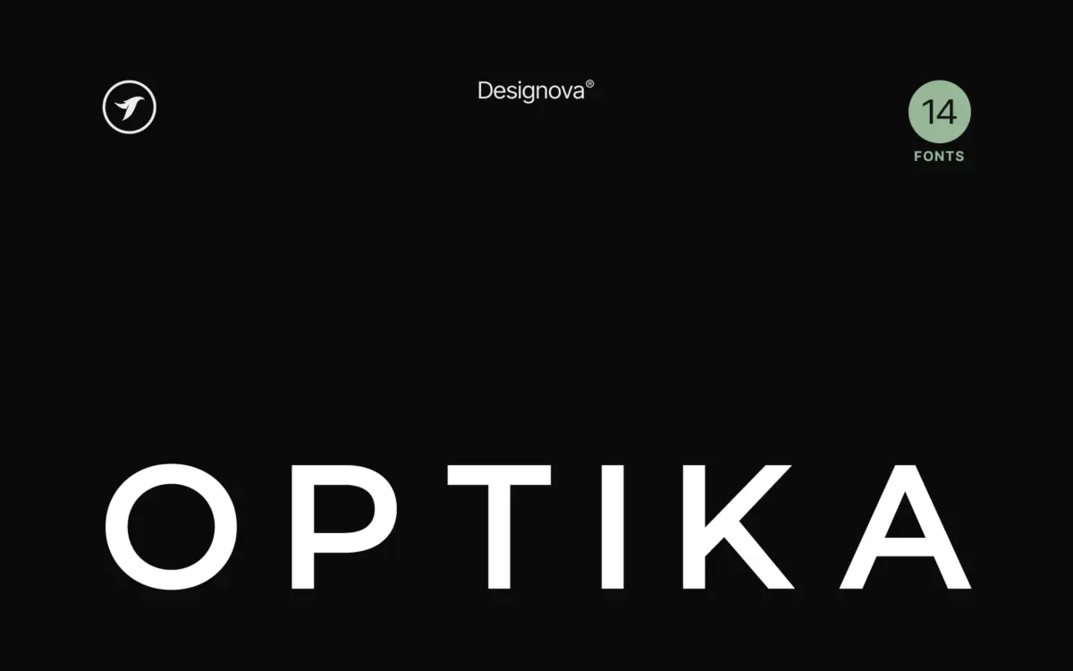
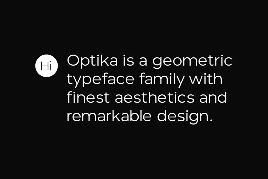
Optika sits squarely in the geometric-adjacent minimalist camp: even stroke weight, restrained curves, and letterforms that seem to have had every unnecessary flourish sanded off. The counters are open, the apertures wide, and there’s little in the way of quirky detailing to distract from the overall shape of a word. It reads as a family designed to disappear into a brand system rather than announce itself.
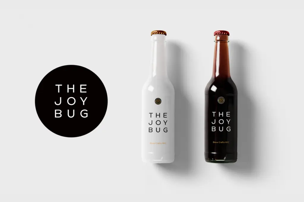
The skeleton leans toward a squared-off geometric structure rather than a humanist one — verticals are true, curves are simple arcs rather than modulated forms. This is the kind of drawing that photographs well in a logo mockup: it holds up as a mark, not just as a paragraph of text. The trade-off is that at close inspection the letterforms don’t offer much personality of their own. This is a typeface built to serve the composition around it, not to be looked at directly.
Character set and features
As a 14-style family, Optika gives you a working weight range to move through — light to bold territory, useful for building hierarchy within a single brand voice rather than mixing typefaces. Having that many weights in one coherent skeleton is the practical value here: a headline, a subhead, and a caption can all come from the same design without hunting for a compatible pairing.
The letter spacing is tight by default, which works in its favour for display use — bring the tracking in and words compress into tidy blocks, useful for logotypes and wordmarks. Push the tracking out, as the seller suggests, and the same letters open into the kind of airy, minimal headline treatment that’s become a staple of contemporary branding work. Beyond the weight range, there’s not much to point to in terms of alternates or special features — this is a family that keeps its toolkit simple, in keeping with the name.
Use cases
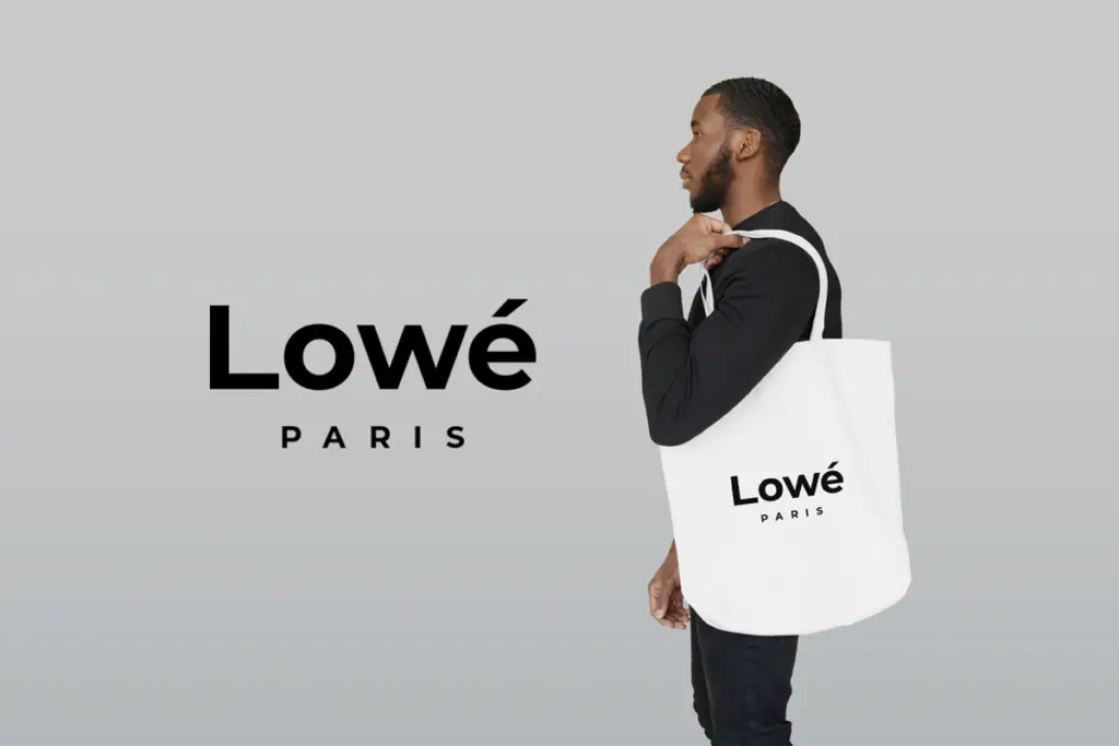
Optika’s natural home is branding and identity work: logotypes, wordmarks, packaging typography, the kind of headline that needs to sit above a hero image without competing with it. The wide weight range means a single studio could build an entire identity system — logo, headline, body copy — from this one family, which is a real convenience when consistency matters more than variety.
It’s less suited to long-form reading. The plainness that makes it useful for a two-word headline becomes a liability across paragraphs of body copy, where more characterful sans serifs give the eye more to hold onto. Editorial designers looking for a workhorse text face should look elsewhere; this is a display and identity tool first.
For posters, signage, and marketing collateral where a clean, undecorated sans is called for, Optika does the job without fuss. It won’t be the typeface anyone remembers by name, but that’s often exactly the brief.
What we liked, and what we didn’t
Strengths
- A 14-weight range wide enough to build an entire brand system from one family.
- Tight default spacing that compresses cleanly into logotype and wordmark treatments.
- Simple geometric skeleton photographs well as a standalone mark or logo.
Trade-offs
- Letterforms carry little individual character, so it can feel interchangeable with other minimalist sans families.
- Not built for long-form reading — body copy performs noticeably weaker than headline settings.
Optika is a competent, unfussy minimalist sans that earns its keep in branding and headline work rather than body text. The 14-weight range is its real strength, giving one studio enough tools to build a full identity system without hunting for a pairing. It won't turn heads on its own, but that's not really the assignment.

Tmfonts writes independent reviews of typefaces: what each font does well, where it falls short, what it suits, and where it is sold.