
Nostalgia Font Free Download
Is Nostalgia free to download?
Nostalgia is a commercial font sold on Creative Market, so the full version needs a paid license. Get it from the official listing: Nostalgia font download.
Need something free? These script fonts from Google Fonts are free for personal and commercial use:
Design style
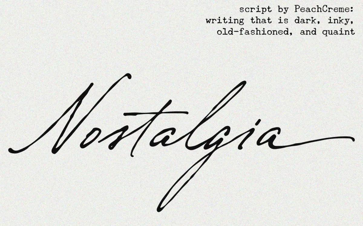
Nostalgia belongs to the well-populated family of connecting scripts built to look like they came off a dip pen. The letters lean forward, the strokes swell and thin the way ink does when a nib drags and lifts, and the whole thing carries a slightly worn, handwritten quality rather than the polished ribbon-swirl of a formal calligraphic face. It reads as intimate and a bit rough at the edges, which is presumably the “vintage” in the name — this isn’t a font aiming for wedding-invitation perfection so much as the feel of a letter written by someone with decent handwriting and a favourite pen.
The lowercase swashes on entry and exit strokes are the main personality trait here. They’re generous, looping down and up past the baseline and x-height, and they’re what makes the connecting joins between letters look continuous rather than stitched together. Where the design earns its keep is in that flow: letters genuinely feel like they were written in one pass, not built letter by letter and hoping the kerning would hide the seams. Where it costs you is at small sizes or tight tracking, where those same swashes start colliding with neighbouring letters and the page gets busy.
Character set and features
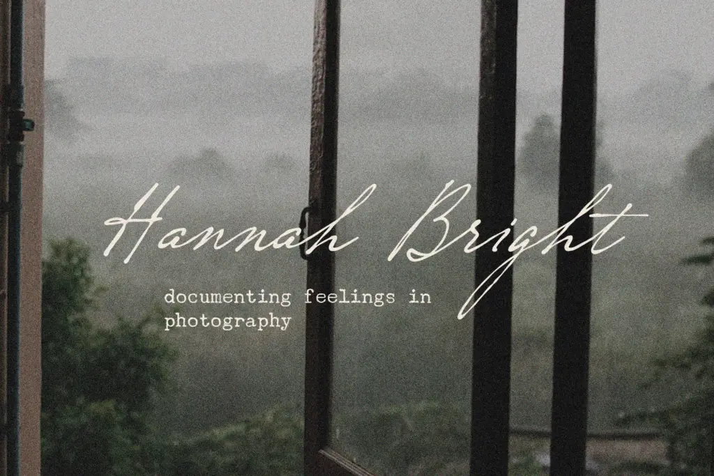
The set covers the basics — upper and lowercase, numerals, and standard punctuation — enough to typeset an invitation suite or a short headline without hunting for missing glyphs. It’s not pitched as a font with an expansive alternates system or a deep ligature library; this is a straightforward, single-style script rather than a family with multiple weights or contextual variants to swap between. That’s fine for what it’s built to do, but designers expecting OpenType-heavy substitution sets for automatic connecting logic should adjust expectations — a lot of the flow here is baked into fixed letterforms rather than programmatically solved.
Legibility is reasonable for a script in this bracket. The seller’s claim that it’s “very simple to read” holds up better in short bursts — a name, a date, a single line — than in long-form settings, where the forward lean and joined strokes start to ask more of the reader. It’s formatted for OTF, TTF, and web formats, so it’ll drop into most design and web workflows without conversion headaches.
Use cases
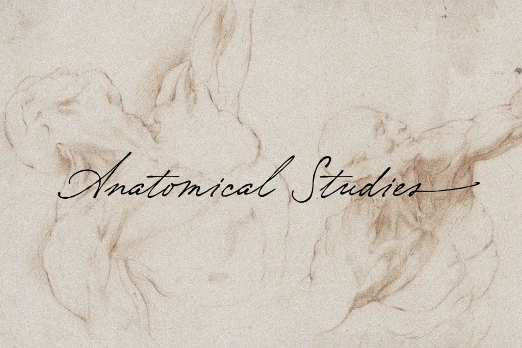
This is a font for the parts of a project that are meant to feel personal: the bride and groom’s names on a save-the-date, a short Valentine’s message, a monogram or a logotype for a small feminine-leaning brand. It performs best set large — headline, title, or feature-word duty — where the swash detail and ink-flow variation actually register rather than muddying together.
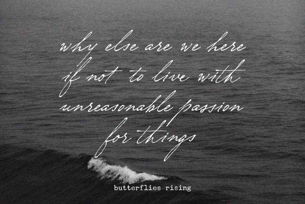
It’s a weaker choice for body copy, dense signage, or anything that needs to hold up at a glance from a distance; the connecting swashes need room to breathe. Pair it with a plain sans or a quiet serif for supporting text, and let Nostalgia carry the one line that’s supposed to feel handwritten.
What we liked, and what we didn’t
Strengths
- Swashed entry and exit strokes give a genuine sense of continuous, one-pass handwriting
- Comes ready in OTF, TTF, WOFF and WOFF2 for easy drop-in across print and web workflows
- Strong at large sizes for names, monograms and short feature lines
Trade-offs
- Swash collisions make it hard to read in dense or long-form settings
- Single-style script with no alternate glyph system for designers wanting more control over joins
Nostalgia does one job well: short, personal-feeling lines that need to look handwritten rather than typeset. It gets crowded fast at small sizes or long settings, and it's a single-style script rather than a deep OpenType system, but for names, dates and headlines it has real warmth.

Tmfonts writes independent reviews of typefaces: what each font does well, where it falls short, what it suits, and where it is sold.