
Lourdes Signature Font Free Download
Is Lourdes Signature free to download?
Lourdes Signature is a commercial font sold on Creative Market, so the full version needs a paid license. Get it from the official listing: Lourdes Signature font download.
Need something free? These script fonts from Google Fonts are free for personal and commercial use:
Design style
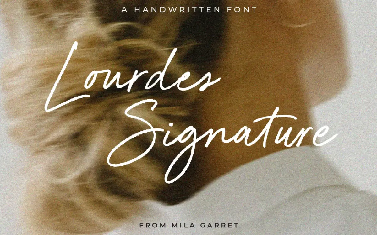
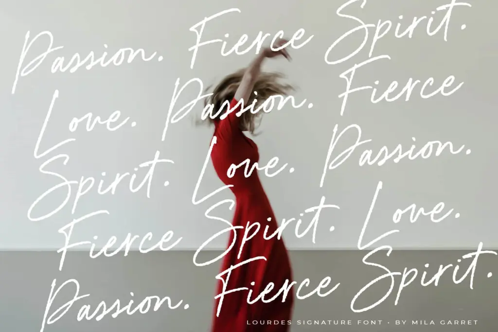
Lourdes Signature sits in the crowded field of monoline handwriting scripts, but it leans toward the drier, more restrained end of that spectrum. The stroke stays a consistent weight throughout, with none of the ink-blot swelling that some scripts pile on to fake spontaneity. What gives it texture instead is a slightly rough edge to the strokes, a hint of a dry pen dragged across paper rather than a smooth vector line. It reads as handwritten without straining for effect.
The letterforms lean forward at a gentle, consistent angle and connect in a way that mimics real cursive movement rather than mechanically joined glyphs. Ascenders and descenders keep their loops small and controlled, which keeps the overall texture even rather than spiky. It is not a flashy script. There is no calligraphic contrast, no flourish-heavy capitals, no dramatic swash reaching across three lines of text. That restraint is the point: this is a script built to sit quietly rather than perform.

Character set and features
The headline feature is the ligature set, said to run past 160 combinations covering common double and triple letter pairings. In practice this is what separates a good monoline script from a mediocre one — without ligatures, repeated letters like
What we liked, and what we didn’t
Strengths
- Consistent monoline weight keeps it legible at smaller sizes than many scripts manage
- Large ligature set smooths over awkward repeated-letter combinations
- Restrained, non-flourished character suits minimal and casual branding work
Trade-offs
- Lacks the dramatic flourishes some buyers expect from a signature-style script
- Not built for long-form setting or paragraphs of text
Lourdes Signature is a competent, understated monoline script well suited to short branding moments rather than showpiece display work. It won't turn heads on its own, but it does its modest job cleanly.

Tmfonts writes independent reviews of typefaces: what each font does well, where it falls short, what it suits, and where it is sold.