
The Silver Editorial Serif Font Free Download
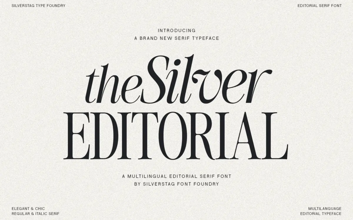
Is The Silver Editorial Serif Font free to download?
The Silver Editorial Serif Font is a commercial font sold on Creative Market, so the full version needs a paid license. Get it from the official listing: The Silver Editorial Serif font download.
Need something free? These serif fonts from Google Fonts are free for personal and commercial use:
Design style
The Silver Editorial belongs to that lineage of high-contrast display serifs that got their start in glossy magazine mastheads and fashion spreads. You can see the 1980s reference in the way the thick strokes swell and then snap thin at the joins, and in terminals that flare just enough to feel drawn rather than engineered. It’s a style built for confidence: tall x-height relative to the cap height, generous shoulders on the bowls, and a general refusal to whisper.
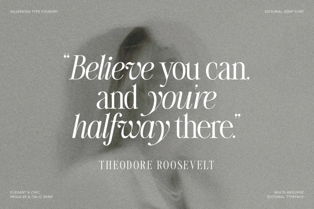
Where it departs from its inspiration is in the cleanup. The seller describes stripping away excess, and that shows in the restraint on the serifs themselves — they’re present and pointed but not fussy, without the decorative flourishes that would tie this to a specific decade rather than a mood. The italic leans harder into personality, with a more cursive slant and looser joins that give it a different register from the upright, useful if you want a secondary voice within the same family rather than a simple obliqued clone.
Character set and features
Ligatures are the headline feature here, and they matter more than usual for a serif this dramatic — the high contrast strokes can collide awkwardly at certain letter pairs without them, and the ligature set is clearly built to solve exactly that. Multilingual support is claimed, which extends the font’s usefulness beyond English-only headline work, though as with any diacritic-heavy language you’ll want to proof accented characters at your working size before committing to a layout.
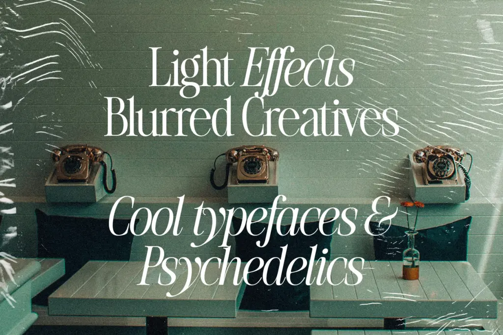
The contrast that makes this typeface distinctive is also its main constraint. At small sizes, the thin strokes start to disappear or flicker on screen, and the ligatures — lovely at 60pt — can muddy at 10pt. This is a headline font first, and the character set seems to know it: the drawing invests in the letterforms that show up big, not in the fine-tuning that would make it hold up as long-form text.
Use cases
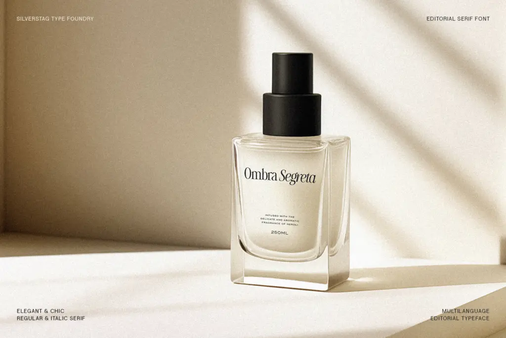
This sits comfortably in editorial work — mastheads, pull quotes, section openers — which is presumably where the name comes from. It also does well in branding contexts that want a fashion or lifestyle register: packaging, retail signage, invitation suites, anywhere a single striking word or short phrase needs to carry visual weight. Logo work is plausible too, provided the mark stays large enough that the thin strokes don’t vanish when scaled down to a favicon or embroidered tag.
It’s less suited to body copy, dense product listings, or anything that needs to survive a busy printed page at small point sizes. Pair it with a plain, low-contrast sans or a quieter serif for supporting text, and let this one do the shouting. Used sparingly, at size, it earns its drama; used everywhere, it becomes exhausting.
What we liked, and what we didn’t
Strengths
- High-contrast strokes and flared terminals give it real presence at large sizes
- Ligature set is genuinely useful for smoothing collisions between the thick and thin strokes
- Italic has its own distinct, more cursive character rather than being a simple slant
Trade-offs
- Thin strokes lose definition and can flicker at small sizes or on low-resolution screens
- Not suited to body copy or dense layouts — it needs a supporting typeface for anything but headlines
The Silver Editorial is a confident, high-contrast display serif that does one job — big, dramatic headlines — genuinely well. It's not built for body text or small sizes, and buyers should treat it strictly as a display face paired with something quieter.

Tmfonts writes independent reviews of typefaces: what each font does well, where it falls short, what it suits, and where it is sold.