
Vintage Rhyme Font Free Download
Is Vintage Rhyme free to download?
Vintage Rhyme is a commercial font sold on Creative Market, so the full version needs a paid license. Get it from the official listing: Vintage Rhyme font download.
Need something free? These serif fonts from Google Fonts are free for personal and commercial use:
Design style
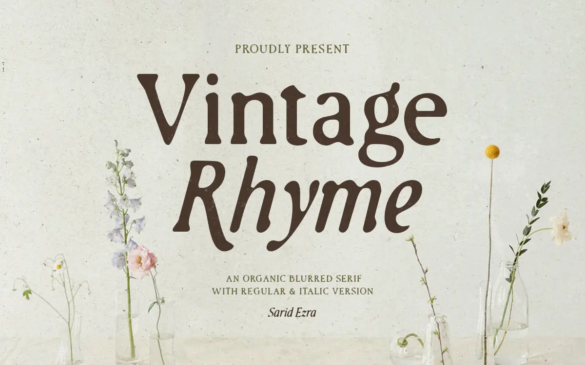
Vintage Rhyme is a serif built to look like it came off a badly-inked letterpress rather than off a screen. The letterforms carry a soft, blurred edge, like ink that has bled slightly into uncoated paper. That’s clearly the point: this isn’t a clean revival, it’s a texture-first display serif that wears its roughness deliberately.
The construction underneath the texture is fairly traditional serif skeleton — moderate contrast, bracketed serifs, an upright regular paired with a companion italic. Take away the blur and you’d have a serviceable, slightly rustic text serif. With the blur left in, it reads as handmade, closer to a stamped mark or a distressed letterpress print than a typeface drawn on a grid. It’s an aesthetic choice more than a structural one, and it’s consistent across the character set, which keeps the family from feeling like a gimmick applied unevenly.
Character set and features
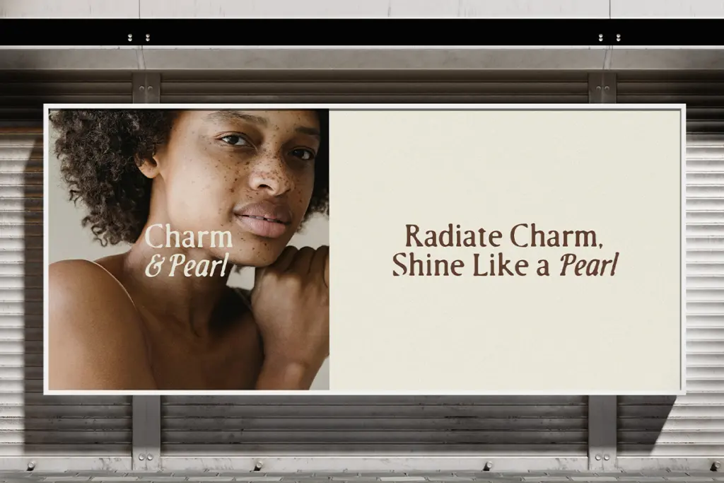
The family gives you a regular and an italic, meant to be used together rather than as two unrelated options — the italic reads as the natural companion voice, useful for accenting a word or two inside a mostly-regular layout. The seller notes multi-language support, which widens the practical reach of the font beyond a narrow Latin set, though the brief doesn’t specify which scripts or diacritics are covered, so it’s worth checking coverage for your particular market before committing.
Because the blur is baked into the outlines, every letter carries the same soft, slightly uneven edge — there’s no crisp fallback version bundled in, at least none described here. That’s fine if the texture is what you’re buying it for, but it does mean the font has one register: worn, not polished. There isn’t a clean weight to switch to when a client asks for something more corporate.
Use cases
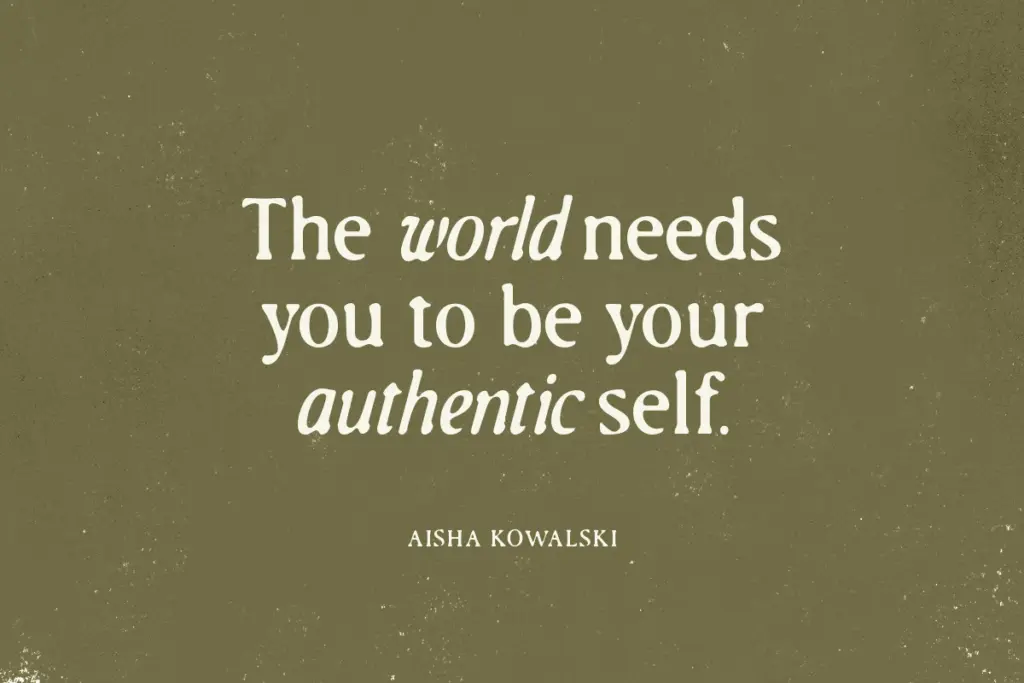
This is a font for surfaces, not paragraphs. It suits logotypes for coffee, craft goods, small-batch food and drink, or any brand that wants to signal handmade authenticity rather than efficiency. Wedding invitations are a reasonable fit too, particularly for couples going for a rustic or vintage theme rather than a formal, engraved look — the blur reads as warmth rather than sloppiness at the right size.
Keep it large. The soft edges that give it character at headline size will start to look genuinely blurry, not stylistically blurred, once you push it down into body copy or small labels. This is a display font, and it should be treated as one: set it big, give it room, and let the texture do the work rather than fighting it with tight leading or small point sizes. It also pairs better with a clean, quiet sans or serif for supporting text than with anything else similarly busy — two textured typefaces on one layout will compete rather than cooperate.

What we liked, and what we didn’t
Strengths
- The blurred texture is applied evenly across the character set, not just a few showcase letters.
- The italic companion gives the family a natural way to add emphasis without switching typefaces.
- Works well at logo and headline scale for handmade, rustic or craft-oriented branding.
Trade-offs
- The texture makes it unreadable at small sizes, ruling out body copy entirely.
- There's no clean, un-blurred alternate for projects that later need a tidier tone.
Vintage Rhyme is a competent one-trick display serif: the blurred, handmade texture is well executed and consistent, but it locks the font into a single register. It's a solid pick for rustic branding and invitations at large sizes, less useful anywhere that needs a clean fallback.

Tmfonts writes independent reviews of typefaces: what each font does well, where it falls short, what it suits, and where it is sold.