
Lucid Wake Font Free Download
Is Lucid Wake free to download?
Lucid Wake is a commercial font sold on Creative Market, so the full version needs a paid license. Get it from the official listing: Lucid Wake font download.
Need something free? These script fonts from Google Fonts are free for personal and commercial use:
Design style
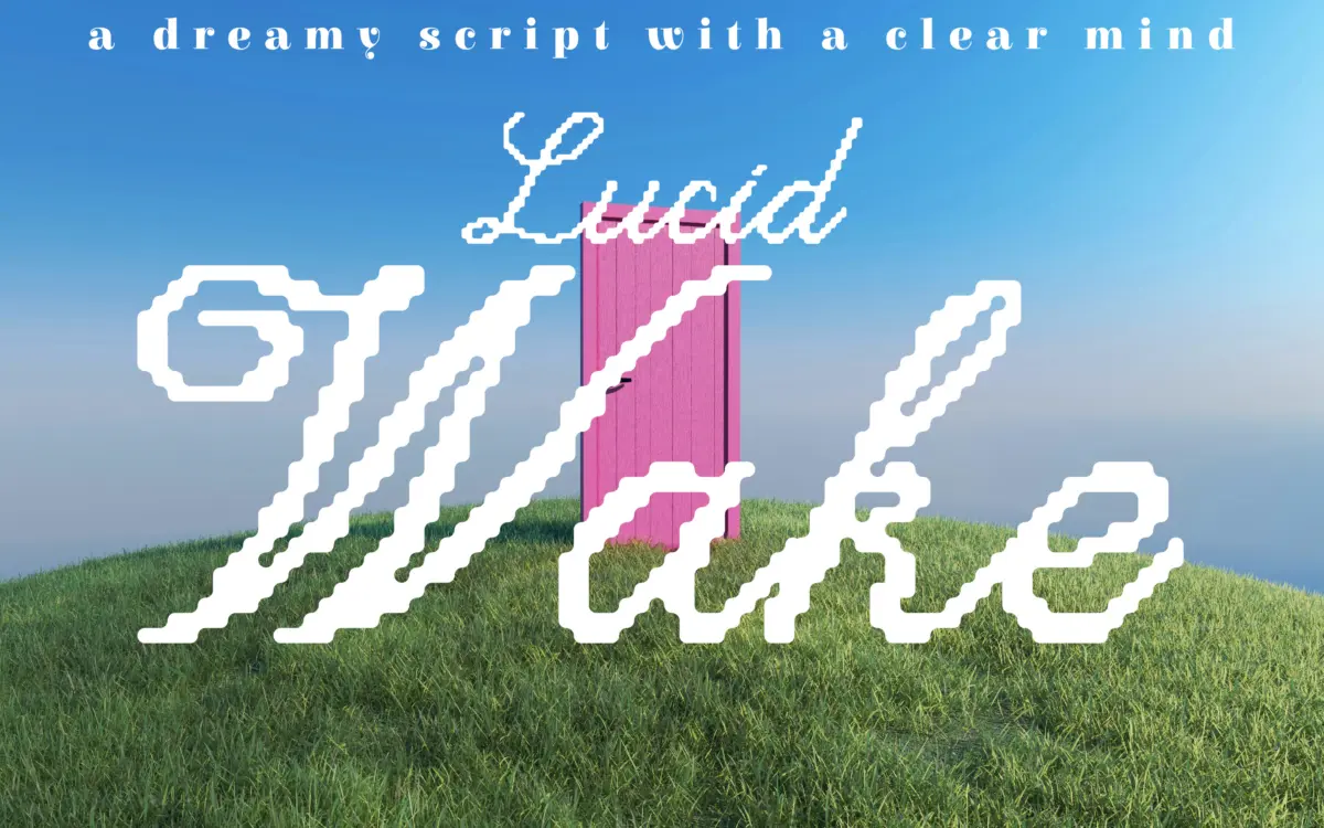
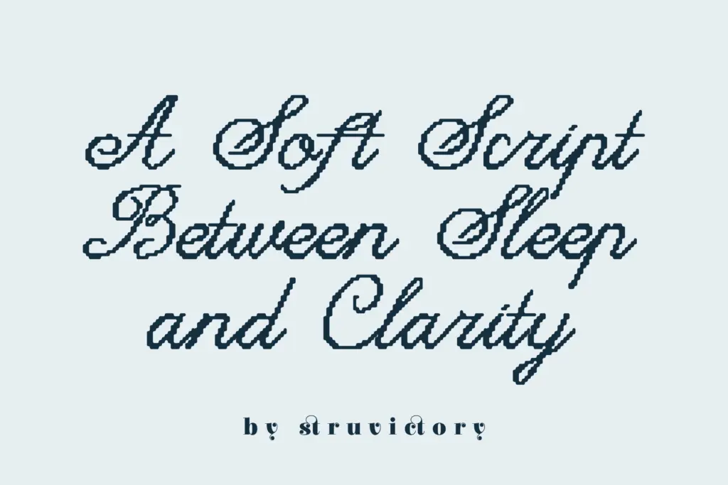
Lucid Wake sits at an odd but workable intersection of two ideas that don’t usually meet: pixel construction and handwritten calligraphy. The strokes carry the loose, connected rhythm of a script — entry swashes, tapering exits, a gentle forward lean — but the edges of each letter are built up from small stepped increments rather than smooth curves. The effect reads less like a glitch font and more like a script that’s been softly quantised, as if drawn on a low-resolution screen and then let breathe.
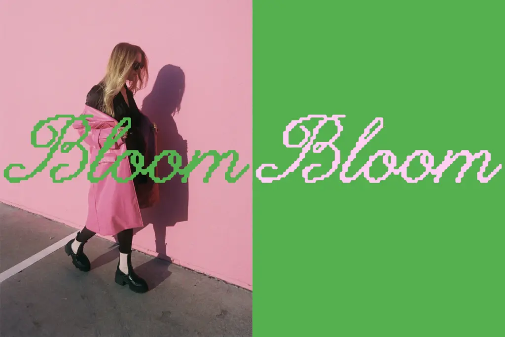
The calligraphic bones are genuine. Letters vary in stroke weight the way a broad or brush pen would produce, so there’s real contrast between thick downstrokes and thinner connectors. The pixel treatment doesn’t fight that structure; it just roughens the outline slightly, giving the whole face a hand-tremor quality rather than a mechanical one. At larger sizes this texture is the whole point — it’s what separates Lucid Wake from a generic script. At smaller sizes the stepping is barely visible, which is worth knowing before you commit to a use case.
Character set and features
The letterforms are consistently soft-edged across the set, with rounded terminals and open counters that keep the pixelation from turning muddy. Ascenders and descenders extend generously, giving the script room to loop and connect without letters colliding — sensible given how much stroke variation is packed into each glyph. Spacing feels calm rather than tight, which supports the
What we liked, and what we didn’t
Strengths
- The pixel-stepped outline gives an otherwise ordinary script a distinctive, memorable texture at display sizes
- Generous ascenders and descenders let the calligraphic strokes connect without crowding
- The mood is consistent — soft, dreamy, unforced — which makes it easy to art-direct around
Trade-offs
- The pixel texture that defines the font disappears at small sizes, leaving a fairly ordinary script behind
- Heavy stroke contrast combined with the stepped edges can blur legibility in dense paragraph settings
Lucid Wake is a genuinely distinctive script thanks to its pixel-softened edges, but that texture only reads at larger sizes and asks for careful spacing everywhere else. It's a strong choice for a cover line or a poster headline, less so for anything that needs to run small.

Tmfonts writes independent reviews of typefaces: what each font does well, where it falls short, what it suits, and where it is sold.