
Sunday Club Font Free Download
Is Sunday Club free to download?
Sunday Club is a commercial font sold on Creative Market, so the full version needs a paid license. Get it from the official listing: Sunday Club font download.
Need something free? These serif fonts from Google Fonts are free for personal and commercial use:
Design style
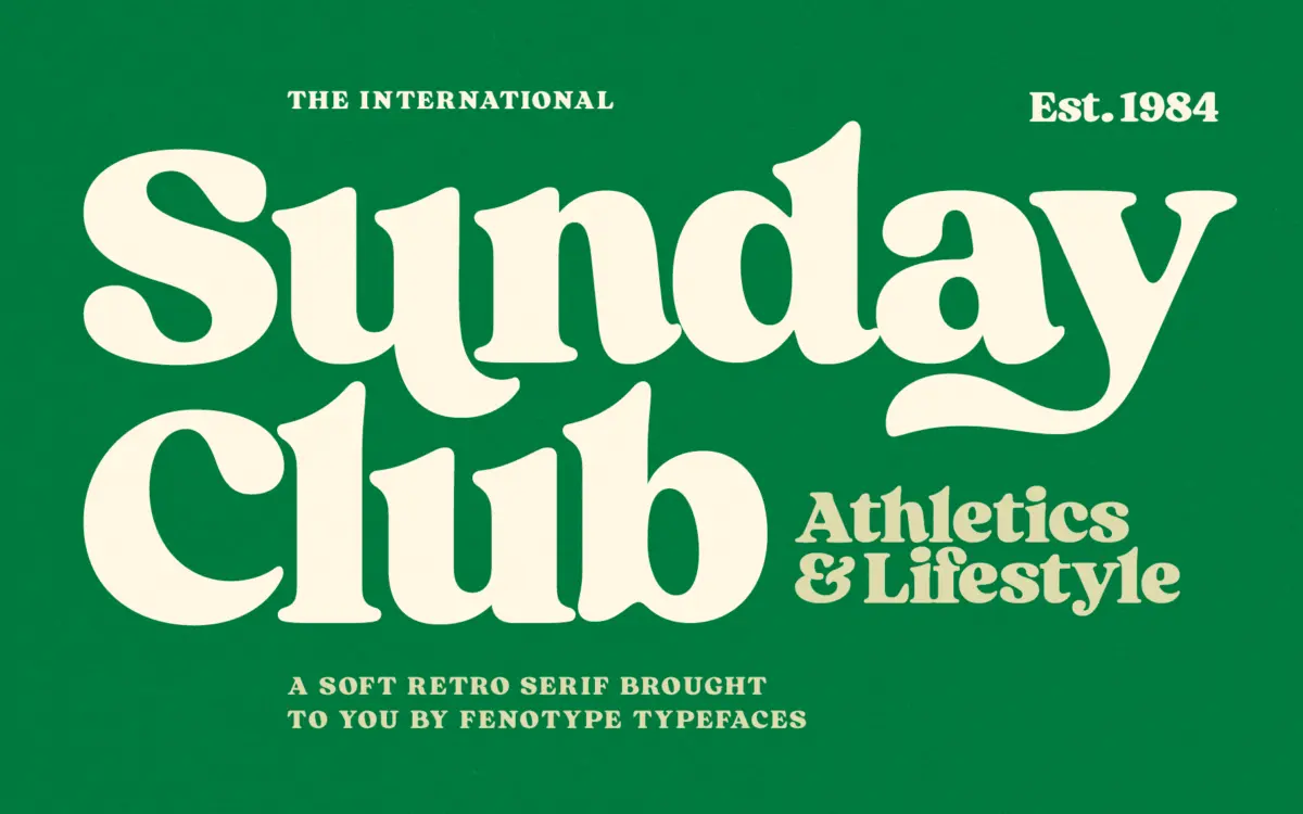
Sunday Club sits in that familiar territory of mid-century signage revival, but it leans heavier and squatter than most of its peers. The strokes carry real weight, with contrast that flattens out rather than snapping thin-to-thick, which gives the face a stamped, almost woodblock feel. Serifs are blunt and slightly bracketed, terminals ball up rather than taper, and the overall rhythm is closer to a hand-cut poster letter than a text serif that happens to look old.
There’s a deliberate nonchalance to the drawing — curves aren’t perfectly even, and some of the swash forms lean into an off-kilter, hand-finished look rather than mechanical polish. That’s the point: this isn’t a face trying to disappear into a paragraph, it’s trying to look like it was painted on a diner window or stitched onto a varsity jacket. It reads as warm and a little brash at once, which is a harder balance to strike than it sounds.
Character set and features
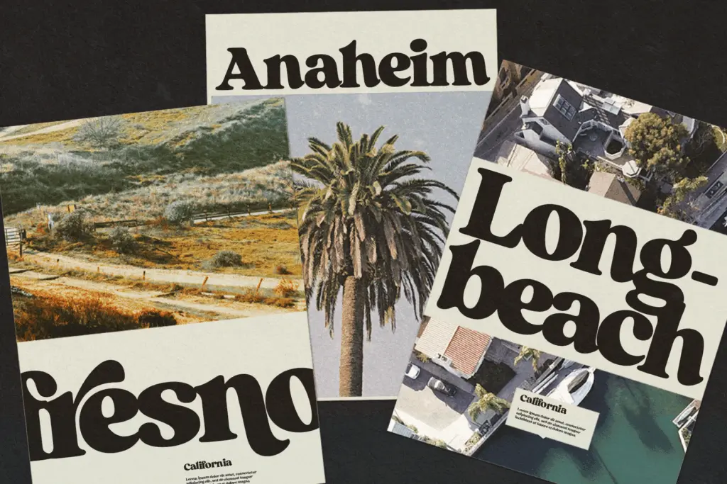
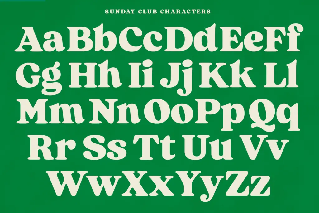
The OpenType support is the substantial part of the package. Over 110 alternate characters are built in, accessed through swash, stylistic, and titling alternate features, plus standard ligatures for common pairs like f_f and a set of discretionary ligatures for less expected combinations. Five stylistic sets are layered on top, giving a working designer several distinct flavours of the same letters without leaving the font file.
In practice this means the difference between a plain-set headline and a fully swashed, ligature-heavy version can be dramatic — the swash caps in particular stretch well beyond the cap height and are clearly meant for short, showcase settings rather than continuous reading. Anyone using this seriously will want to spend time in the glyph panel; the default character isn’t the best version of this font, the alternates are.
Use cases
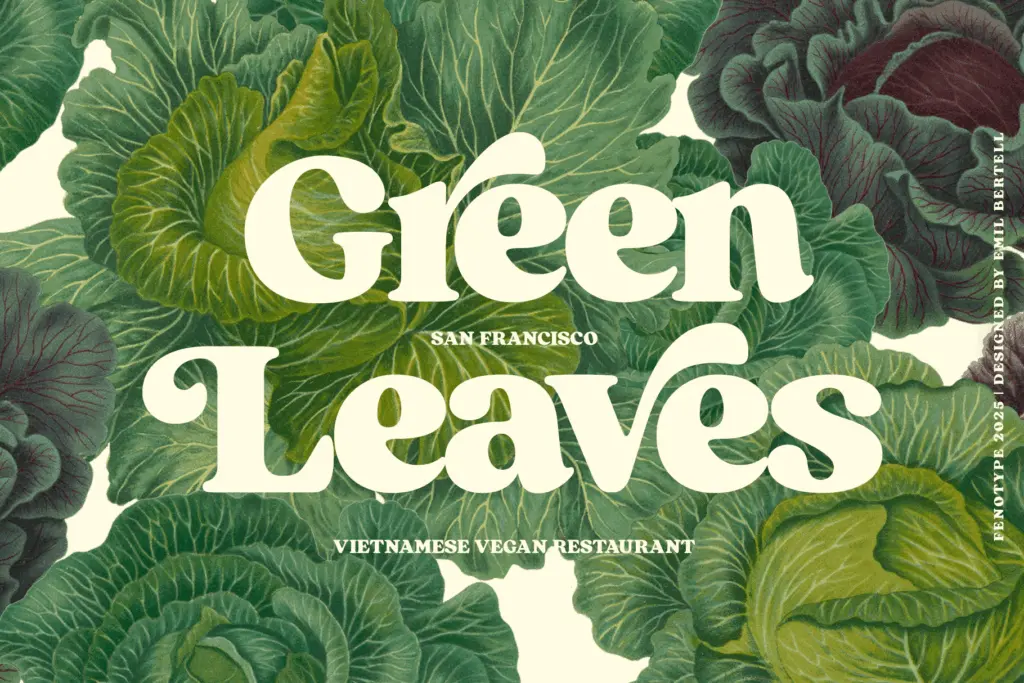
Sunday Club is a headline and lockup face first. It’s built for logotypes, badge and label work, packaging that wants a retro-Americana or vintage-craft signal, and short editorial headlines where the weight can carry a page on its own. The swash alternates make it a strong candidate for wordmarks — cafés, bakeries, barbershops, small-batch anything — where a single word or short phrase needs to feel established rather than new.
It is not built for body copy, and shouldn’t be asked to do that job; the weight and the wide, confident spacing that make it work as a headline would tire the eye fast at paragraph sizes. Pairing it with a plainer serif or sans for supporting text is the sensible route, letting Sunday Club handle the one or two words that need presence. For branding work where a client wants nostalgia without looking dated, or for packaging that needs a stamped, artisanal mark, this earns its place in the toolkit — provided the job stays short.
What we liked, and what we didn’t
Strengths
- Deep OpenType alternate and ligature set that genuinely changes the character of the type
- Strong stamped, hand-cut feel suited to vintage branding and packaging
- Swash caps give short wordmarks real presence without extra styling
Trade-offs
- Too heavy and wide-set for anything beyond a few words at a time
- Default glyph set is noticeably plainer than the alternates, requiring manual setup to look its best
Sunday Club is a confident, weighty retro serif that earns its keep on logotypes and short headlines rather than body text. The alternate glyph set is deep enough to reward the time spent in it, but this is strictly a display tool with a narrow lane.

Tmfonts writes independent reviews of typefaces: what each font does well, where it falls short, what it suits, and where it is sold.