
Brittany Signature Script Font Free Download
Is Brittany Signature Script free to download?
Brittany Signature Script is a commercial font sold on Creative Market, so the full version needs a paid license. Get it from the official listing: Brittany Signature Script font download.
Need something free? These script fonts from Google Fonts are free for personal and commercial use:
Design style
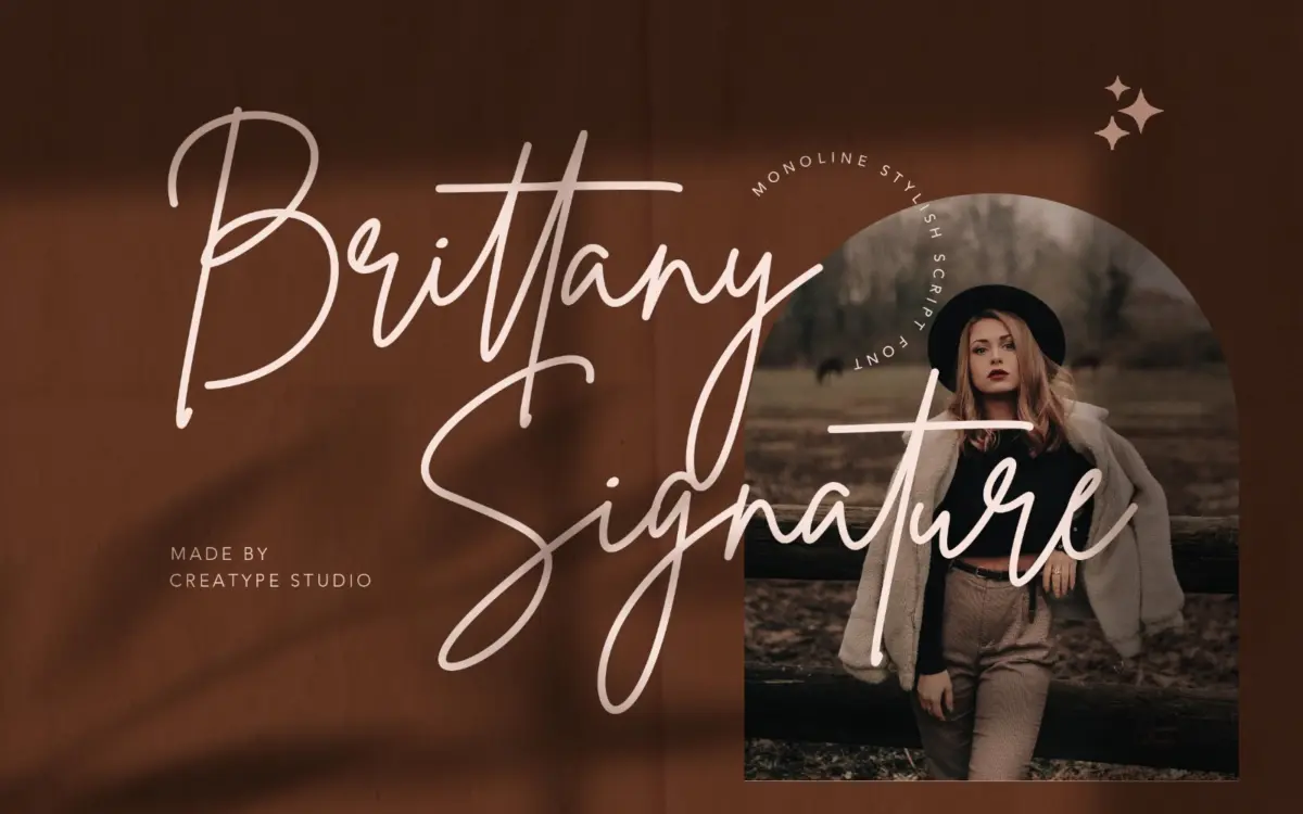
Brittany Signature Script belongs to the signature-script family that has become a marketplace staple: fast, inky strokes that mimic a hand signing quickly rather than writing carefully. The letters lean forward with real conviction, joins are tight, and the baseline dips and rises the way an actual signature does rather than sitting on a ruled line. Where it earns its keep is in the flourish work — entry and exit strokes swing wide without collapsing into illegibility, and the ink-flow effect (thick where the pen presses, thin on the release) gives the whole thing a sense of having been drawn with an actual brush pen rather than built purely in a vector app.
It doesn’t try to be pretty in a wedding-calligraphy sense. It’s closer to the loose, confident mark you’d see on a perfume label or a founder’s signature scrawled across a package. That’s a narrower lane than generic script, and the design commits to it rather than hedging toward something more universally decorative.
Character set and features
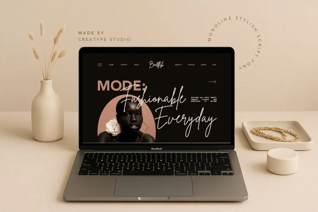
The set covers standard Latin characters plus multilingual glyphs for a run of Western European languages, so accented characters in French, German, Portuguese, Spanish and others are supported rather than bolted on as an afterthought. Ligatures are included, which matters more in a script like this than in most: connecting letterforms cleanly at odd angles is the whole game, and the ligature set covers a reasonable number of common pairs without needing constant manual kerning.
PUA encoding means the alternate characters and ligatures are reachable through a standard glyphs panel or even without one, which is useful for anyone not confident manually inserting Unicode. That’s a practical detail rather than a design one, but it’s the difference between a font people actually use to its full extent and one where half the character set goes untouched because nobody could find it.
At small sizes the script starts to lose the connective tissue that makes it read as a signature — this is true of nearly every font in this genre, and Brittany is no exception. It wants space and it wants size.
Use cases
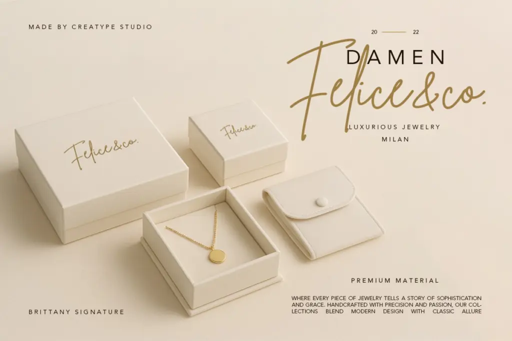
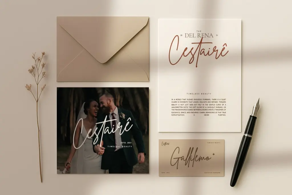
This is a font for a single word or a short line, not a paragraph. A brand name, a logotype, a monogram on packaging, the closing line on an invitation, a signature-style watermark on a photograph — those are the jobs it’s built for, and it does them with more personality than a lot of scripts that try to cover both display and body duty. Used at a large enough size, the ligatures and flourishes read clearly and the piece looks intentional rather than templated.
Pushed into smaller applications — body copy, dense product labels, anything under about 24pt — it starts to fight itself, with joins blurring together and the flourishes eating into surrounding text. It also reads distinctly casual and personal, so it suits handmade, boutique or lifestyle branding more than anything that needs to feel corporate or restrained. Pair it with a plain sans or serif for supporting text rather than asking it to do double duty.
What we liked, and what we didn’t
Strengths
- Ink-flow stroke variation gives it a genuine hand-signed feel rather than a uniform vector script
- Ligature set and PUA encoding make the connective flourishes actually usable without extra kerning work
- Multilingual glyph support covers accented Western European characters cleanly
Trade-offs
- Legibility drops quickly below display sizes as the joins blur together
- Limited to a narrow use case — short lines and single words rather than any extended setting
Brittany Signature Script does one job well: a confident, brush-inked signature mark for branding and short display lines. It's not built for body text or dense layouts, and like most fonts in this genre it needs size and space to read cleanly, but within its lane it has more personality than most.

Tmfonts writes independent reviews of typefaces: what each font does well, where it falls short, what it suits, and where it is sold.