
Sunday Eighties Font Free Download
Is Sunday Eighties Font free to download?
Sunday Eighties Font is a commercial font sold on Creative Market, so the full version needs a paid license. Get it from the official listing: Sunday Eighties font download.
Need something free? These serif fonts from Google Fonts are free for personal and commercial use:
Design style
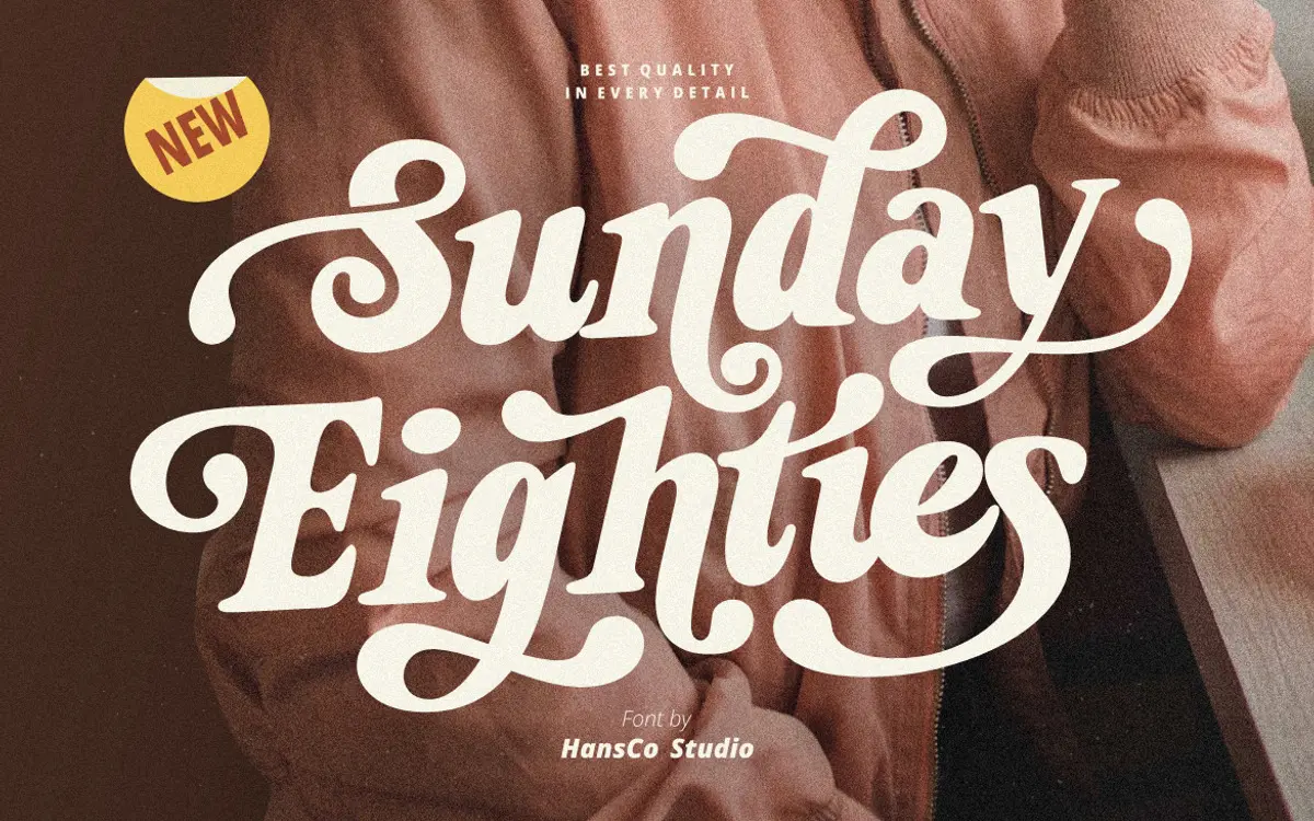
Sunday Eighties leans into the thick-and-thin theatrics of 1970s and 80s signage lettering. The serifs are chunky, the strokes carry heavy, almost slab-like contrast, and several letters carry a slight rounded swing that keeps the whole thing from reading as stiff or formal. It’s a display serif built for personality, not for restraint. You can feel the reference to hand-painted shop signs and retro packaging in the way the terminals flare and the curves bulge slightly before tapering off.
What keeps it from tipping into pastiche is the consistency of the stroke weight logic across the alphabet. The bold weight does the heavy lifting, and it stays legible even as individual letters get expressive. That said, this is a font with one mood. It commits fully to a groovy, retro-funk register, and there is no quieter alternate skeleton to fall back on if a project needs a lighter touch.
Character set and features
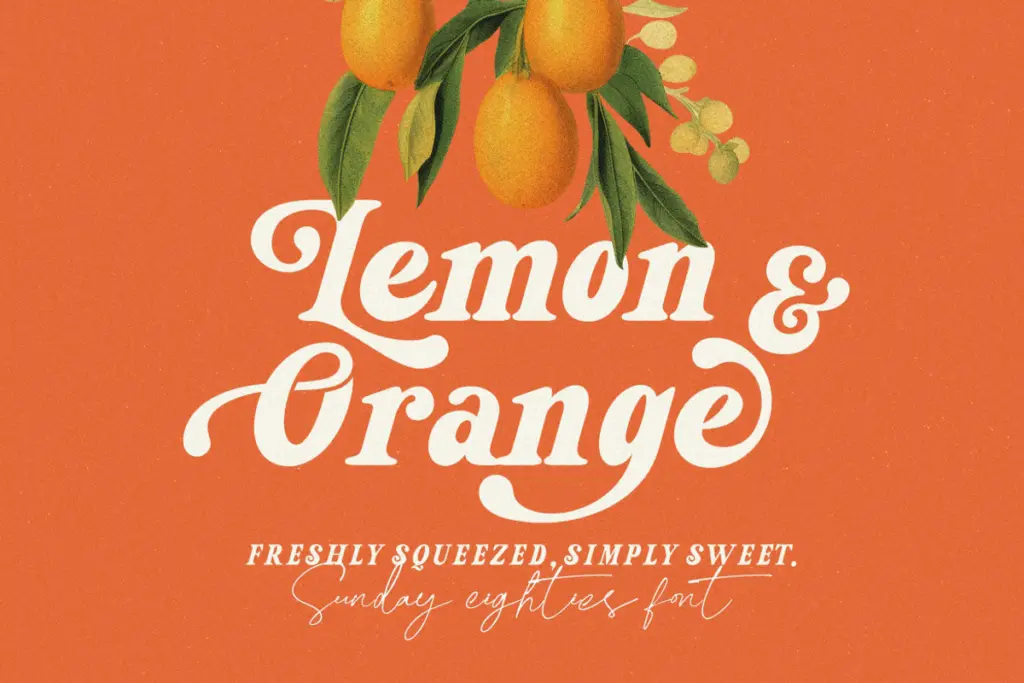
The set covers uppercase, lowercase, numerals, and standard punctuation, alongside alternate swash characters that swap in tails and looping flourishes on select letters. These alternates are where the font earns its keep — a plain word set in the base characters looks decent, but drop in a few swash caps or a tailed lowercase letter and the retro character shows up much more convincingly. Multilingual support is included, which extends the font’s reach beyond English-only branding work.
Access to the alternates depends on software that reads OpenType features properly — the glyphs panel in Adobe apps or CorelDraw, as the font itself assumes. In apps without that support, you’re stuck manually inserting alternate glyphs one at a time, which is a real friction point if your workflow lives in something simpler. There’s no separate light or regular weight bundled in; this is a one-weight, one-mood typeface, so anyone hoping to build a full type system around it alone will need to source a companion elsewhere.
Use cases
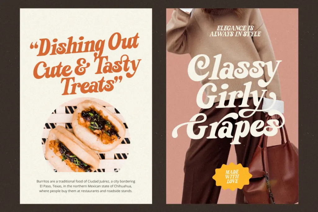
This font is squarely a logotype and short-headline tool. It’s suited to badge-style logo marks, product labels, sticker sheets, and packaging that wants a nostalgic, slightly funky edge — think craft food branding, apparel graphics, or a YouTube channel identity going for a retro vibe rather than a corporate one. The bold weight holds up fine at large sizes on posters and t-shirt prints, where its chunky serifs and swashes actually get room to breathe.
It is not a font for body copy or dense text. At small sizes the contrast between thick and thin strokes starts to compete with itself, and the swash alternates lose their charm when crammed into a paragraph. Treat it as a display face for names, single words, or short lines set large — a wordmark, a package headline, a T-shirt front — and pair it with a plain, quiet sans or serif for any supporting text the project needs.
What we liked, and what we didn’t
Strengths
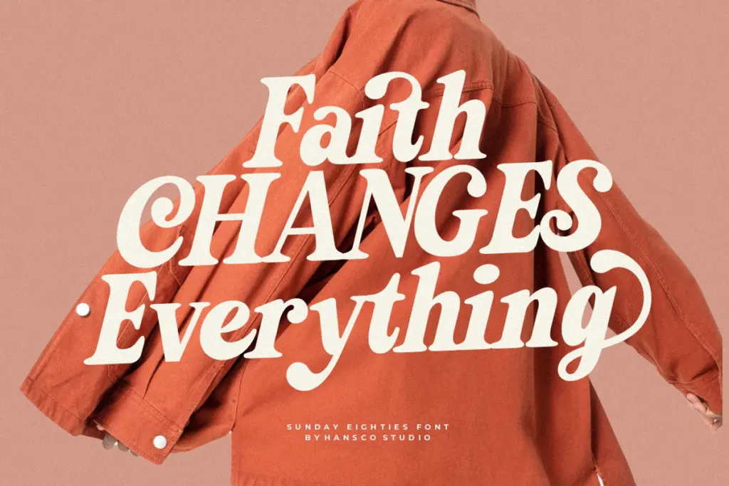
- The bold, chunky serif strokes give logos and packaging headlines real retro presence.
- Swash alternates add a distinct hand-painted, funky character when used deliberately.
- Multilingual support extends its use beyond English-only branding jobs.
Trade-offs
- No lighter weight or quieter companion style is included for text or subheads.
- Alternates require OpenType-aware software, which is a barrier in simpler design tools.
Sunday Eighties is a confident, single-mood retro display serif that earns its keep in logos, packaging headlines and apparel graphics. The swash alternates do most of the character work, but you'll need OpenType-aware software to reach them, and there's no lighter weight or text-friendly alternative built in.

Tmfonts writes independent reviews of typefaces: what each font does well, where it falls short, what it suits, and where it is sold.