
Cocktails and Company Script Font Free Download
Is Cocktails and Company Script free to download?
Cocktails and Company Script is a commercial font sold on Creative Market, so the full version needs a paid license. Get it from the official listing: Cocktails and Company Script font download.
Need something free? These script fonts from Google Fonts are free for personal and commercial use:
Design style
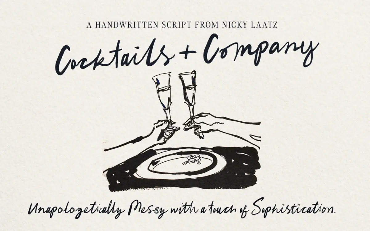
Cocktails and Company Script is built on the premise that handwriting should look unfinished. The strokes swing wide, baselines dip and rise, and letters lean into each other with the kind of inconsistency that a ruler-drawn script deliberately avoids. It reads as brush-written rather than pen-written: strokes thicken and thin the way a loaded brush would, with terminals that trail off rather than snap shut. There’s a deliberate untidiness to the whole thing, and it works in its favour. Too many handwritten scripts try to smooth over their looseness with a metronomic rhythm; this one leans into the wobble.
That said, it is not a raw, freehand scrawl. There’s an evident structure underneath the mess — consistent stroke weight relationships, a controlled slant, letters that still sit on a workable baseline despite their jumps. It’s a designed version of casual, which is the only version that actually functions as a typeface rather than a novelty.
Character set and features
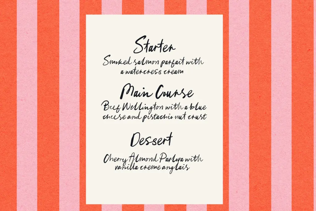
The font is ligature-driven, which is the detail to understand before using it for anything longer than a word or two. Left switched off, it will still function, but the connections between letters won’t read as natural — the ligatures are doing the work of joining strokes convincingly, faking the variation a hand would introduce. Any layout software that supports OpenType features needs those turned on; skipping this step is the single most common way people end up disappointed with scripts like this one.
It’s also PUA encoded, meaning the extended glyph set — alternates, swashes, connecting forms — is reachable even in applications that don’t support proper OpenType ligature substitution, through a glyph panel or PUA character map. That’s a practical accommodation for people working outside professional design software, though it does mean building special characters by hand rather than relying on automatic substitution.
Use cases
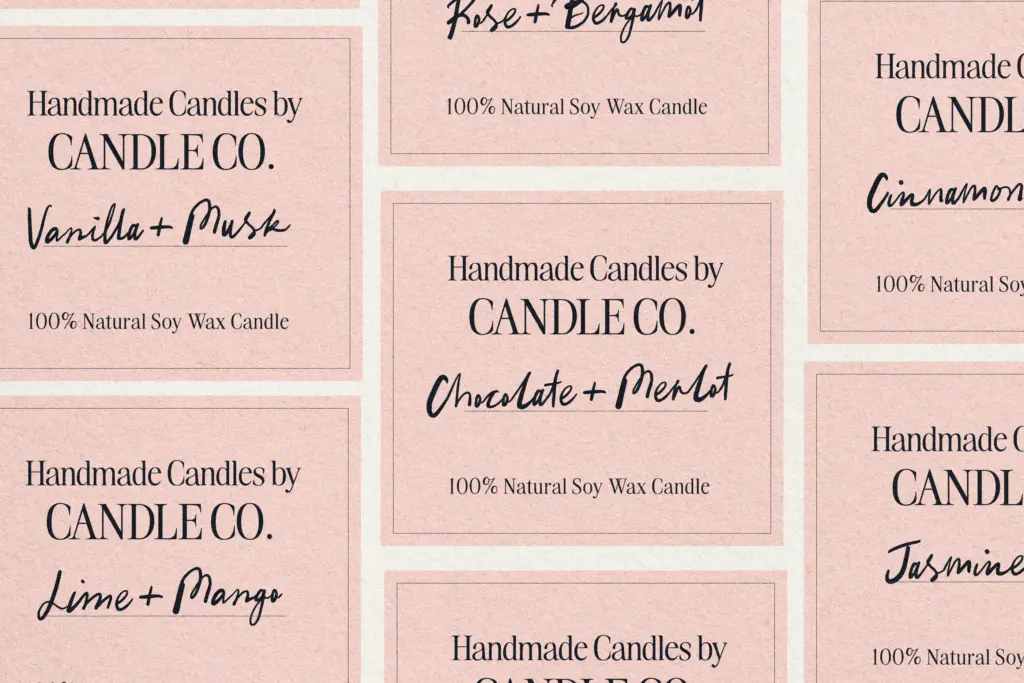
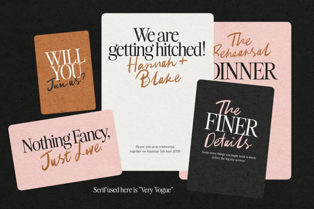
This sits comfortably in casual branding: café signage, small-batch packaging, market stall signs, anything trying to communicate handmade rather than manufactured. It suits greeting cards and invitations that want warmth without formality — a birthday card or a casual bridal shower notice rather than a black-tie wedding suite, where its messiness would read as informal rather than romantic. Illustrators and letterers will find it useful as a base layer for hand-lettered compositions, something to build texture or a rough sketch around.
Where it struggles is in long-form text. The variability that makes single words charming becomes visual noise across a paragraph; readers have to work harder to track a baseline that keeps moving. Keep it to headlines, short phrases, and standalone words, and pair it with a settled, quiet body font for anything that needs actual reading.
What we liked, and what we didn’t
Strengths
- Convincing brush-drawn variation instead of a repetitive, mechanical script rhythm
- Ligature system creates natural-looking letter connections when features are enabled
- PUA encoding gives access to the full character set outside professional layout software
Trade-offs
- Requires OpenType ligatures turned on to look as intended, which trips up some workflows
- Legibility drops quickly in longer text due to its shifting baseline and loose spacing
Cocktails and Company Script delivers a genuinely loose, brush-built handwritten feel that avoids the over-polished trap many scripts fall into. It needs its ligatures switched on to work properly, and it's best kept short — headlines and single words, not paragraphs. A solid pick for casual branding and informal stationery, not for anything demanding sustained reading.

Tmfonts writes independent reviews of typefaces: what each font does well, where it falls short, what it suits, and where it is sold.