
Desirable Calligraphy Font Free Download
Is Desirable Calligraphy free to download?
Desirable Calligraphy is a commercial font sold on Creative Market, so the full version needs a paid license. Get it from the official listing: Desirable Calligraphy font download.
Need something free? These script fonts from Google Fonts are free for personal and commercial use:
Design style
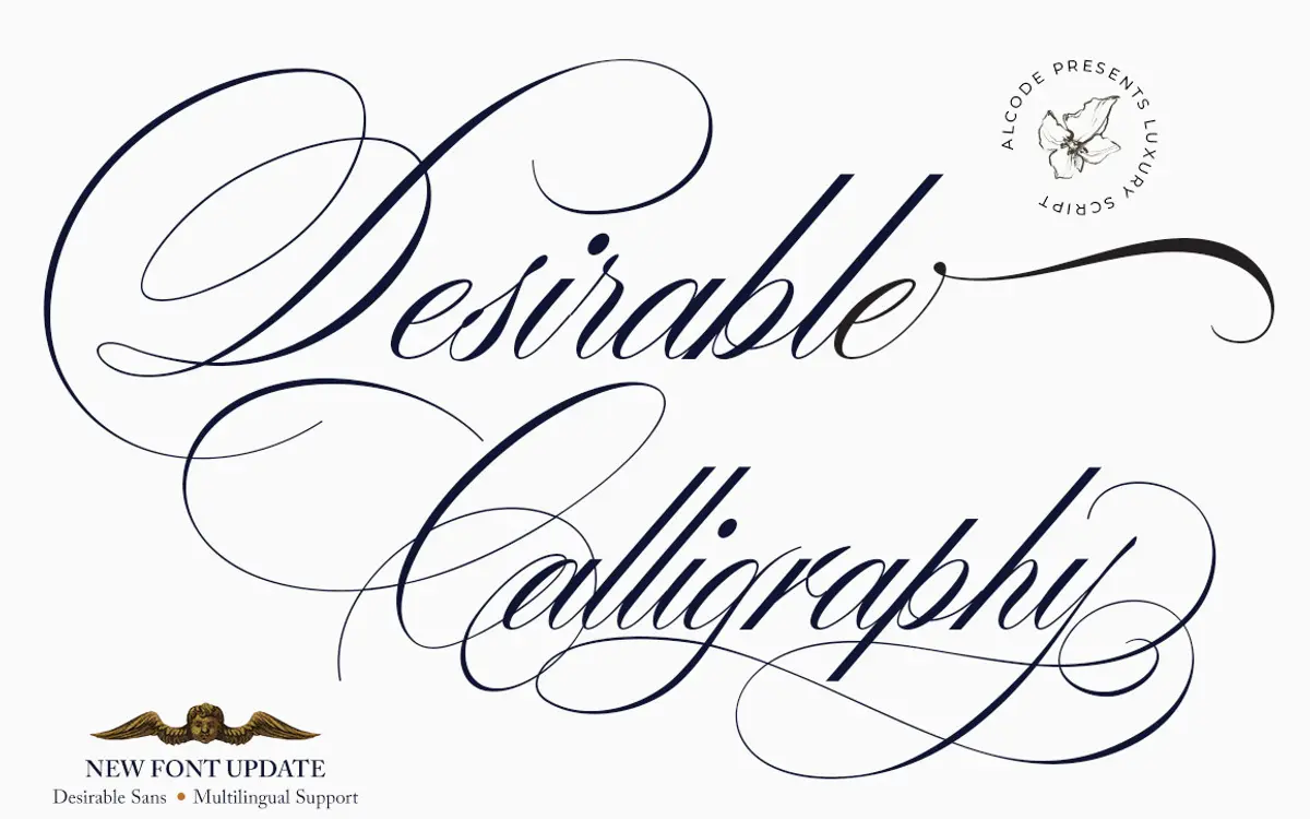
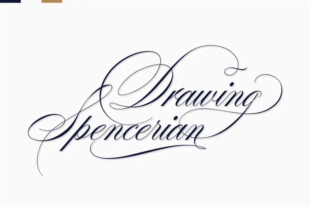
Desirable Calligraphy sits in the crowded field of pointed-nib scripts that reference old manuscript hands, but it leans harder into formality than most. The strokes carry noticeable thick-to-thin contrast, with entry strokes that taper to fine hairlines and exit strokes that swell before releasing. The overall angle is consistent and fairly upright compared to more casual brush scripts, which gives it a composed, almost engraved feel rather than a loose, handwritten one.
Letter joins are close and the connecting strokes are drawn with some flourish, particularly on capitals, which tend toward looped, ornamental forms rather than restrained monoline caps. That makes the typeface read as ceremonial rather than everyday. It won’t pass as a quick note scrawled by hand, but that isn’t really the ambition here. The rhythm between letters is even enough that words don’t fight each other for space, though tight tracking at small sizes can cause loops to crowd.
Character set and features
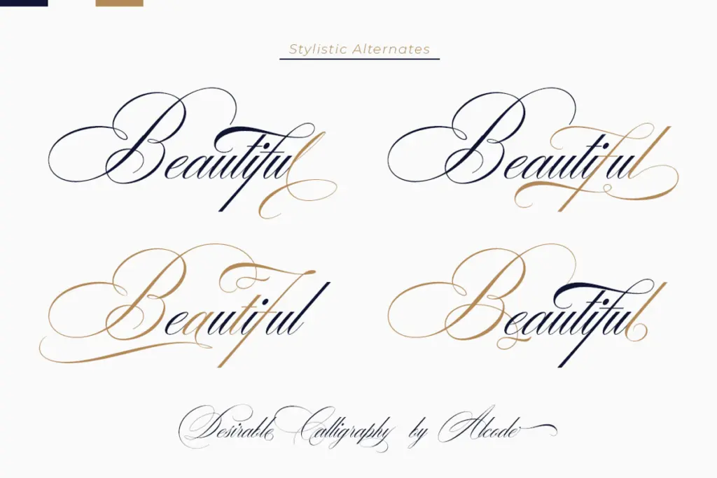
The font includes standard OpenType infrastructure — ligatures and alternate characters that let you swap default joins for smoother or more decorative ones where letter combinations would otherwise collide or look mechanical. This matters more in a script like this than in a sans, since without contextual alternates, connected scripts can produce awkward pile-ups at certain letter pairs. Multilingual character support is included, which extends usability beyond basic English typesetting, though exactly how deep that support goes should be checked against your specific language needs before committing to a layout.
Files come in both OTF and TTF formats. The OTF is where the ligatures and alternates live; if you’re working in an application that doesn’t parse OpenType features, you’ll need to access those glyphs manually through a system character map, which is a bit of friction for anyone expecting features to activate automatically in basic design tools.
Use cases
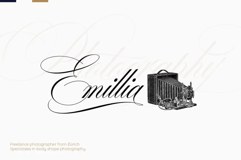
This is a font built for occasion work: wedding invitations and save-the-dates, certificates, formal greeting cards, and the kind of packaging or label design that wants to suggest heritage or craft rather than trend. The elegance reads best at medium-to-large display sizes — headlines, monograms, cover lettering — where the contrast in the strokes and the looped capitals have room to breathe. Push it down to body-copy sizes and the fine hairlines start to disappear, and the ligatures that make it feel considered at display size become harder to justify given the legibility cost.
It also works as a logotype or wordmark for brands trying to signal tradition or luxury — think small-batch food producers, bridal businesses, or stationery lines — provided the brand has room for something ornate. It’s less suited to social media captions or blog headers where speed and casual tone matter more than ceremony; there, the formality will feel mismatched. Pair it with a plain, quiet sans or serif for supporting text, since this script needs contrast rather than competition to stay legible.
What we liked, and what we didn’t
Strengths
- Strong stroke contrast gives it a genuinely formal, engraved character rather than a generic script look
- Ligatures and alternates help smooth over awkward letter collisions common to connected scripts
- Multilingual support extends its use beyond basic Latin-only stationery work
Trade-offs
- Tight, looped letterforms lose legibility quickly once sized down for body text
- OpenType features require manual access via character map in apps that don't support them natively
Desirable Calligraphy is a well-drawn, formal script suited to ceremonial and luxury-adjacent work — weddings, certificates, heritage branding. It loses clarity at small sizes and needs a plain companion typeface to carry supporting text, so treat it as a display specialist rather than an all-purpose script.

Tmfonts writes independent reviews of typefaces: what each font does well, where it falls short, what it suits, and where it is sold.