
El-Hidrant Font Free Download
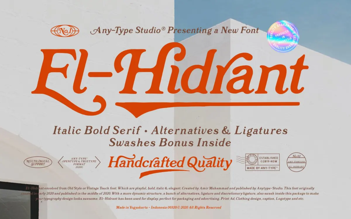
Is El-Hidrant free to download?
El-Hidrant is a commercial font sold on Creative Market, so the full version needs a paid license. Get it from the official listing: El-Hidrant font download.
Need something free? These serif fonts from Google Fonts are free for personal and commercial use:
Design style
El-Hidrant sits in that crowded but reliable territory of old-style serifs revived for contemporary display work. The brief cites Caslon and Bookman as reference points, and the debt shows in the bracketed serifs and moderate stroke contrast, but the drawing has been loosened up considerably. Curves bow out more than a strict revival would allow, and the italic in particular leans toward calligraphic flourish rather than historical accuracy. This isn’t a scholarly revival; it’s a mood board version of one, built for headlines rather than paragraphs.
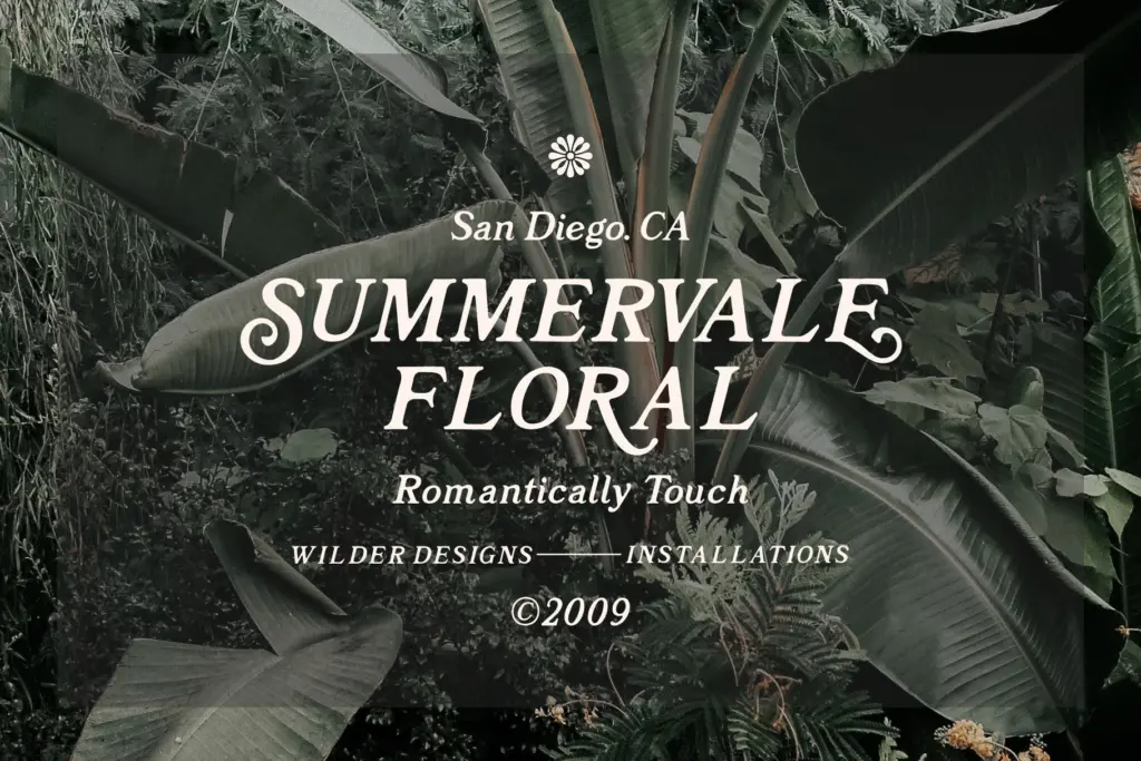
The swash set is where the personality actually lives. Entry and exit strokes swing wide on capitals, and the alternates push the letterforms toward something closer to a hand-lettered signage script than a book face. Used sparingly, this gives titling work a bit of theatre. Used across a whole line, it gets busy fast — the swashes want room to breathe and don’t play well stacked tight.
Character set and features
The package covers uppercase and lowercase, numerals, punctuation and symbols, with multilingual support extending its reach beyond a single-language market. Ligatures and discretionary ligatures are included alongside stylistic alternates, and the swash characters ship as a separate file in OTF, TTF and EPS — a sensible move, since it lets you drop swash caps into a layout as vector ornaments rather than fighting with OpenType feature panels in every app.
That said, the discretionary ligatures and alternates only pay off in software that exposes OpenType features properly. In anything more basic, you’re stuck with the default glyphs, which are fine but noticeably less interesting than what’s available underneath. Designers working in Illustrator or InDesign will get full value; anyone pasting text into a template tool may not.
Use cases
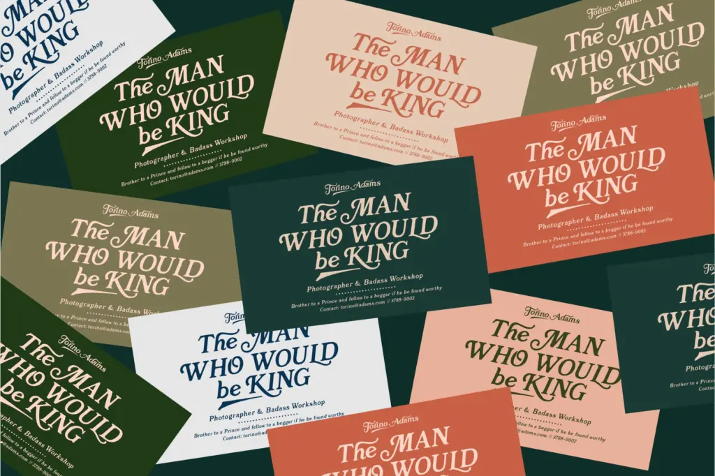
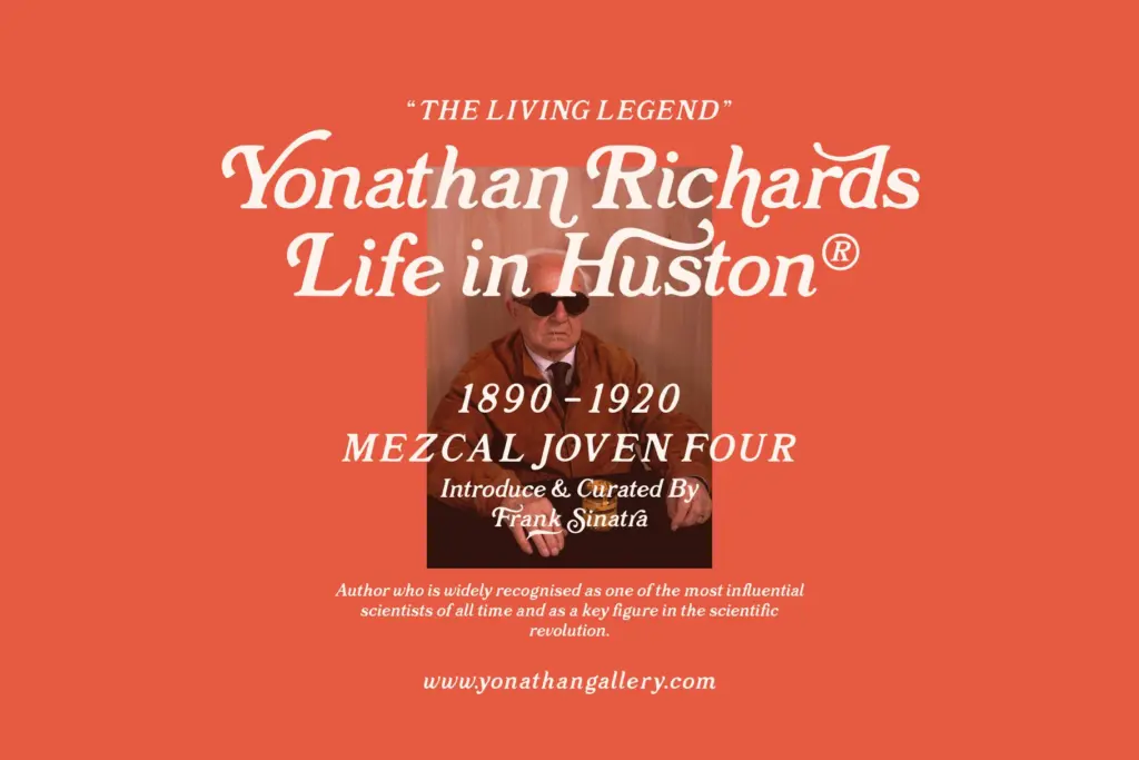
This is a display face first, and it knows it. At headline sizes — packaging fronts, badge lockups, logotypes, editorial titling — the serifs read cleanly and the swash caps give a wordmark some lift without needing extra ornament layered on top. It has an obvious home in retail branding that wants a heritage or craft feel: labels, apparel graphics, café signage, that general
What we liked, and what we didn’t
Strengths
- Separate swash files in OTF, TTF and EPS make it easy to drop ornamental caps into a layout without fighting OpenType panels.
- The moderate stroke contrast and bracketed serifs give it a warm, craft-brand feel suited to packaging and labels.
- Discretionary ligatures and stylistic alternates offer real variation for anyone with full OpenType access.
Trade-offs
- The swash alternates get visually noisy when set tight or run across a full line rather than used as isolated accents.
- Without OpenType feature support, users are left with a fairly ordinary default character set.
El-Hidrant is a decent vintage-flavoured display serif with a genuinely useful swash package, best kept to headlines and logotypes rather than running text. It won't surprise anyone who's used similar Caslon-adjacent revivals, but the separate swash files are a practical touch. Fine for badge and packaging work, less so anywhere legibility at small sizes matters.

Tmfonts writes independent reviews of typefaces: what each font does well, where it falls short, what it suits, and where it is sold.